Exam 2: Graphs,Charts and Tablesdescribing Your Data
Exam 1: The Where,Why,and How of Data Collection167 Questions
Exam 2: Graphs,Charts and Tablesdescribing Your Data139 Questions
Exam 3: Describing Data Using Numerical Measures138 Questions
Exam 4: Introduction to Probability125 Questions
Exam 5: Discrete Probability Distributions161 Questions
Exam 6: Introduction to Continuous Probability Distributions122 Questions
Exam 7: Introduction to Sampling Distributions136 Questions
Exam 8: Estimating Single Population Parameters174 Questions
Exam 9: Introduction to Hypothesis Testing183 Questions
Exam 10: Estimation and Hypothesis Testing for Two Population Parameters121 Questions
Exam 11: Hypothesis Tests and Estimation for Population Variances69 Questions
Exam 12: Analysis of Variance162 Questions
Exam 13: Goodness-Of-Fit Tests and Contingency Analysis105 Questions
Exam 14: Introduction to Linear Regression and Correlation Analysis139 Questions
Exam 15: Multiple Regression Analysis and Model Building152 Questions
Exam 16: Analyzing and Forecasting Time-Series Data133 Questions
Exam 17: Introduction to Nonparametric Statistics103 Questions
Exam 18: Introduction to Quality and Statistical Process Control43 Questions
Select questions type
A university recently collected data for a sample of 200 business majors.One variable collected was the number of credits left to be taken before graduation.This variable could effectively be displayed using a line chart.
(True/False)
4.8/5  (27)
(27)
The undergraduate students at your university are classified as freshmen,sophomores,juniors,or seniors.A recent study of undergraduates asked the students to indicate the number of credits they were registered for this term.The responses were 3,6,9,12,15,and 18.The number of cells in a joint frequency distribution for the two variables,class standing,and credit hours is:
(Multiple Choice)
4.8/5 (36)
Consider the following chart.Which of the following statements is most correct? 
(Multiple Choice)
4.7/5 (37)
For the same data,a graph of a relative frequency distribution will look exactly the same as a graph of the frequency distribution.
(True/False)
4.8/5 (42)
When developing a frequency distribution,the following classes would be considered acceptable:
5 to < 10
10 to < 20
20 to < 40
(True/False)
4.9/5 (40)
Consider the following chart.Which of the following statements is most correct? 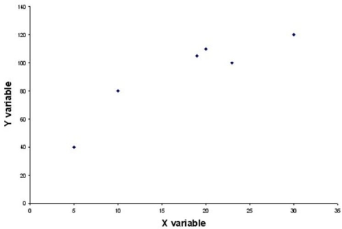
(Multiple Choice)
4.8/5 (36)
The following class limits would be acceptable for developing a frequency distribution on income:
$0 < $5,000
$5001 < $10,000
$10,001 < $20,000
Over $20,000
(True/False)
4.8/5 (47)
Discuss the steps that you would use to manually construct a histogram for the salaries of the 1,124 employees in the Ferris Steel Company.
(Essay)
4.8/5 (27)
Frequency distributions can be formed from which of the following types of data?
(Multiple Choice)
4.7/5 (36)
A homeowners association consists of 20 homes.The family in each home is considered an automatic member of the association.Recently,one of the homes fell into a state of disrepair.A survey was conducted of the homeowners both on the same street as the house in question and on the second street.At issue was whether legal action should be brought against the homeowner with the problem house.There are 8 homes on the same street as the problem house and 6 of these called for legal action.The percentage of houses on the second street that favored legal action is 50 percent.Which type of chart might be most effective for conveying the information about percentage of residents favoring legal action by street?
(Multiple Choice)
4.8/5 (39)
The upper and lower limits of each class in a frequency distribution are also referred to as the data array.
(True/False)
4.8/5 (40)
In a study involving car owners,one question asked the owner for the number of miles driven last year.A second question asked the owner for the age of the vehicle.A histogram would be useful for analyzing the relationship between miles driven and the age of the vehicle.
(True/False)
4.8/5 (41)
A tire store manager has collected data showing the number of tires of each brand sold during the past month.A bar chart might be effective in graphically illustrating which brands tend to sell best at this store.
(True/False)
4.9/5 (32)
When using the Histogram tool in Excel to construct a frequency distribution and histogram,if the first bin value is 10 and the second bin value is 20,the frequency count for the second class will include all values from 10 up to,but not including,20.
(True/False)
4.9/5 (32)
One of the differences between a stem and leaf diagram and a histogram is that even for variables involving a large number of different values,the stem and leaf diagram shows the individual data values whereas the histogram requires you to group the data and lose the individual values.
(True/False)
4.7/5 (29)
Which of the following is not considered desirable when constructing a frequency distribution for continuous data?
(Multiple Choice)
4.9/5 (34)
In Excel a joint frequency distribution table can be created using a tool called PivotTable.
(True/False)
4.8/5 (35)
When developing a bar chart,it is usually preferable to organize the bars in order from high to low.
(True/False)
4.8/5 (31)
Filters
- Essay(0)
- Multiple Choice(0)
- Short Answer(0)
- True False(0)
- Matching(0)