Exam 5: Exploring Data With Graphs
Exam 1: Why Is My Evil Lecturer Forcing Me to Learn Statistics26 Questions
Exam 2: The Spine of Statistics26 Questions
Exam 3: The Phoenix of Statistics16 Questions
Exam 4: The Ibm Spss Statistics Environment22 Questions
Exam 5: Exploring Data With Graphs21 Questions
Exam 6: The Beast of Bias25 Questions
Exam 7: Non-Parametric Models47 Questions
Exam 8: Correlation25 Questions
Exam 9: The Linear Model Regression23 Questions
Exam 10: Comparing Two Means24 Questions
Exam 11: Moderation, Mediation and Multicategory Predictors24 Questions
Exam 12: Glm 1: Comparing Several Independent Means46 Questions
Exam 13: Glm 2: Comparing Means Adjusted for Other Predictors Analysis of Covariance24 Questions
Exam 14: Glm 3: Factorial Designs21 Questions
Exam 15: Glm 4: Repeated-Measures Designs24 Questions
Exam 16: Glm 5: Mixed Designs22 Questions
Exam 17: Multivariate Analysis of Variance Manova25 Questions
Exam 18: Exploratory Factor Analysis25 Questions
Exam 19: Categorical Outcomes: Chi-Square and Loglinear Analysis24 Questions
Exam 20: Categorical Outcomes: Logistic Regression25 Questions
Exam 21: Multilevel Linear Models23 Questions
Select questions type
A histogram is most closely related to which of the following graphs?
Free
(Multiple Choice)
4.9/5  (41)
(41)
Correct Answer: Verified
A
Inspect the post-test box-whisker plot. Which of the following quartiles has the greatest range of data? 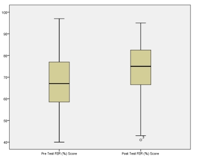
Free
(Multiple Choice)
4.7/5 (39)
Correct Answer:Verified
A
Twenty-five percentile points is commonly referred to as a
Free
(Multiple Choice)
4.9/5 (44)
Correct Answer:Verified
A
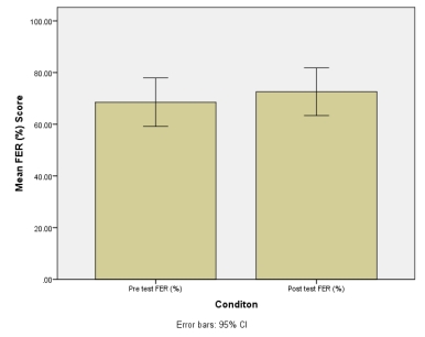
Researchers were interested in finding out how the respiratory parameters in a group of individuals who were diagnosed with asthma responded to a six-week aerobic training intervention. Forced expired ratio (FER, %) is the product of the forced expired ratio in 1 second (FEV1, litres) divided by the forced vital capacity (FVC, litres) and was the parameter the researchers were most interested in. The results are presented below. Enter the data into SPSS and plot a bar chart representing the mean of the pre- and post-test data. Add the 95% confidence intervals for the mean. You should get the bar chart shown below. What does the 95% confidence interval (CI) that you have plotted refer to? 
(Multiple Choice)
4.9/5 (30)
Describe the appearance of the line of best fit plotted with the FER data.
(Multiple Choice)
4.8/5 (35)
Analyse the following box-whisker plot. What assumptions can be made about participant 3 in the post-test data set? 
(Multiple Choice)
4.9/5 (28)
Which measure of central tendency is presented in a box-whisker plot?
(Multiple Choice)
4.9/5 (29)
Calculate the mean and standard deviation of the pre-test FER scores.
(Multiple Choice)
4.8/5 (40)
Calculate the mean and standard deviation of the post-test FER scores.
(Multiple Choice)
5.0/5 (36)
Which of the following are important components of graphical illustrations?
(Multiple Choice)
4.8/5 (41)
Plot the FEV1 data presented in Q11 as a scatterplot. You should get the scatterplot shown below. Inspecting the scatterplot, what is the r-value for the line of best fit? 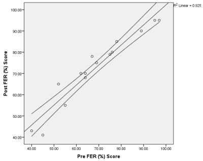
(Multiple Choice)
4.8/5 (41)
If you were to graphically present the learning style data, which might be the most appropriate option?
(Multiple Choice)
4.9/5 (25)
A researcher randomized 75 children into three groups (25 per group). Each group was taught how to perform a basketball free throw using either a visual, aural or verbal learning style. The success of the learning style was determined by the number of points scored from ten attempts. Which of the following would be considered the independent variable?
(Multiple Choice)
4.7/5 (32)
The graph presented below represents the post-test FER data, but what is its correct title? 
(Multiple Choice)
4.8/5 (42)
Which measure of data distribution is presented as the 'box' in a box-whisker plot?
(Multiple Choice)
4.7/5 (35)
Filters
- Essay(0)
- Multiple Choice(0)
- Short Answer(0)
- True False(0)
- Matching(0)