Exam 3: Visual Displays of Data
Exam 1: An Introduction to Statistics and Research Design156 Questions
Exam 2: Frequency Distributions89 Questions
Exam 3: Visual Displays of Data108 Questions
Exam 4: Central Tendency and Variability108 Questions
Exam 5: Sampling and Probability145 Questions
Exam 6: The Normal Curve, Standardization and Z Scores142 Questions
Exam 7: Hypothesis Testing With Z Tests141 Questions
Exam 8: Confidence Intervals, Effect Size, and Statistical Power147 Questions
Exam 9: The Single-Sample T Test124 Questions
Exam 10: The Paired-Samples T Test101 Questions
Exam 11: The Independent-Samples T Test99 Questions
Exam 12: One-Way Between-Groups Anova108 Questions
Exam 13: One-Way Within-Groups Anova102 Questions
Exam 14: Two-Way Between-Groups Anova115 Questions
Exam 15: Correlation139 Questions
Exam 16: Regression113 Questions
Exam 17: Chi-Square Tess120 Questions
Exam 18: Choosing and Reporting Statistics105 Questions
Select questions type
When constructing graphs, it is best to include the zero value on both axes:
(Multiple Choice)
4.8/5  (33)
(33)
In a pictorial graph, images are used at each level of the _____ variable to represent its value on the _____ variable.
(Multiple Choice)
4.8/5 (37)
A pie chart is almost always better at presenting data than a bar graph.
(True/False)
4.8/5 (41)
The _____ allows researchers to make predictions from a person's value on one variable to a person's value on another variable.
(Multiple Choice)
4.9/5 (36)
Pie charts represent the percent or proportion of each observed category through the:
(Multiple Choice)
4.9/5 (50)
If graphing two or more nominal independent variables and one scale dependent variable, use a:
(Multiple Choice)
4.7/5 (38)
On a histogram the y-axis depicts counts or frequencies, while on a bar graph the y-axis depicts _____.
(Multiple Choice)
4.7/5 (31)
The x-axis of a bar graph indicates discrete levels of a nominal variable.
(True/False)
4.8/5 (41)
A pie chart is a type of multivariable graph that allows you to plot numerous variables simultaneously.
(True/False)
4.8/5 (41)
When plotting two scale variables, a _____ is the best graph option.
(Multiple Choice)
4.9/5 (34)
A bar graph is almost always better at presenting data than a pie chart.
(True/False)
4.8/5 (43)
A researcher investigated the relationship between IQ and years of education.What type of graph should the researcher use to illustrate his findings?
(Multiple Choice)
4.9/5 (29)
Use the following to answer questions
Figure: Class Rank 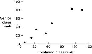 -(Figure: Class Rank) Given the construction of this graph, what is the independent variable?
(Multiple Choice)
4.9/5 (50)
What type of lie is it when the method of assessment or measure has limited responses, thus creating an imbalance in possible responses?
(Multiple Choice)
4.8/5 (36)
The y-axis on a graph should start with 0, or have cut marks to indicate that it does not go down to 0.
(True/False)
4.9/5 (31)
Use the following to answer questions
This graph depicts fictional data that replicate the pattern of performance observed in a study published by Nietfeld and Ender (2003).
Figure: Intelligence and Teaching Efficacy 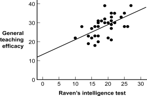 -(Figure: Intelligence and Teaching Efficacy) If the graph creator asserts with certainty that a person with a Raven's intelligence test score of 5 would have a teaching efficacy score of 15, the statement would be which kind of lie?
(Multiple Choice)
4.9/5 (44)
Use the following to answer questions
Figure: Class Rank
-(Figure: Class Rank) The type of graph depicted in the figure is a:
(Multiple Choice)
4.9/5 (32)
In a _____ images are used at each level of the independent variable to represent its value on the dependent variable.
(Multiple Choice)
4.7/5 (33)
Filters
- Essay(0)
- Multiple Choice(0)
- Short Answer(0)
- True False(0)
- Matching(0)