Exam 3: Visual Displays of Data
Exam 1: An Introduction to Statistics and Research Design156 Questions
Exam 2: Frequency Distributions89 Questions
Exam 3: Visual Displays of Data108 Questions
Exam 4: Central Tendency and Variability108 Questions
Exam 5: Sampling and Probability145 Questions
Exam 6: The Normal Curve, Standardization and Z Scores142 Questions
Exam 7: Hypothesis Testing With Z Tests141 Questions
Exam 8: Confidence Intervals, Effect Size, and Statistical Power147 Questions
Exam 9: The Single-Sample T Test124 Questions
Exam 10: The Paired-Samples T Test101 Questions
Exam 11: The Independent-Samples T Test99 Questions
Exam 12: One-Way Between-Groups Anova108 Questions
Exam 13: One-Way Within-Groups Anova102 Questions
Exam 14: Two-Way Between-Groups Anova115 Questions
Exam 15: Correlation139 Questions
Exam 16: Regression113 Questions
Exam 17: Chi-Square Tess120 Questions
Exam 18: Choosing and Reporting Statistics105 Questions
Select questions type
To efficiently conduct an alumni survey, a university collects data on all those who attend the annual alumni reunion on campus.What type of manipulation is this?
(Multiple Choice)
4.9/5  (41)
(41)
Use the following to answer questions
This figure depicts the results of a study by Ahluwalia et al.(2006) investigating the effects of two types of gum (placebo or nicotine) and two types of counseling (educational or motivational) in helping people to stop smoking.
Figure: Smoking Cessation 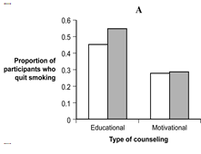
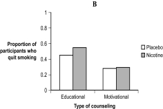 -(Figure: Smoking Cessation) What is the difference between the data depicted in Figure A and the data in Figure B?
(Multiple Choice)
4.9/5 (38)
Use the following to answer questions
This figure depicts the typical relation found between a person's age (in years) and his or her reaction time in a simple reaction time task (e.g., time to press a button when a light turns green).
Figure: Age and Reaction Time 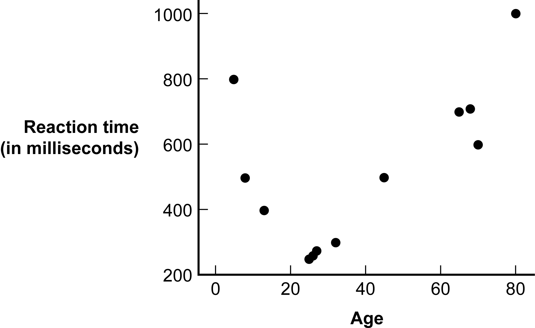 -(Figure: Age and Reaction Time) If one were to assume with certainty that a person who is 2 years old has a reaction time of 9,000 milliseconds, which error would be made?
(Multiple Choice)
5.0/5 (32)
Data based on a biased scale typically do not convey what the researcher wants to convey.
(True/False)
5.0/5 (48)
Line graphs are used to represent the relation between two scale variables.Two common types of relations depicted in these graphs are:
(Multiple Choice)
4.8/5 (35)
The y-axis of a bar graph indicates discrete levels of a nominal variable.
(True/False)
4.8/5 (39)
A _____ depicts the relation between two scale variables, whereas a _____ displays values of a scale variable within different categories of a nominal variable.
(Multiple Choice)
4.8/5 (40)
A graph of floral growth as a function of fertilizer portrays the data as flowers.The flowers are examples of:
(Multiple Choice)
4.8/5 (32)
Cut marks are sometimes used on an axis to indicate that the axis starts at a value other than:
(Multiple Choice)
4.9/5 (39)
_____ are a form of chartjunk that refer to visual patterns that computers provide as options to fill in the bars.
(Multiple Choice)
4.9/5 (35)
To test whether a chemical found in many common plastic items is toxic, researchers fed different amounts of the chemical (from 0 to 20 micrograms) to mice and later performed a blood test to determine the amount of toxins present in each mouse.To create a scatterplot of the data, which variable should be listed on the x-axis?
(Multiple Choice)
4.8/5 (36)
Geographic information systems is an innovation in graphing that has abundant application in geography but not in other social sciences.
(True/False)
4.9/5 (45)
Line graphs are similar to scatterplots in that they display the relation between two _____ variables, but line graphs can also represent _____ y scores, given each x value.
(Multiple Choice)
4.9/5 (30)
The lie of interpolation assumes that a trend in the data extends beyond the bounds of the measurement scale.
(True/False)
4.8/5 (35)
When the data on a scatterplot form a pattern that breaks or bends to form a curve, these data are considered to be related in a(n) _____ way.
(Multiple Choice)
4.8/5 (30)
A duck is a type of chartjunk that takes the form of a background pattern.
(True/False)
4.9/5 (36)
Sun is reading an article about autism rates and how they are increasing in a majority of Western countries around the world.She notices that the authors incorrectly used a line graph to depict the number of autism diagnoses in five different countries, which is a nominal variable.What type of graph should have been created to represent the autism rates in different regions of the world?
(Multiple Choice)
4.8/5 (44)
Filters
- Essay(0)
- Multiple Choice(0)
- Short Answer(0)
- True False(0)
- Matching(0)