Exam 2: Frequency Distributions
Exam 1: An Introduction to Statistics and Research Design156 Questions
Exam 2: Frequency Distributions89 Questions
Exam 3: Visual Displays of Data108 Questions
Exam 4: Central Tendency and Variability108 Questions
Exam 5: Sampling and Probability145 Questions
Exam 6: The Normal Curve, Standardization and Z Scores142 Questions
Exam 7: Hypothesis Testing With Z Tests141 Questions
Exam 8: Confidence Intervals, Effect Size, and Statistical Power147 Questions
Exam 9: The Single-Sample T Test124 Questions
Exam 10: The Paired-Samples T Test101 Questions
Exam 11: The Independent-Samples T Test99 Questions
Exam 12: One-Way Between-Groups Anova108 Questions
Exam 13: One-Way Within-Groups Anova102 Questions
Exam 14: Two-Way Between-Groups Anova115 Questions
Exam 15: Correlation139 Questions
Exam 16: Regression113 Questions
Exam 17: Chi-Square Tess120 Questions
Exam 18: Choosing and Reporting Statistics105 Questions
Select questions type
It would be preferable to have a grouped frequency table rather than a frequency table when data:
(Multiple Choice)
4.7/5  (37)
(37)
A normal distribution is also known as a _____ distribution.
(Multiple Choice)
4.9/5 (44)
Use the following to answer questions
This polygon represents a fictional distribution of scores.
Figure: Frequency Polygon 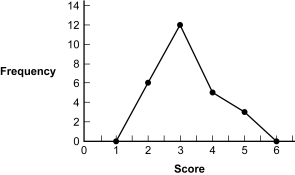 -(Figure: Frequency Polygon) What seems to be the shape of the distribution represented in this frequency polygon?
(Multiple Choice)
4.9/5 (34)
A benefit to using the stem-and-leaf plot is that it easily identifies _____ and allows for quick comparisons between _____.
(Multiple Choice)
4.9/5 (37)
If 2 out of 3 dentists recommend a certain kind of gum, what percentage of dentists recommend that gum, rounded to the nearest whole number?
(Multiple Choice)
4.7/5 (38)
Raw scores are data that have not been modified from their original form.
(True/False)
4.7/5 (38)
Use the following to answer questions
This table and figure depict the average SAT scores for entering freshmen in the year 1995 at 36 North Carolina colleges.
Table: North Carolina SAT 825 922 870 1121 990 1230 1302 926 1054 845 826 956 840 923 818 867 600 1030 831 935 890 879 1005 842 780 757 1002 774 915 921 1071 921 915 848 915 813
Figure: Histogram of SAT 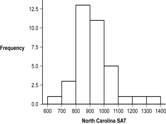 -(Figure: Histogram of SAT) Based on the frequency distribution, approximately how many participants scored 1000 or above?
(Multiple Choice)
4.8/5 (39)
Use the following to answer questions
This table and figure depict the average SAT scores for entering freshmen in the year 1995 at 36 North Carolina colleges.
Table: North Carolina SAT 825 922 870 1121 990 1230 1302 926 1054 845 826 956 840 923 818 867 600 1030 831 935 890 879 1005 842 780 757 1002 774 915 921 1071 921 915 848 915 813
Figure: Histogram of SAT
-(Figure: Histogram of SAT) Based on the frequency distribution, what was the interval with the most common score?
(Multiple Choice)
4.8/5 (40)
Dr.Choi is examining the weights of 750 children, 2 to 18 years old, to find out if childhood obesity rates are increasing in his city.With this type of data, is it better to use a frequency table or a grouped frequency table? Why?
(Multiple Choice)
4.9/5 (34)
A _____ is a line graph with the x-axis and y-axis representing values (or midpoints of intervals) and frequencies, respectively.
(Multiple Choice)
4.7/5 (28)
A _____ is a data point that has not yet been transformed or analyzed.
(Multiple Choice)
4.7/5 (29)
In a _____, the tail of the distribution extends to the left.
(Multiple Choice)
4.8/5 (30)
A positive skew may have a tail that indicates extreme scores _____ the center of the distribution.
(Multiple Choice)
4.7/5 (36)
Use the following to answer question
This histogram represents the frequency of graduation rates for all U.S.colleges (data collected by U.S.News & World Report, 1995).
Figure: Graduation Rates 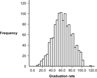 -(Figure: Graduation Rates) The shape of the distribution of graduation rates appears to be:
(Multiple Choice)
4.9/5 (39)
Filters
- Essay(0)
- Multiple Choice(0)
- Short Answer(0)
- True False(0)
- Matching(0)