Exam 2: Organizing and Visualizing
Exam 1: Defining and Collecting Data200 Questions
Exam 2: Organizing and Visualizing189 Questions
Exam 3: Numerical Descriptive Measures80 Questions
Exam 4: Basic Probability108 Questions
Exam 5: Discrete Probability Distributions81 Questions
Exam 6: Conthe Tinuonormausl Disdis Tributionstribution and Other38 Questions
Exam 7: Sampling Distributions62 Questions
Exam 8: Confidence Interval Estimation139 Questions
Exam 9: Fundamentals of Hypothesis Testing: One-Sample Tests133 Questions
Exam 10: Two-Sample Tests95 Questions
Exam 11: Analysis of Variance73 Questions
Exam 12: Chi-Square and Nonparametric100 Questions
Exam 13: Simple Linear Regression89 Questions
Exam 14: Introduction to Multiple113 Questions
Exam 15: Multiple Regression62 Questions
Exam 16: Time-Series Forecasting61 Questions
Exam 17: Business Analytics102 Questions
Exam 18: A Roadmap for Analyzing Data133 Questions
Exam 19: Statistical Applications in Quality Management86 Questions
Exam 20: Decision Making121 Questions
Select questions type
A survey of 150 executives were asked what they think is the most common mistake
Candidates make during job interviews.Six different mistakes were given.Which of the
Following is the best for presenting the information?
(Multiple Choice)
4.9/5  (40)
(40)
True or False: Given below is the scatter plot of the price/earnings ratio versus earnings per
share of 20 U.S.companies.There appears to be a negative relationship between price/earnings
ratio and earnings per share. 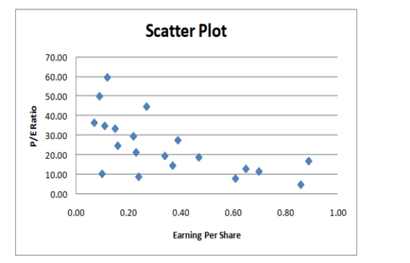
(True/False)
4.7/5 (35)
You have collected data on the monthly seasonally adjusted civilian unemployment rate for the
United States over a 10-year period.Which of the following is the best for presenting the data?
(Multiple Choice)
4.9/5 (36)
The point halfway between the boundaries of each class interval in a grouped frequency
distribution is called the _______.
(Essay)
4.9/5 (30)
It is essential that each class grouping or interval in a frequency distribution be ________ and
________.
(Essay)
4.8/5 (34)
True or False: A research analyst was directed to arrange raw data collected on the yield of
wheat, ranging from 40 to 93 bushels per acre, in a frequency distribution.He should choose 30
as the class interval width.
(True/False)
4.9/5 (34)
SCENARIO 2-18
The stem-and-leaf display below shows the result of a survey on 50 students on their satisfaction
with their school with the higher scores represent higher level of satisfaction. 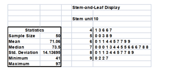 -Referring to Scenario 2-18, what was the highest level of satisfaction?
(Essay)
4.9/5 (39)
True or False: Determining the class boundaries of a frequency distribution is highly
subjective.
(True/False)
4.8/5 (42)
SCENARIO 2-13
Given below is the stem-and-leaf display representing the amount of detergent used in gallons (with
leaves in 10ths of gallons)in a day by 25 drive-through car wash operations in Phoenix. 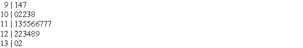 2-36 Organizing and Visualizing Variables
-Referring to Scenario 2-13, construct a percentage polygon for the detergent data if the
corresponding frequency distribution uses "9.0 but less than 10.0" as the first class.
2-36 Organizing and Visualizing Variables
-Referring to Scenario 2-13, construct a percentage polygon for the detergent data if the
corresponding frequency distribution uses "9.0 but less than 10.0" as the first class.
(Essay)
4.8/5 (40)
Referring to Scenario 2-11, construct a histogram for the defects data, using "0 but less than 5" as
the first class.
(Essay)
4.7/5 (28)
SCENARIO 2-6
A sample of 200 students at a Big-Ten university was taken after the midterm to ask them whether
they went bar hopping the weekend before the midterm or spent the weekend studying, and whether
they did well or poorly on the midterm.The following table contains the result. 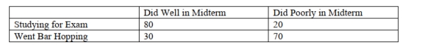 -Referring to Scenario 2-6, _______ percent of the students in the sample spent the weekend
Studying and did well on the midterm.
-Referring to Scenario 2-6, _______ percent of the students in the sample spent the weekend
Studying and did well on the midterm.
(Multiple Choice)
4.7/5 (34)
SCENARIO 2-18
The stem-and-leaf display below shows the result of a survey on 50 students on their satisfaction
with their school with the higher scores represent higher level of satisfaction.
-True or False: Referring to Scenario 2-18, the level of satisfaction is concentrated around 75.
(True/False)
4.8/5 (32)
True or False: Given below is the scatter plot of the price/earnings ratio versus earnings per
share of 20 U.S.companies.There appear to be a positive relationship between price/earnings
ratio and earnings per share. 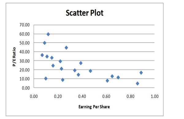
(True/False)
4.7/5 (37)
SCENARIO 2-5
The following are the duration in minutes of a sample of long-distance phone calls made within the
continental United States reported by one long-distance carrier. 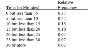 -Referring to Scenario 2-5, if 1,000 calls were randomly sampled, how many calls lasted under 10
Minutes?
-Referring to Scenario 2-5, if 1,000 calls were randomly sampled, how many calls lasted under 10
Minutes?
(Multiple Choice)
4.8/5 (25)
SCENARIO 2-11
The ordered array below resulted from selecting a sample of 25 batches of 500 computer chips and
determining how many in each batch were defective.  -Referring to Scenario 2-11, if a frequency distribution for the defects data is constructed, using
"0 but less than 5" as the first class, the frequency of the "20 but less than 25" class would be
________.
-Referring to Scenario 2-11, if a frequency distribution for the defects data is constructed, using
"0 but less than 5" as the first class, the frequency of the "20 but less than 25" class would be
________.
(Essay)
4.9/5 (32)
SCENARIO 2-7 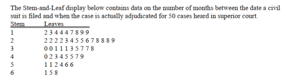 -Referring to Scenario 2-7, the civil suit with the longest wait between when the suit was filed and
when it was adjudicated had a wait of ________ months.
-Referring to Scenario 2-7, the civil suit with the longest wait between when the suit was filed and
when it was adjudicated had a wait of ________ months.
(Essay)
5.0/5 (32)
Referring to Scenario 2-11, construct a cumulative percentage polygon for the defects data if the
corresponding frequency distribution uses "0 but less than 5" as the first class.
(Essay)
4.7/5 (36)
SCENARIO 2-8
The Stem-and-Leaf display represents the number of times in a year that a random sample of 100
"lifetime" members of a health club actually visited the facility. 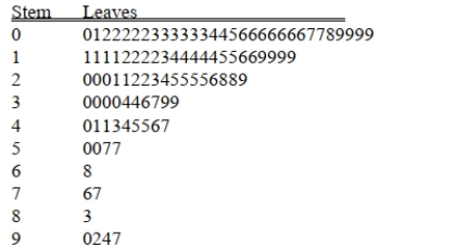 -Referring to Scenario 2-8, if a frequency distribution with equal sized classes was made from this
data, and the first class was "0 but less than 10," the class midpoint of the third class would be
________.
-Referring to Scenario 2-8, if a frequency distribution with equal sized classes was made from this
data, and the first class was "0 but less than 10," the class midpoint of the third class would be
________.
(Essay)
4.8/5 (29)
SCENARIO 2-8
The Stem-and-Leaf display represents the number of times in a year that a random sample of 100
"lifetime" members of a health club actually visited the facility.
-Referring to Scenario 2-8, the person who visited the health club less than anyone else in the
sample visited the facility ________ times.
(Essay)
4.9/5 (35)
A type of vertical bar chart in which the categories are plotted in the descending rank order of the
Magnitude of their frequencies is called a
(Multiple Choice)
4.9/5 (36)
Filters
- Essay(0)
- Multiple Choice(0)
- Short Answer(0)
- True False(0)
- Matching(0)