Exam 2: Exploring Data With Tables and Graphs
Exam 1: Introduction to Statistics60 Questions
Exam 2: Exploring Data With Tables and Graphs60 Questions
Exam 3: Describing, Exploring, and Comparing Data60 Questions
Exam 4: Probability60 Questions
Exam 5: Discrete Probability Distributions59 Questions
Exam 6: Normal Probability Distributions58 Questions
Exam 7: Estimating Parameters and Determining Sample Sizes60 Questions
Exam 8: Hypothesis Testing60 Questions
Exam 9: Inferences From Two Samples60 Questions
Exam 10: Correlation and Regression60 Questions
Exam 11: Chi-Square and Analysis of Variance60 Questions
Exam 12: Control Charts and Process Monitoring178 Questions
Select questions type
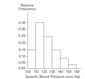
A nurse measured the blood pressure of each person who visited her clinic. Following is a relative-frequency histogram for the systolic blood pressure readings for those people
Aged between 25 and 40 years. The blood pressure readings were given to the nearest
Whole number. Approximately what percentage of the people aged 25 -40 had a systolic
Blood pressure reading between 110 and 139 mm Hg inclusive? Systolic Blood Pressure for People Aged 25-40 Years
Free
(Multiple Choice)
4.8/5  (35)
(35)
Correct Answer: Verified
D
The frequency distribution below summarizes the home sale prices in the city of Summerhill for the month of June. Determine the width of each class. Sale Price (in thousand S) Frequency 80.0-110.9 2 111.0-141.9 5 142.0-172.9 7 173.0-203.9 10 204.0-234.9 3 235.0-265.9 1
Free
(Multiple Choice)
4.9/5 (37)
Correct Answer:Verified
B
A bar chart and a Pareto chart both use bars to show frequencies of categories of categorical
data. What characteristic distinguishes a Pareto chart from a bar chart and how does that
characteristic help us in understanding the data?
Free
(Essay)
4.7/5 (35)
Correct Answer:Verified
In a Pareto chart, the bars are arranged in descending order according to frequencies. The Pareto chart helps us
understand data by drawing attention to the categories which have the highest frequencies.
The frequency distribution below summarizes the home sale prices in the city of Summerhill for the month of June. Determine the class midpoint (in thousand $)for the Class 235.0 -265.9. Sale Price (in thousand S) Frequency 80.0-110.9 2 111.0-141.9 5 142.0-172.9 7 173.0-203.9 10 204.0-234.9 3 235.0-265.9 1
(Multiple Choice)
4.8/5 (36)
Describe the differences between a histogram and a stemplot and discuss the advantages and
disadvantages of each.
(Essay)
4.8/5 (29)
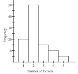
The histogram below represents the number of television sets per household for a sample of U.S. households. What is the sample size?
Number of TV Sets Per U.S. Household
(Multiple Choice)
4.8/5 (34)
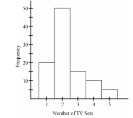
The histogram below represents the number of television sets per household for a sample of U.S. households. What is the sample size?
(Multiple Choice)
4.9/5 (33)
The following data represent the number of cars passing through a toll booth during a certain time period over a number of days. 38 39 37 37 44 38 41 38 39 35 42 39 43 37 41
Which of these choices display the correct dotplot?
(Multiple Choice)
4.9/5 (32)
The scatterplot below displays the amount of nitrous oxide (NO)explained by the amount of carbon monoxide (CO)emissions in million metric tons over a ten year period in the United
States. Select the choice that best describes any relationship between the variables. 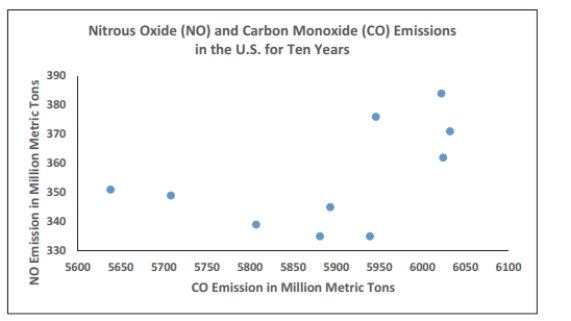
(Multiple Choice)
5.0/5 (33)
The weights (in pounds)of 22 members of the junior varsity football team are listed below. 144 152 142 151 160 152 131 164 141 153 140
144 175 156 147 133 172 159 135 159 148 171
Which of these choices display the correct stemplot?
(Multiple Choice)
4.9/5 (28)
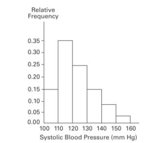
A nurse measured the blood pressure of each person who visited her clinic. Following is a relative-frequency histogram for the systolic blood pressure readings for those people
Aged between 25 and 40 years. The blood pressure readings were given to the nearest
Whole number. Approximately what percentage of the people aged 25 -40 had a systolic
Blood pressure reading between 110 and 119 mm Hg inclusive? Systolic Blood Pressure for People Aged 25 - 40 Years
(Multiple Choice)
4.8/5 (36)
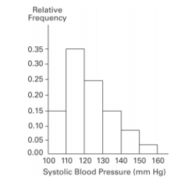
A nurse measured the blood pressure of each person who visited her clinic. Following is a relative-frequency histogram for the systolic blood pressure readings for those people
Aged between 25 and 40 years. The blood pressure readings were given to the nearest
Whole number. Approximately what percentage of the people aged 25 -40 had a systolic
Blood pressure reading between 110 and 139 mm Hg inclusive?
Systolic Blood Pressure for People Aged 25 - 40 Years 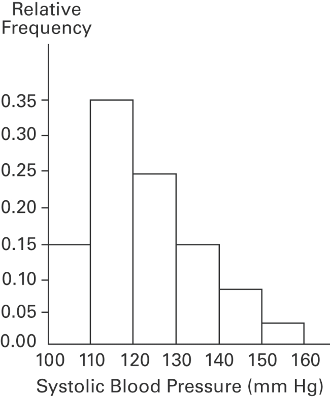
(Multiple Choice)
4.9/5 (39)
Which explained by the amount of carbon monoxide (CO)emissions in million metric tons over a
Ten year period in the United States? The data set is below: CO 5638 5708 5893 5807 5881 5939 6024 6032 5946 6022 NO 351 349 345 339 335 335 362 371 376 384
(Multiple Choice)
4.9/5 (37)
The following data show the number of laps run by each participant in a marathon. 46 65 55 43 51 48 57 30 43 49 32 56
Which of these choices display the correct stemplot?
(Multiple Choice)
4.9/5 (32)
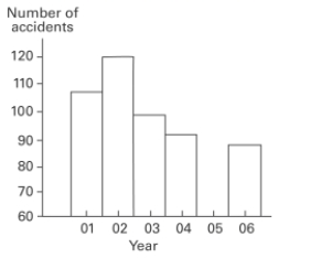
The graph below shows the number of car accidents occurring in one city in each of the
years 2011 through 2016. The number of accidents dropped in 2013 after a new speed limit
was imposed. Does the graph distort the data? How would you redesign the graph to be less
misleading? Number of Car Accidents for 2011 - 2016
(Essay)
4.9/5 (43)
A nurse measured the blood pressure of each person who visited her clinic. Following is a relative-frequency histogram for the systolic blood pressure readings for those people
Aged between 25 and 40 years. The blood pressure readings were given to the nearest
Whole number. Approximately what percentage of the people aged 25 -40 had a systolic
Blood pressure reading between 110 and 119 mm Hg inclusive? Systolic Blood Pressure for People Aged 25 - 40 Years
(Multiple Choice)
4.9/5 (50)
The linear __________ coefficient denoted by r measures the __________ of the linear association between two variables.
(Multiple Choice)
4.9/5 (35)
Describe how a data point labeled as an outlier can affect the analysis of a data set in a
frequency distribution or histogram.
(Essay)
4.7/5 (32)
In a survey, 20 people were asked how many magazines they had purchased during the
previous year. The results are shown below. Construct a histogram to represent the data.
Use 4 classes with a class width of 10, and begin with a lower class limit of -0.5. What is the
approximate amount at the center? 6 15 3 36 25 18 12 18 5 30 24 7 0 22 33 24 19 4 12 9
(Essay)
4.9/5 (38)
The following data set represents Heather's average monthly charges (in $)for cable TV for the
past 24 months. 105 125 110 98 102 115 110 123 118 101 95 128 110 105 122 107 118 107 117 125 116 110 101 107
Construct a frequency distribution with 4 classes, a class width of 2 hours, and a lower limit of 100 for class
(Essay)
4.7/5 (27)
Filters
- Essay(0)
- Multiple Choice(0)
- Short Answer(0)
- True False(0)
- Matching(0)