Exam 2: Graphs, Charts and Tablesdescribing Your Data
Exam 1: The Where, Why, and How of Data Collection167 Questions
Exam 2: Graphs, Charts and Tablesdescribing Your Data138 Questions
Exam 3: Describing Data Using Numerical Measures138 Questions
Exam 4: Introduction to Probability125 Questions
Exam 5: Discrete Probability Distributions161 Questions
Exam 6: Introduction to Continuous Probability Distributions122 Questions
Exam 7: Introduction to Sampling Distributions136 Questions
Exam 8: Estimating Single Population Parameters174 Questions
Exam 9: Introduction to Hypothesis Testing183 Questions
Exam 10: Estimation and Hypothesis Testing for Two Population Parameters121 Questions
Exam 11: Hypothesis Tests and Estimation for Population Variances69 Questions
Exam 12: Analysis of Variance162 Questions
Exam 13: Goodness-Of-Fit Tests and Contingency Analysis105 Questions
Exam 14: Introduction to Linear Regression and Correlation Analysis139 Questions
Exam 15: Multiple Regression Analysis and Model Building148 Questions
Exam 16: Analyzing and Forecasting Time-Series Data131 Questions
Exam 17: Introduction to Nonparametric Statistics103 Questions
Exam 18: Introducing Business Analytics48 Questions
Exam 19: Introduction to Decision Analysis48 Questions
Exam 20: Introduction to Quality and Statistical Process Control42 Questions
Select questions type
A histogram can be created for discrete or continuous data.
Free
(True/False)
4.7/5  (31)
(31)
Correct Answer: Verified
True
The Maple Grove Hotel manager has collected data on the number of rooms occupied each evening for the past 700 nights. The fewest rooms occupied during that period was 11 and the most was the capacity, 430. Based on this information, which of the following would be reasonable class limits for the first class if the manager wishes to use 8 classes to develop a frequency distribution?
Free
(Multiple Choice)
4.9/5 (34)
Correct Answer:Verified
B
A histogram is an effective tool for graphically describing a joint frequency distribution.
Free
(True/False)
4.9/5 (33)
Correct Answer:Verified
False
A study was recently conducted by the regional electric and gas company. Data were collected for three customer categories showing the dollar amount of natural gas and the dollar amount of electricity consumed during the year. Which of the following graphs would most likely be used to display both sets of data together?
(Multiple Choice)
4.9/5 (33)
The managers at Harris Pizza in Boston have tracked the tips received by their drivers along with the total bill to the customer. An appropriate graph for analyzing the relationship between these two variables is:
(Multiple Choice)
4.7/5 (29)
A study was recently conducted in which makers of toothpaste tracked sales for the month at different stores in a market area. The variable of interest was the number of units sold. The numbers ranged from 1,200 to 22,700. In this case, the stems in a stem and leaf diagram might be values such as 1 and 22 while the leaves would be 200 and 700.
(True/False)
4.8/5 (34)
After developing a frequency distribution for a quantitative variable, a histogram can be developed with the horizontal axis representing the values of the variable and the vertical axis representing the frequency of occurrence in each class or group.
(True/False)
4.9/5 (35)
In constructing a stem and leaf diagram, the stem and leaves are defined using a similar method to the definition of the bins of a histogram.
(True/False)
4.8/5 (35)
Another name for a joint frequency distribution is a cross-tabulation table.
(True/False)
4.8/5 (32)
When choosing class boundaries for a frequency distribution, classes such as 60-70, 70-80, 80-90 would be acceptable.
(True/False)
4.9/5 (29)
Recently a survey was conducted in which customers of a large insurance company were asked to indicate the number of speeding tickets they had received in the past three years. The data in this case would most likely be analyzed using a frequency distribution with the data grouped into classes such as 0-2, 3-5, 6-8, etc.
(True/False)
4.8/5 (36)
A stem and leaf diagram is more appropriate for graphically displaying a joint frequency distribution than is a histogram since the stems can be used to display one variable while the leaves can be used to display the second variable.
(True/False)
4.8/5 (28)
Consider the following chart. Which of the following statements is most correct? 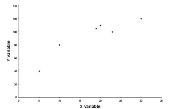
(Multiple Choice)
4.8/5 (30)
If two variables show a positive linear relationship in a scatter diagram:
(Multiple Choice)
4.9/5 (25)
When using the Histogram tool in Excel to construct a frequency distribution and histogram, if the first bin value is 10 and the second bin value is 20, the frequency count for the second class will include all values from 10 up to, but not including, 20.
(True/False)
4.8/5 (34)
Discuss the steps that you would use to manually construct a histogram for the salaries of the 1,124 employees in the Ferris Steel Company.
(Essay)
4.9/5 (29)
The sales manager at Western Furniture Company tracked data on the number of customers who came into the store each day and the total dollar volume of sales at the store during the same day. She is considering putting together a report for top management and wishes to show the relationship between these two variables. Which of the following graphs would likely be most useful? She has a sample of 36 days worth of data.
(Multiple Choice)
4.8/5 (34)
The J.B. Hanson Company is interested in analyzing the relationship between end-of-the-week inventory levels and sales for the same week. The graph that most likely would be used to show this relationship is a histogram.
(True/False)
4.9/5 (28)
Explain why it is appropriate to connect the points on a line graph, but the points on a scatter plot should not be connected.
(Essay)
4.7/5 (34)
Filters
- Essay(0)
- Multiple Choice(0)
- Short Answer(0)
- True False(0)
- Matching(0)