Exam 2: Graphs, Charts and Tablesdescribing Your Data
Exam 1: The Where, Why, and How of Data Collection167 Questions
Exam 2: Graphs, Charts and Tablesdescribing Your Data138 Questions
Exam 3: Describing Data Using Numerical Measures138 Questions
Exam 4: Introduction to Probability125 Questions
Exam 5: Discrete Probability Distributions161 Questions
Exam 6: Introduction to Continuous Probability Distributions122 Questions
Exam 7: Introduction to Sampling Distributions136 Questions
Exam 8: Estimating Single Population Parameters174 Questions
Exam 9: Introduction to Hypothesis Testing183 Questions
Exam 10: Estimation and Hypothesis Testing for Two Population Parameters121 Questions
Exam 11: Hypothesis Tests and Estimation for Population Variances69 Questions
Exam 12: Analysis of Variance162 Questions
Exam 13: Goodness-Of-Fit Tests and Contingency Analysis105 Questions
Exam 14: Introduction to Linear Regression and Correlation Analysis139 Questions
Exam 15: Multiple Regression Analysis and Model Building148 Questions
Exam 16: Analyzing and Forecasting Time-Series Data131 Questions
Exam 17: Introduction to Nonparametric Statistics103 Questions
Exam 18: Introducing Business Analytics48 Questions
Exam 19: Introduction to Decision Analysis48 Questions
Exam 20: Introduction to Quality and Statistical Process Control42 Questions
Select questions type
Assuming you have data for a variable with 2,000 values, using the 2k ≥ n guideline, what is the least number of groups that should be used in developing a grouped data frequency distribution?
(Multiple Choice)
4.9/5  (38)
(38)
Explain why a relative frequency histogram is sometimes preferable to a regular frequency histogram.
(Essay)
4.8/5 (32)
A scatter diagram is a line graph without the points connected by a line.
(True/False)
4.8/5 (35)
In constructing a histogram for a joint frequency distribution, the histogram will have the most meaning for the decision maker if there are no gaps between the bars on the histogram.
(True/False)
4.8/5 (35)
When a histogram is constructed for discrete numerical data, there should be spaces between the bars of the histogram.
(True/False)
4.7/5 (40)
In a report describing the number of people in the family of each of the 400 employees at a manufacturing company, the frequency count at the value 3 was 220. This means that the relative frequency at the 3 level is .44.
(True/False)
4.8/5 (29)
A professor wants to know if the amount of time her students spent working on a statistics assignment relates to the grade the student receives. She surveyed 10 students and recorded the data below. Which of the following statements is most correct? 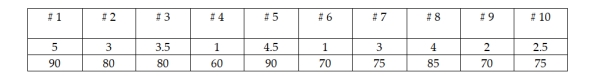
(Multiple Choice)
4.8/5 (39)
In situations involving two or more variables, both histograms and bar charts can be used for multiple variables on the same graph.
(True/False)
5.0/5 (26)
When using the Histogram tool in Excel to construct a frequency distribution and histogram, the bins represent the upper class limits.
(True/False)
4.9/5 (33)
Why should a histogram contain no gaps between the bars but a bar chart may have gaps?
(Essay)
4.9/5 (34)
Roscoe and Associates makes computer software for use in the telecommunications industry. Recently, managers at the company collected data for the year 2001 on three variables: total dollars spent on research and development, total sales dollars, and total employee salaries. To graphically present these three variables, the managers would be justified in using a line chart with all three variables plotted.
(True/False)
4.8/5 (28)
When developing a scatter diagram, it is appropriate to connect the points on the graph with straight lines or the lines can be omitted.
(True/False)
4.8/5 (34)
Which of the following is a key difference between a bar chart and a histogram?
(Multiple Choice)
4.8/5 (34)
A histogram can be constructed for data that are either quantitative or qualitative.
(True/False)
4.8/5 (30)
A frequency histogram should be computed from which type of data?
(Multiple Choice)
4.7/5 (37)
One of the differences between a stem and leaf diagram and a histogram is that even for variables involving a large number of different values, the stem and leaf diagram shows the individual data values whereas the histogram requires you to group the data and lose the individual values.
(True/False)
4.9/5 (29)
Filters
- Essay(0)
- Multiple Choice(0)
- Short Answer(0)
- True False(0)
- Matching(0)