Exam 2: Graphs, Charts and Tablesdescribing Your Data
Exam 1: The Where, Why, and How of Data Collection167 Questions
Exam 2: Graphs, Charts and Tablesdescribing Your Data138 Questions
Exam 3: Describing Data Using Numerical Measures138 Questions
Exam 4: Introduction to Probability125 Questions
Exam 5: Discrete Probability Distributions161 Questions
Exam 6: Introduction to Continuous Probability Distributions122 Questions
Exam 7: Introduction to Sampling Distributions136 Questions
Exam 8: Estimating Single Population Parameters174 Questions
Exam 9: Introduction to Hypothesis Testing183 Questions
Exam 10: Estimation and Hypothesis Testing for Two Population Parameters121 Questions
Exam 11: Hypothesis Tests and Estimation for Population Variances69 Questions
Exam 12: Analysis of Variance162 Questions
Exam 13: Goodness-Of-Fit Tests and Contingency Analysis105 Questions
Exam 14: Introduction to Linear Regression and Correlation Analysis139 Questions
Exam 15: Multiple Regression Analysis and Model Building148 Questions
Exam 16: Analyzing and Forecasting Time-Series Data131 Questions
Exam 17: Introduction to Nonparametric Statistics103 Questions
Exam 18: Introducing Business Analytics48 Questions
Exam 19: Introduction to Decision Analysis48 Questions
Exam 20: Introduction to Quality and Statistical Process Control42 Questions
Select questions type
To show the relationship between amount of rainfall and the number of car accidents, the best type of graph to use is a scatter diagram.
(True/False)
4.8/5  (33)
(33)
The city counsel has just voted to pass the city's budget for next year. If you were writing a report describing the budget so the citizens could understand how the total tax dollars will be spent, which of the following graphs might be most appropriate?
(Multiple Choice)
4.8/5 (36)
A joint frequency distribution is used to describe the number of occurrences where two observations in a data set have the same value.
(True/False)
4.9/5 (29)
Many Walmart stores have automotive departments where customers can buy tires, have their vehicles serviced, and obtain other automotive services. Recently, the manager at an Ohio Walmart collected data on the time customers had to wait to get the desired automotive service. Of the 500 cars in the sample, the shortest time any customer spent waiting was 3 minutes and the longest time was 183 minutes. Assuming that the manager wishes to develop a frequency distribution with 9 classes, which of the following would be an appropriate class width for each class?
(Multiple Choice)
4.8/5 (37)
The difference between bar charts and histograms is that bar charts always show percentage while histograms always show frequency.
(True/False)
4.9/5 (34)
The undergraduate students at your university are classified as freshmen, sophomores, juniors, or seniors. A recent study of undergraduates asked the students to indicate the number of credits they were registered for this term. The responses were 3, 6, 9, 12, 15, and 18. The number of cells in a joint frequency distribution for the two variables, class standing, and credit hours is:
(Multiple Choice)
4.9/5 (37)
There is no hard-and-fast rule regarding the number of classes that must be used when establishing a frequency distribution for a continuous variable.
(True/False)
4.8/5 (35)
A pie chart is almost always constructed when the variable of interest is qualitative.
(True/False)
5.0/5 (27)
A cumulative frequency distribution shows the percentage of observations for the variable of interest with values less than or equal to the upper limit of each class.
(True/False)
4.8/5 (35)
Consider the following chart. Which of the following statements is most correct? 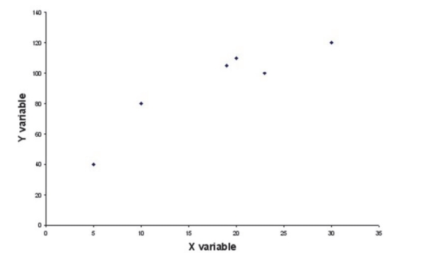
(Multiple Choice)
4.8/5 (29)
A common rule of thumb for determining how many classes to use when developing a frequency distribution with classes is:
(Multiple Choice)
4.7/5 (26)
Suppose you are given the following data. 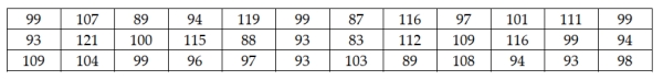 If you wish to have a histogram with five classes, what should the first class limits be?
(Essay)
4.9/5 (39)
Which of the following is an acceptable format for setting up class boundaries for a frequency distribution?
(Multiple Choice)
4.7/5 (27)
If the Viking Sales Company plans to display the sales for each of its six major products for the year 2001, an effective chart to do this would be a histogram.
(True/False)
4.8/5 (35)
Recently a survey was conducted in which customers of a large insurance company were asked to indicate the number of speeding tickets they had received in the past three years. The minimum value in the data was zero and the largest was six tickets. If you wished to illustrate the proportion of people who had three or fewer tickets, you would most likely construct a cumulative relative frequency distribution.
(True/False)
4.8/5 (23)
In forming the classes for a frequency distribution and histogram, suppose there were a number of empty classes. You should:
(Multiple Choice)
4.8/5 (44)
One way to develop a frequency distribution using Excel is to use the Frequency function.
(True/False)
4.9/5 (32)
If a manager is interested in analyzing the relationship between the age of customers and the dollar volume of business that is done in the store, a relative frequency distribution would be most appropriate.
(True/False)
4.8/5 (29)
To show how the price of a stock has changed over the last 3 months, the best type of chart to use is:
(Multiple Choice)
4.8/5 (28)
Filters
- Essay(0)
- Multiple Choice(0)
- Short Answer(0)
- True False(0)
- Matching(0)