Exam 10: Managing Data and Using Graphics
Exam 1: Establishing a Framework for Business Communication75 Questions
Exam 2: Focusing on Interpersonal and Group Communication67 Questions
Exam 3: Planning Spoken and Written Messages76 Questions
Exam 4: Preparing Spoken and Written Messages74 Questions
Exam 5: Communicating Electronically70 Questions
Exam 6: Delivering Good and Neutral News Messages73 Questions
Exam 7: Delivering Bad-News Messages66 Questions
Exam 8: Delivering Persuasive Messages78 Questions
Exam 9: Understanding the Report Process and Research Methods76 Questions
Exam 10: Managing Data and Using Graphics64 Questions
Exam 11: Organizing and Preparing Reports and Proposals61 Questions
Exam 12: Designing and Delivering Business Presentations79 Questions
Exam 13: Preparing Résumés and Application Letters65 Questions
Exam 14: Interviewing for a Job and Preparing Employment Messages61 Questions
Exam 15: Document Format and Layout Guide54 Questions
Exam 16: Referencing Styles20 Questions
Exam 17: Language Review and Exercises49 Questions
Exam 18: Extension Course Posttest100 Questions
Exam 19: Extension Course Pretest100 Questions
Select questions type
A line chart is an effective graphic for comparing housing prices in a particular state or region with housing prices in the United States over a five-year period.
(True/False)
4.7/5  (27)
(27)
Which of the following sentences best introduces a graph in a written report?
(Multiple Choice)
4.8/5 (36)
What is meant by "common language?" How does common language help professionals manage quantities of data efficiently?
(Essay)
4.8/5 (37)
A graphic that will not fit on the page where it is introduced should be placed in an appendix.
(True/False)
4.8/5 (34)
A company that wants to chart employee absences over a two-year period should use which of the following?
(Multiple Choice)
4.9/5 (30)
Which of the following is FALSE concerning the use of pictograms?
(Multiple Choice)
4.8/5 (41)
What questions should you ask yourself to help determine whether using a graphic presentation is appropriate and effective your written or oral report.
(Essay)
5.0/5 (36)
For Kayla to avoid a visual distortion in the bar chart she is creating to show her company's sales by region,she should design the quantitative axis to begin at zero,and make each bar the same width.
(True/False)
4.9/5 (37)
The statement that "you can prove anything with statistics" suggests that statistics can be used incorrectly.Discuss some ways statistics can be gathered or used incorrectly.
(Essay)
4.9/5 (32)
Graphics in reports generally do not need titles because their content is obvious.
(True/False)
4.8/5 (28)
Thomas is writing a report which contains a column (vertical)bar chart that shows last year's employee enrollment in three management training programs: conflict resolution,time management,and team building.Which of the following statements best interprets and analyzes the graph?
(Multiple Choice)
5.0/5 (31)
Interpreting Quantitative Data
Your company has surveyed employees to determine their interest in learning about financial planning.Based on the responses,the company will develop training for employees who are interested.The table shows the total employee responses,using the raw data and percentages.The results of this survey will be reported to the director of Human Resources and used to develop a financial planning training seminar for employees.
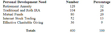 Required:
Write an analysis of this data that explains the results of the survey.This analysis will appear in the written report to the director of Human Resources.
Required:
Write an analysis of this data that explains the results of the survey.This analysis will appear in the written report to the director of Human Resources.
(Essay)
4.9/5 (34)
Which of the following statements about statistics is FALSE?
(Multiple Choice)
4.8/5 (33)
Which of the following is correct concerning the design of pie charts?
(Multiple Choice)
4.8/5 (36)
A pie chart is the best type of graphic aid to use to summarize the results of a survey question to which each respondent could check more than one answer.
(True/False)
4.9/5 (43)
List at least four questions the researcher should ask when considering the ethical implications of a graphic developed to illustrate text.
(Essay)
4.9/5 (34)
Graphics should clarify,simplify,or reinforce the text discussion.
(True/False)
4.8/5 (29)
The extreme use of color,complicated symbols and art techniques,and unusual combinations of typefaces,should be avoided because they can distract and bury relevant data.
(True/False)
4.7/5 (39)
Which of the following guidelines does NOT apply to a bar chart?
(Multiple Choice)
4.8/5 (30)
Data that can be presented in a pie chart may also be presented in a bar chart,but the reverse is not always true.
(True/False)
4.9/5 (38)
Filters
- Essay(0)
- Multiple Choice(0)
- Short Answer(0)
- True False(0)
- Matching(0)