Exam 2: Graphs,charts and Tablesdescribing Your Data
Exam 1: The Where, why, and How of Data Collection167 Questions
Exam 2: Graphs,charts and Tablesdescribing Your Data138 Questions
Exam 3: Describing Data Using Numerical Measures130 Questions
Exam 4: Using Probability and Probability Distributions77 Questions
Exam 5: Discrete Probability Distributions119 Questions
Exam 6: Introduction to Continuous Probability Distributions90 Questions
Exam 7: Introduction to Sampling Distributions104 Questions
Exam 8: Estimating Single Population Parameters145 Questions
Exam 9: Introduction to Hypothesis Testing129 Questions
Exam 10: Estimation and Hypothesis Testing for Two Population Parameters97 Questions
Exam 11: Hypothesis Tests and Estimation for Population Variances71 Questions
Exam 12: Analysis of Variance137 Questions
Exam 13: Goodness-Of-Fit Tests and Contingency Analysis104 Questions
Exam 14: Introduction to Linear Regression and Correlation Analysis136 Questions
Exam 15: Multiple Regression Analysis and Model Building153 Questions
Exam 16: Analyzing and Forecasting Time-Series Data133 Questions
Exam 17: Introduction to Nonparametric Statistics104 Questions
Exam 18: Introduction to Quality and Statistical Process Control110 Questions
Exam 19: Introduction to Decision Analysis116 Questions
Select questions type
If a manager is interested in analyzing the relationship between the age of customers and the dollar volume of business that is done in the store,a relative frequency distribution would be most appropriate.
(True/False)
4.9/5  (38)
(38)
A homeowners association consists of 20 homes.The family in each home is considered an automatic member of the association.Recently,one of the homes fell into a state of disrepair.A survey was conducted of the homeowners both on the same street as the house in question and on the second street.At issue was whether legal action should be brought against the homeowner with the problem house.There are 8 homes on the same street as the problem house and 6 of these called for legal action.The percentage of houses on the second street that favored legal action is 50 percent.Which type of chart might be most effective for conveying the information about percentage of residents favoring legal action by street?
(Multiple Choice)
4.7/5 (28)
A cumulative frequency distribution shows the percentage of observations for the variable of interest with values less than or equal to the upper limit of each class.
(True/False)
4.8/5 (42)
When developing a scatter diagram,it is appropriate to connect the points on the graph with straight lines or the lines can be omitted.
(True/False)
4.7/5 (44)
In Excel a joint frequency distribution table can be created using a tool called PivotTable.
(True/False)
4.7/5 (34)
A joint frequency distribution is used to describe the number of occurrences where two observations in a data set have the same value.
(True/False)
4.9/5 (40)
When developing a bar chart,it is usually preferable to organize the bars in order from high to low.
(True/False)
4.9/5 (33)
The Fitness Center manager has collected data on the number of visits to the club each week for the past 8 weeks.These data are shown as follows.Which of the following statements is most correct? 
(Multiple Choice)
5.0/5 (42)
If a scatter diagram shows points that are reasonably aligned and are sloping downward from left to right,this implies that there is a negative linear relationship between the two variables.
(True/False)
4.9/5 (35)
A stem and leaf diagram is more appropriate for graphically displaying a joint frequency distribution than is a histogram since the stems can be used to display one variable while the leaves can be used to display the second variable.
(True/False)
4.9/5 (26)
One of the advantages that a stem and leaf diagram has over a histogram is:
(Multiple Choice)
4.9/5 (41)
One of the differences between a stem and leaf diagram and a histogram is that even for variables involving a large number of different values,the stem and leaf diagram shows the individual data values whereas the histogram requires you to group the data and lose the individual values.
(True/False)
4.8/5 (36)
Consider the following chart.Which of the following statements is most correct? 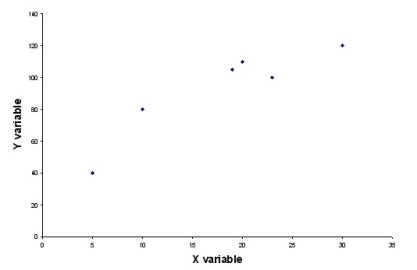
(Multiple Choice)
4.8/5 (35)
There is no difference between cumulative frequency and relative frequency.
(True/False)
5.0/5 (33)
In a report describing the number of people in the family of each of the 400 employees at a manufacturing company,the frequency count at the value 3 was 220.This means that the relative frequency at the 3 level is .44.
(True/False)
5.0/5 (45)
In creating a frequency distribution for numerical data,describe the steps in choosing the classes.
(Essay)
4.9/5 (37)
A university recently collected data for a sample of 200 business majors.One variable collected was the number of credits left to be taken before graduation.This variable could effectively be displayed using a line chart.
(True/False)
4.8/5 (36)
The managers at Harris Pizza in Boston have tracked the tips received by their drivers along with the total bill to the customer.An appropriate graph for analyzing the relationship between these two variables is:
(Multiple Choice)
4.8/5 (46)
One way to develop a frequency distribution using Excel is to use the Frequency function.
(True/False)
5.0/5 (39)
Filters
- Essay(0)
- Multiple Choice(0)
- Short Answer(0)
- True False(0)
- Matching(0)