Exam 17: The Short-Run Tradeoff Between Inflation and Unemployment
Exam 1: Ten Principles of Economics439 Questions
Exam 2: Thinking Like an Economist615 Questions
Exam 3: Interdependence and the Gains From Trade527 Questions
Exam 4: The Market Forces of Supply and Demand697 Questions
Exam 5: Measuring a Nations Income518 Questions
Exam 6: Measuring the Cost of Living543 Questions
Exam 7: Production and Growth507 Questions
Exam 8: Saving, Investment, and the Financial System565 Questions
Exam 9: The Basic Tools of Finance510 Questions
Exam 10: Unemployment and Its Natural Rate698 Questions
Exam 11: The Monetary System517 Questions
Exam 12: Money Growth and Inflation484 Questions
Exam 13: Open-Economy Macroeconomics: Basic Concepts520 Questions
Exam 14: A Macroeconomic Theory of the Open Economy478 Questions
Exam 15: Aggregate Demand and Aggregate Supply563 Questions
Exam 16: The Influence of Monetary and Fiscal Policy on Aggregate Demand510 Questions
Exam 17: The Short-Run Tradeoff Between Inflation and Unemployment516 Questions
Exam 18: Six Debates Over Macroeconomic Policy372 Questions
Select questions type
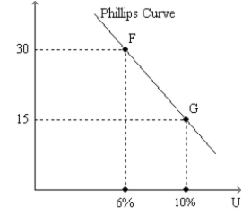
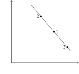
Which of the following is vertical?
Free
(Multiple Choice)
5.0/5  (39)
(39)
Correct Answer: Verified
A
Suppose the Federal Reserve pursues contractionary monetary policy. In the long run
Free
(Multiple Choice)
4.7/5 (29)
Correct Answer:Verified
D
Suppose the price level is 115.00 at the end of 2020, 112.02 at the end of 2021, and 109.08 at the end of 2022. Can we accurately describe the period 2021-2022 as a period of disinflation?
Free
(Essay)
4.7/5 (30)
Correct Answer:Verified
No. Since the price level is falling over the period, it is accurate to characterize the period as one of deflation, rather than disinflation.
Figure 35-1. The left-hand graph shows a short-run aggregate-supply SRAS) curve and two aggregate-demand AD curves. On the right-hand diagram, U represents the unemployment rate.
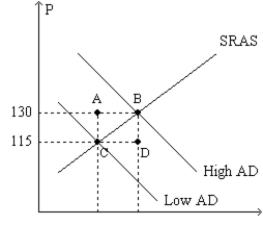 -Refer to Figure 35-1. Assuming the price level in the previous year was 100, point G on the right-hand graph corresponds to
(Multiple Choice)
4.9/5 (47)
By raising aggregate demand more than anticipated, policymakers
(Multiple Choice)
4.9/5 (43)
An event that directly affects firms' costs of production and thus the prices they charge is called
(Multiple Choice)
4.9/5 (33)
An adverse supply shock shifts the short-run Phillips curve to the left.
(True/False)
4.8/5 (37)
If people correctly anticipate that inflation will fall by 1%, then
(Multiple Choice)
4.8/5 (41)
Typical estimates of the sacrifice ratio suggest that about 10 percent of annual output has to be given up in order to reduce the inflation rate from
(Multiple Choice)
4.8/5 (38)
Figure 35-1. The left-hand graph shows a short-run aggregate-supply SRAS) curve and two aggregate-demand AD curves. On the right-hand diagram, U represents the unemployment rate.
-Refer to Figure 35-1. What is measured along the vertical axis of the right-hand graph?
(Multiple Choice)
4.8/5 (29)
Figure 35-3. The left-hand graph shows a short-run aggregate-supply SRAS) curve and two aggregate-demand AD) curves. On the left-hand diagram, Y represents output and on the right-hand diagram, U represents the unemployment rate. 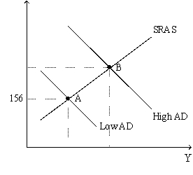
 -Refer to Figure 35-3. Assume the figure charts possible outcomes for the year 2018. In 2018, the economy is at point B on the left-hand graph, which corresponds to point B on the right-hand graph. Also, point A on the left-hand graph corresponds to A on the right-hand graph. The price level in the year 2018 is
(Multiple Choice)
4.9/5 (31)
Figure 35-2
Use the pair of diagrams below to answer the following questions.
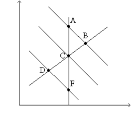 -Refer to Figure 35-2. If the economy starts at C and 1, then in the short run, an increase in taxes moves the economy to
(Multiple Choice)
4.8/5 (36)
If the Federal Reserve increases the rate at which it increases the money supply, then unemployment is lower
(Multiple Choice)
4.8/5 (38)
Which of the following would not be associated with a favorable supply shock?
(Multiple Choice)
4.9/5 (41)
Which of the following describes the Volcker disinflation most accurately?
(Multiple Choice)
4.8/5 (32)
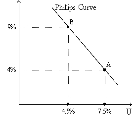
How are the effects of the financial crisis shown using the Phillips curve diagram?
(Essay)
4.8/5 (39)
The Economy in 2008
In the first half of June 2008 the effects of a housing and financial crisis and an increase in world prices of oil and foodstuffs were affecting the economy.
-Refer to The Economy in 2008. Given the effects of the financial and housing crisis on the price level and output and the effects of increased world commodity prices on the price level and output, the aggregate demand and aggregate supply model tells us that
(Multiple Choice)
4.8/5 (29)
Filters
- Essay(0)
- Multiple Choice(0)
- Short Answer(0)
- True False(0)
- Matching(0)