Exam 2: Tabular and Graphical Methods
Exam 1: Statistics and Data100 Questions
Exam 2: Tabular and Graphical Methods123 Questions
Exam 3: Numerical Descriptive Measures151 Questions
Exam 4: Basic Probability Concepts116 Questions
Exam 5: Discrete Probability Distributions139 Questions
Exam 6: Continuous Probability Distributions128 Questions
Exam 7: Sampling and Sampling Distributions124 Questions
Exam 8: Interval Estimation123 Questions
Exam 9: Hypothesis Testing135 Questions
Exam 10: Statistical Inference Concerning Two Populations124 Questions
Exam 11: Statistical Inference Concerning Variance111 Questions
Exam 12: Chi-Square Tests120 Questions
Exam 13: Analysis of Variance58 Questions
Exam 14: Regression Analysis140 Questions
Exam 15: Inference With Regression Models124 Questions
Exam 16: Regression Models for Nonlinear Relationships115 Questions
Exam 17: Regression Models With Dummy Variables114 Questions
Exam 18: Time Series and Forecasting124 Questions
Exam 19: Returns, Index Numbers and Inflation120 Questions
Exam 20: Nonparametric Tests108 Questions
Select questions type
The _________ is a graphical technique that cannot be used to display qualitative data.
(Essay)
4.9/5  (42)
(42)
Construct a stem-and-leaf diagram for the following data set. 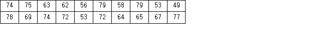 Is the distribution symmetric?
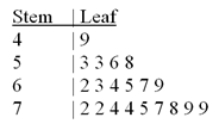
(Essay)
4.9/5 (40)
Each month the Bureau of Labor Statistics reports the number of people (in thousands)employed in the United States by age.The accompanying frequency distribution shows the results for August 2011. 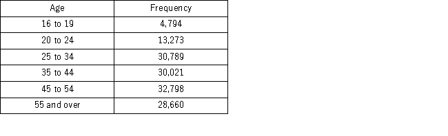 a.Construct a relative frequency distribution.What proportion of workers is between 20 and 24 years old?
b.Construct a cumulative relative frequency distribution.What proportion of workers is younger than 35 years old?
c.Construct a relative frequency histogram.
a.Construct a relative frequency distribution.What proportion of workers is between 20 and 24 years old?
b.Construct a cumulative relative frequency distribution.What proportion of workers is younger than 35 years old?
c.Construct a relative frequency histogram.
(Essay)
4.9/5 (32)
A polygon connects a series of neighboring points where each point represents the midpoint of a particular class and its associated frequency or relative frequency.
(True/False)
5.0/5 (38)
An ogive is a graph that plots the cumulative frequency (or the cumulative relative frequency)of each class above the lower limit of the corresponding class.
(True/False)
4.9/5 (40)
Use the following data to construct a scatterplot.What type of relationship is implied? 
(Multiple Choice)
4.9/5 (36)
The percent frequency of a category equals the frequency of the category multiplied by 100%.
(True/False)
4.9/5 (39)
An auto parts chain asked customers to complete a survey rating the chain's customer service as average,above average,or below average.The following table shows the results from the survey. 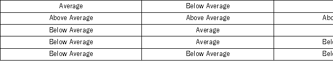 A rating of Average or Above Average accounted for what number of responses to the survey?
(Multiple Choice)
4.9/5 (36)
A stem-and-leaf diagram is constructed by separating each value of a data set into two parts.What are these parts?
(Multiple Choice)
4.8/5 (35)
Consider the following frequency distribution. 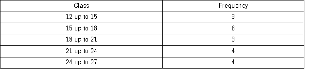 The total number of observations in the frequency distribution is ______.
(Multiple Choice)
4.9/5 (38)
A hair stylist records the hair color of her 25 most recent appointments,classifying the color as blonde,brown,black,or red.Her data set is displayed next. 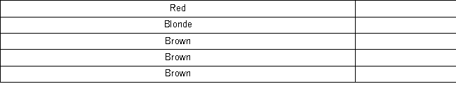 a.Construct a frequency and relative frequency distribution of the hair color of the stylist's customers.
b.Construct a pie chart.Which hair color is the most common among the stylist's customers?
c.Create a bar chart to display the frequency distribution.How many customers had black hair?
a.Construct a frequency and relative frequency distribution of the hair color of the stylist's customers.
b.Construct a pie chart.Which hair color is the most common among the stylist's customers?
c.Create a bar chart to display the frequency distribution.How many customers had black hair?
(Essay)
5.0/5 (31)
The manager at a water park constructed the following frequency distribution to summarize attendance in July and August. 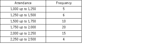 What of the following is the most likely attendance range?
(Multiple Choice)
4.7/5 (36)
The relative frequency of a category is calculated by dividing the category's frequency by the total number of observations.
(True/False)
4.8/5 (43)
A scatterplot depicts a positive _________ relationship,if as x increases,y tends to increase at an increasing rate.
(Essay)
4.8/5 (35)
Consider the following frequency distribution.  What proportion of the observations are at least 15 but less than 18?
(Multiple Choice)
4.9/5 (36)
The following is a list of five of the world's busiest airports by passenger traffic for 2010. 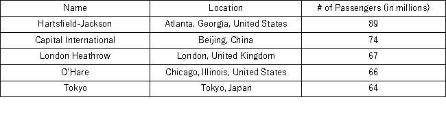 How many more millions of passengers flew out of Atlanta than flew out of Chicago?
(Multiple Choice)
4.8/5 (35)
The accompanying chart shows the numbers of books written by each author in a collection of cookbooks.What type of chart is this? 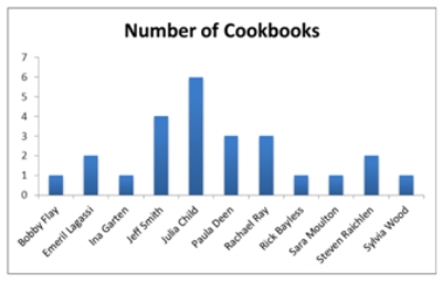
(Multiple Choice)
4.9/5 (37)
Thirty students at Eastside High School took the SAT on the same Saturday.Their raw scores are given next. 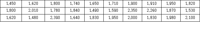 Consider a frequency distribution of the data that groups the data in classes of 1400 up to 1600,1600 up to 1800,1800 up to 2000,and so on.What is the approximate relative frequency of students who scored more than 1600 but less than 1800?
(Multiple Choice)
4.7/5 (40)
Filters
- Essay(0)
- Multiple Choice(0)
- Short Answer(0)
- True False(0)
- Matching(0)