Exam 2: Tabular and Graphical Methods
Exam 1: Statistics and Data100 Questions
Exam 2: Tabular and Graphical Methods123 Questions
Exam 3: Numerical Descriptive Measures151 Questions
Exam 4: Basic Probability Concepts116 Questions
Exam 5: Discrete Probability Distributions139 Questions
Exam 6: Continuous Probability Distributions128 Questions
Exam 7: Sampling and Sampling Distributions124 Questions
Exam 8: Interval Estimation123 Questions
Exam 9: Hypothesis Testing135 Questions
Exam 10: Statistical Inference Concerning Two Populations124 Questions
Exam 11: Statistical Inference Concerning Variance111 Questions
Exam 12: Chi-Square Tests120 Questions
Exam 13: Analysis of Variance58 Questions
Exam 14: Regression Analysis140 Questions
Exam 15: Inference With Regression Models124 Questions
Exam 16: Regression Models for Nonlinear Relationships115 Questions
Exam 17: Regression Models With Dummy Variables114 Questions
Exam 18: Time Series and Forecasting124 Questions
Exam 19: Returns, Index Numbers and Inflation120 Questions
Exam 20: Nonparametric Tests108 Questions
Select questions type
A __________ ___________ is a table that shows the number of data observations that fall into specific interval.
Free
(Essay)
4.8/5  (33)
(33)
Correct Answer: Verified
frequency distribution
An analyst constructed the following frequency distribution on the monthly returns for 50 selected stocks. 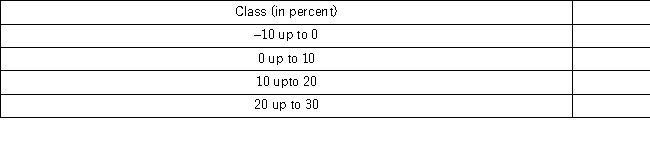 The number of stocks with returns of less than 10% is ______.
Free
(Multiple Choice)
4.8/5 (39)
Correct Answer:Verified
C
Johnson and Johnson (JNJ)is a consumer staples company.Consumer staples are products people need and buy even during times of financial hardship.Do you think JNJ will have a volatile stock price? Does the accompanying graph accurately depict the volatility of JNJ stock? Explain. 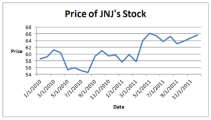
Free
(Essay)
4.8/5 (28)
Correct Answer:Verified
The scale on the vertical axis should begin at zero.Refer to Figure 2.6 where graphs with misleading scales are shown.
The following frequency distribution shows the frequency of the asking price,in thousands of dollars,for current homes on the market in a particular city. 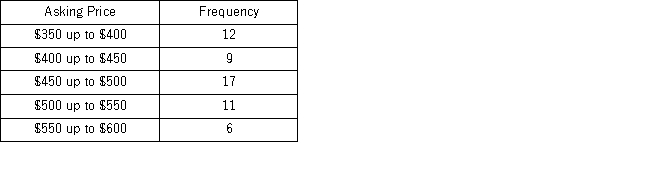 What percentage of houses has an asking price under $550,000?
(Multiple Choice)
4.9/5 (34)
The following histogram represents the number of pages in each book within a collection.What is the frequency of books containing at least 250 but fewer than 300 pages? 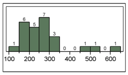
(Multiple Choice)
4.9/5 (38)
The accompanying cumulative relative frequency distribution shows a summary of the scores from an Algebra II exam at a local high school.Twenty students took the exam. 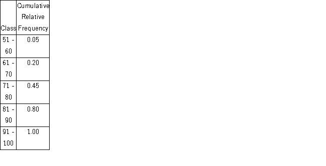 a.Construct the relative frequency distribution.What proportion of students scored between 81 and 90?
b.Construct the frequency distribution.How many students scored between 71 and 80?
c.Construct an ogive.What is the approximate percentage of students that scored less than 85?
a.Construct the relative frequency distribution.What proportion of students scored between 81 and 90?
b.Construct the frequency distribution.How many students scored between 71 and 80?
c.Construct an ogive.What is the approximate percentage of students that scored less than 85?
(Essay)
4.9/5 (27)
The following stem-and-leaf diagram shows the last 20 dividend payments (in cents)paid by Proctor and Gamble. 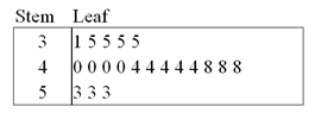 The most common dividend payment is _____.
(Multiple Choice)
4.9/5 (32)
For both qualitative and quantitative data,what is the difference between the relative frequency and the percent frequency?
(Multiple Choice)
4.8/5 (39)
Automobiles traveling on a road with a posted speed limit of 65 miles per hour are checked for speed by a state police radar system.The following table is a frequency distribution of speeds. 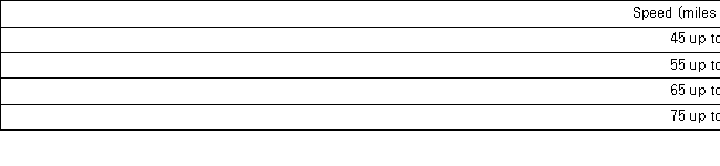 When using a polygon to graph quantitative data,what does each point represent?
(Multiple Choice)
4.7/5 (30)
The following table lists some of the busiest ports in the world based on the number of containers in 2010. 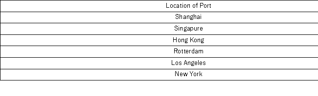 Construct a pie chart to summarize the data.Approximately what percent of the total number of containers go through Hong Kong?
(Essay)
4.7/5 (29)
The following is a list of five of the world's busiest airports by passenger traffic for 2010. 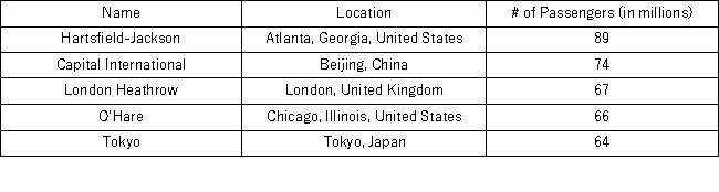 The percentage of passenger traffic in the five busiest airports that occurred in Asia is the closest to ___________.
(Multiple Choice)
4.9/5 (35)
For qualitative data,a frequency distribution groups data into __________ and records the number of _____________.
(Essay)
4.9/5 (41)
A stem-and-leaf diagram is useful in that it gives an overall picture of where quantitative data are centered and how the data are dispersed from the center.
(True/False)
4.9/5 (41)
A car dealership created a scatterplot showing the manufacturer's retail price and profit margin for the cars they have on their lot. 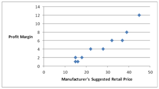 As the manufacturer's suggested retail price increases,the profit margin tends to ___________.
(Multiple Choice)
4.8/5 (38)
A survey conducted by CBS news asked 1,026 respondents: "What would you do with an unexpected tax refund?" The responses are summarized in the following table. 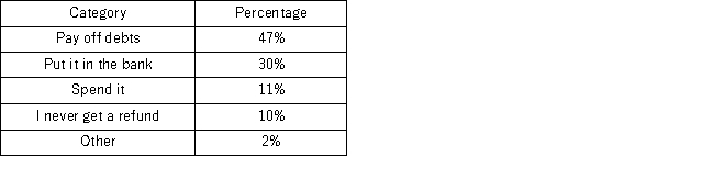 How many people will either put it in the bank or spend it?
(Multiple Choice)
4.8/5 (37)
The Statistical Abstract of the United States,2010 provided the following frequency distribution of the number of people who live below the poverty level by region. 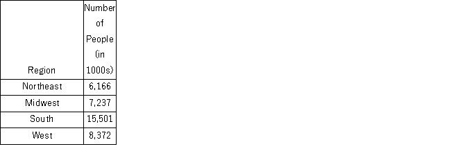 What is the percentage of people who live below the poverty level in the West or Midwest?
(Multiple Choice)
5.0/5 (36)
The following table shows the percentage of e-mail that is sent each day of the business week according to an Intermedia survey. 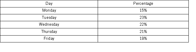 Which of the following best displays this data?
(Multiple Choice)
4.9/5 (33)
Students in Professor Smith's business statistics course have evaluated the overall effectiveness of the professor's instruction on a five-point scale,where a score of 1 indicates very poor performance and a score of 5 indicates outstanding performance.The raw scores are displayed in the accompanying table: 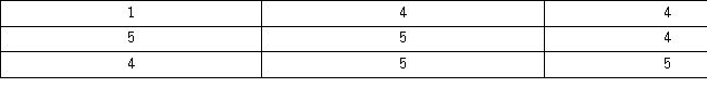 What is the relative frequency of the students who gave Professor Smith an evaluation of 3?
(Multiple Choice)
4.8/5 (40)
Scatterplot is a graphical tool that is focused on describing one variable.
(True/False)
4.8/5 (43)
Filters
- Essay(0)
- Multiple Choice(0)
- Short Answer(0)
- True False(0)
- Matching(0)