Exam 2: Tabular and Graphical Methods
Exam 1: Statistics and Data100 Questions
Exam 2: Tabular and Graphical Methods123 Questions
Exam 3: Numerical Descriptive Measures151 Questions
Exam 4: Basic Probability Concepts116 Questions
Exam 5: Discrete Probability Distributions139 Questions
Exam 6: Continuous Probability Distributions128 Questions
Exam 7: Sampling and Sampling Distributions124 Questions
Exam 8: Interval Estimation123 Questions
Exam 9: Hypothesis Testing135 Questions
Exam 10: Statistical Inference Concerning Two Populations124 Questions
Exam 11: Statistical Inference Concerning Variance111 Questions
Exam 12: Chi-Square Tests120 Questions
Exam 13: Analysis of Variance58 Questions
Exam 14: Regression Analysis140 Questions
Exam 15: Inference With Regression Models124 Questions
Exam 16: Regression Models for Nonlinear Relationships115 Questions
Exam 17: Regression Models With Dummy Variables114 Questions
Exam 18: Time Series and Forecasting124 Questions
Exam 19: Returns, Index Numbers and Inflation120 Questions
Exam 20: Nonparametric Tests108 Questions
Select questions type
The following histogram represents the number of pages in each book within a collection.What is the frequency of books containing at least 250 but fewer than 400 pages? 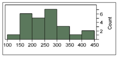
(Multiple Choice)
5.0/5  (35)
(35)
A pie chart is a segmented circle that portrays the categories and relative sizes of some quantitative variable.
(True/False)
4.9/5 (42)
The following data represent the ages of patients in the cardiac section of the local hospital.Construct a stem-and-leaf diagram.Comment on whether or not the distribution is symmetric. 
(Essay)
4.8/5 (35)
The following table shows the prices (in $1,000s)of the last 15 trucks sold at a Toyota dealership.  Construct a stem-and-leaf diagram.Given this diagram,estimate the price that a potential buyer would likely pay for a Toyota truck.
(Essay)
4.9/5 (36)
In order to summarize qualitative data,a useful tool is a __________.
(Multiple Choice)
4.9/5 (34)
The following table shows the number of payroll jobs the government added during the years it added jobs (since 1973).The jobs are in thousands. 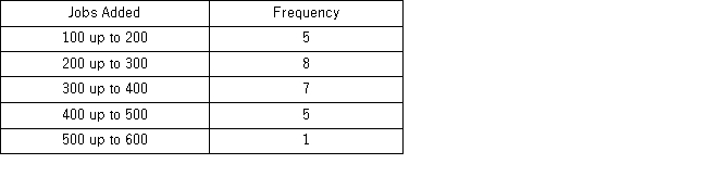 Approximately what percent of the time did the government add 200,000 or more jobs?
(Multiple Choice)
4.8/5 (38)
A histogram is a series of rectangles where the width and height of each rectangle represent the frequency (or relative frequency)and the width of the class,respectively.
(True/False)
4.7/5 (35)
For which of the following data sets will a pie chart be most useful?
(Multiple Choice)
4.8/5 (37)
The following frequency distribution displays the weekly sales of a certain brand of television at an electronics store. 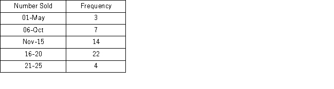 How many weeks of data are included in this frequency distribution?
(Multiple Choice)
4.9/5 (34)
When summarizing quantitative data it is always better to have up to 30 classes in a frequency distribution.
(True/False)
4.9/5 (40)
Horizontal bar charts are constructed by placing _________________________________________________________.
(Multiple Choice)
4.7/5 (44)
The following stem-and-leaf diagram shows the speeds in miles per hour (mph)of 14 cars approaching a toll booth on a bridge in Oakland,California. 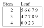 How many of the cars were traveling faster than 25 mph but slower than 40 mph?
(Multiple Choice)
4.8/5 (34)
The following table displays the top 40 American League batting averages of the 2011 season. 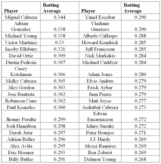 a.Construct frequency,relative frequency,and cumulative relative frequency distributions that group the data in classes of 0.265 up to 0.280,0.280 up to 0.295,0.295 up to 0.310,and so on.
b.How many of these players have a batting average above 0.340? What proportion of these players has a batting average of at least 0.280 but below 0.295? What percentage of these players has a batting average below 0.325?
c.Construct a relative frequency histogram.Is the distribution symmetric? If not,is it positively or negatively skewed?
d.Construct an ogive.
e.Using the ogive,approximately what proportion of the players in this group has a batting average above 0.290?
a.Construct frequency,relative frequency,and cumulative relative frequency distributions that group the data in classes of 0.265 up to 0.280,0.280 up to 0.295,0.295 up to 0.310,and so on.
b.How many of these players have a batting average above 0.340? What proportion of these players has a batting average of at least 0.280 but below 0.295? What percentage of these players has a batting average below 0.325?
c.Construct a relative frequency histogram.Is the distribution symmetric? If not,is it positively or negatively skewed?
d.Construct an ogive.
e.Using the ogive,approximately what proportion of the players in this group has a batting average above 0.290?
(Essay)
4.8/5 (29)
A bar chart depicts the frequency or relative frequency of each category of qualitative data as a bar rising vertically from the horizontal axis.It is also acceptable for the bar to extend horizontally from the vertical axis.
(True/False)
5.0/5 (38)
The following histogram represents the number of pages in each book within a collection.What is the frequency of books containing at least 200 but fewer than 250 pages? 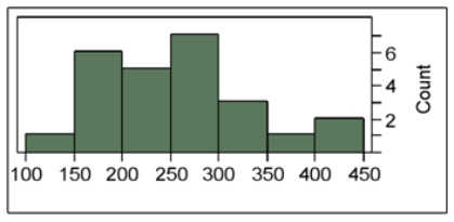
(Multiple Choice)
4.7/5 (43)
Thirty students at Eastside High School took the SAT on the same Saturday.Their raw scores are given next. 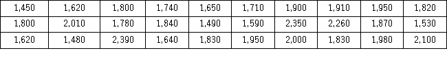 Consider a frequency distribution of the data that groups the data in classes of 1400 up to 1600,1600 up to 1800,1800 up to 2000,and so on.What percent of students scored less than 2200?
(Multiple Choice)
4.8/5 (35)
The accompanying table shows students' scores from the final exam in a history course. 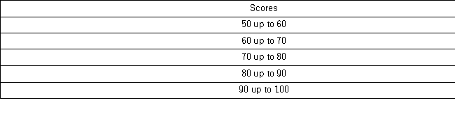 How many of the students scored at least 70 but less than 90?
(Multiple Choice)
4.8/5 (34)
The accompanying chart shows the number of books written by each author in a collection of cookbooks.What type of data is being represented? 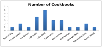
(Multiple Choice)
4.8/5 (26)
When displaying quantitative data,what is an ogive used to plot?
(Multiple Choice)
4.8/5 (33)
Filters
- Essay(0)
- Multiple Choice(0)
- Short Answer(0)
- True False(0)
- Matching(0)