Exam 2: Frequency Distributions and Graphs
Exam 1: The Nature of Probability and Statistics81 Questions
Exam 2: Frequency Distributions and Graphs107 Questions
Exam 3: Data Description127 Questions
Exam 4: Probability and Counting Rules173 Questions
Exam 5: Discrete Probability Distributions117 Questions
Exam 6: The Normal Distribution114 Questions
Exam 7: Confidence Intervals and Sample Size122 Questions
Exam 8: Hypothesis Testing178 Questions
Exam 9: Testing the Difference Between Two Means, Two Variances, and Two Proportions99 Questions
Exam 10: Correlation and Regression73 Questions
Exam 11: Other Chi-Square Tests73 Questions
Exam 12: Analysis of Variance69 Questions
Exam 13: Nonparametric Statistics62 Questions
Exam 14: Sampling and Simulation58 Questions
Select questions type
Following are the numbers of Dean's List students in a random sample of 20 university co Construct a dotplot for these data.
0 1 0 3 3 2 5 5 0 2 3 5 6 0 3 4 5 2 6 0
urses.
(Multiple Choice)
4.8/5  (37)
(37)
The frequency polygon is a graph that displays the data by using lines that connect points
plotted for the frequencies at the midpoints of the classes.
(True/False)
4.9/5 (34)
Using the ogive shown below, what is the cumulative frequency of data values less than o to 16 ?
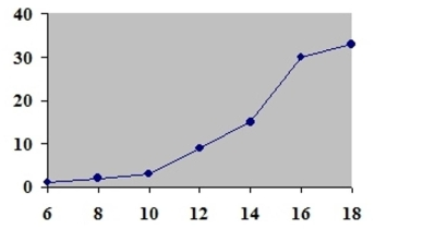 r equal
(Multiple Choice)
4.9/5 (44)
A survey was taken on how much trust people place in the information they read on the Ir Construct a categorical frequency distribution for the data. A trust in all that they read, trust in most of what they read, trust in about one-half of what they read, trust in a small portion of what they read.
(Multiple Choice)
4.8/5 (34)
In an ungrouped frequency distribution of the average age of high school graduates, what would be the boundaries for the class of graduates who were reported to be 18 years old?
(Multiple Choice)
4.7/5 (41)
A time series graph represents data that occur over a specific time period.
(True/False)
4.8/5 (30)
A Pareto chart arranges data from largest to smallest according to frequencies.
(True/False)
4.8/5 (30)
A pie graph would best represent the number of inches of rain that has fallen in Ohio
each day for the past 2 months.
(True/False)
4.8/5 (36)
A stem and leaf plot has the advantage over a grouped frequency distribution of retaining
the actual data while still showing them in graphical form.
(True/False)
4.8/5 (40)
The following frequency distribution presents the frequency of passenger vehicles that pa through a certain intersection from 8:00 AM to 9:00 AM on a particular day.
Vehicle Type Frequency Motorcycle 5 Sedan 95 SUV 65 Truck 30
Construct a frequency bar graph for the data.
(Multiple Choice)
4.9/5 (38)
Construct a dotplot for the following data.
3.99 4.02 3.97 3.94 3.94 3.92 3.91 3.91 3.91 4.04 3.98 3.94 3.96 3.97 3.94 3.99 3.93 3.90 3.97 3.99
(Multiple Choice)
4.7/5 (45)
A recent statistics exam yielded the following 25 scores. Construct a grouped frequency distribution with the class limits shown below.
63 86 77 51 67
55 89 63 68 96
81 82 44 80 90
77 87 74 91 59
77 79 45 87 97
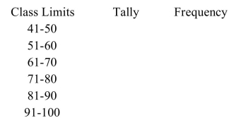
(Multiple Choice)
4.9/5 (43)
Karen is constructing a pie graph to represent the number of hours her classmates do homework each day. She found that 8 of 24 classmates did homework for three hours
Each day. In her pie graph, this would represent how many degrees?
(Multiple Choice)
4.8/5 (42)
Given the following frequency distribution, how many pieces of data were less than 28.5 ? Class Boundaries Frequencies 13.5-18.5 4 18.5-23.5 9 23.5-28.5 12 28.5-33.5 15 33.5-38.5 17
(Multiple Choice)
4.8/5 (42)
Filters
- Essay(0)
- Multiple Choice(0)
- Short Answer(0)
- True False(0)
- Matching(0)