Exam 2: Frequency Distributions and Graphs
Exam 1: The Nature of Probability and Statistics81 Questions
Exam 2: Frequency Distributions and Graphs107 Questions
Exam 3: Data Description127 Questions
Exam 4: Probability and Counting Rules173 Questions
Exam 5: Discrete Probability Distributions117 Questions
Exam 6: The Normal Distribution114 Questions
Exam 7: Confidence Intervals and Sample Size122 Questions
Exam 8: Hypothesis Testing178 Questions
Exam 9: Testing the Difference Between Two Means, Two Variances, and Two Proportions99 Questions
Exam 10: Correlation and Regression73 Questions
Exam 11: Other Chi-Square Tests73 Questions
Exam 12: Analysis of Variance69 Questions
Exam 13: Nonparametric Statistics62 Questions
Exam 14: Sampling and Simulation58 Questions
Select questions type
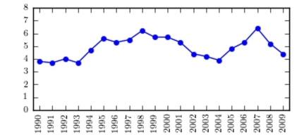
The following time-series plot presents the population growth (in percent) of a suburb of Atlanta, Georgia for each of the years 1990 through 2009. Estimate the amount by which the rate of growth changed from 1993 to 1995 .
(Multiple Choice)
4.8/5  (36)
(36)
7.0 7.4 10.4 10.9 9.7 9.3 7.3 8.7 7.1 5.4 6.6 9.3 9.8 8.9 9.3 7.7 8.4 8.7 8.8 7.3 2.4 2.5 9.6 8.8
(Multiple Choice)
4.7/5 (32)
The frequency polygon and the histogram are two different ways to represent the same
data set.
(True/False)
5.0/5 (42)
A sample of 200 high school students were asked how many hours per week they spend u television. The following frequency distribution presents the results.
Time Spent Watehing Television Number of hours Frequency 0.0-3.9 46 4.0-7.9 43 8.0-11.9 37 12.0-15.9 20 16.0-19.9 28 20.0-23.9 15 24.0-27.9 11
Construct a frequency polygon for the frequency distribution.
(Multiple Choice)
4.9/5 (32)
The following pie chart presents the percentages of fish caught in each of four ratings cate
Match this pie chart with its corresponding bar graph.
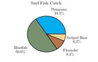 gories.
(Multiple Choice)
4.9/5 (34)
The following information shows the colors of cars preferred by customers. Draw a pie graph and inc how many degrees that black represents in a pie graph?
Number Black 50 White 60 Green 30 Blue 20 40
ate
(Essay)
4.7/5 (42)
A Pareto chart is useful for showing percentages of the total at different times.
(True/False)
4.9/5 (35)
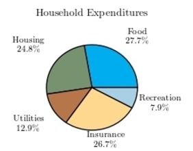
Following is a pie chart that presents the percentages spent by a certain household on its largest annual expenditures. What percentage of the money spent was spent on food, hous utilities?
(Multiple Choice)
4.8/5 (34)
The following table presents the purchase totals (in dollars) of a random sample of gasolis purchases at a convenience store.
Construct a frequency histogram using a class width of 10 , and using 0 as the lower class the first class.
95 99 4 75 23 26 27 65 68 69 31 7 72 67 46 0 46 1 53 67
(Multiple Choice)
4.9/5 (44)
The following frequency distribution presents the weights in pounds (lb) of a sample of visitors to a health clinic.
Weight (lb) Frequency 90-99 1 100-109 4 110-119 4 120-129 3 130-139 7 140-149 6 150-159 4 160-169 2 What is the class width?
(Multiple Choice)
4.8/5 (33)
A recent statistics exam yielded the following 10 scores. Construct a frequency polygon distribution using the class limits shown below.
Class Limits Midpoints Tally Frequency 61-70 71-80 81-90 91-100
(Multiple Choice)
4.7/5 (44)
A sample of 200 high school students were asked how many hours per week they spend u television. The following frequency distribution presents the results.
Time Spent Watching Television Number of hours Frequency 0.0-3.9 81 4.0-7.9 51 8.0-11.9 34 12.0-15.9 17 16.0-19.9 13 20.0-23.9 2 24.0-27.9 2
Construct a relative frequency polygon for the frequency distribution.
(Multiple Choice)
4.8/5 (37)
An automobile dealer wants to construct a pie graph to represent types of cars sold in July. He sold 72 cars, 16 of which were convertibles. How many degrees should be
Used for the convertibles section ?
(Multiple Choice)
4.7/5 (35)
The following frequency distribution presents the frequency of passenger vehicles that pa: through a certain intersection from 8:00 AM to 9:00 AM on a particular day.
Vehicle Type Frequency Motorcycle 14 Sedan 46 SUV 24 Truck 30
Construct a relative frequency Parato chart for the data. s
(Multiple Choice)
4.9/5 (36)
Which type of graph represents the data by using vertical bars of various heights to indicate frequencies?
(Multiple Choice)
4.7/5 (32)
Find the class boundaries, midpoint, and width of the class 28-34?
(Short Answer)
4.8/5 (37)
Filters
- Essay(0)
- Multiple Choice(0)
- Short Answer(0)
- True False(0)
- Matching(0)