Exam 3: Visual Displays of Data Exam
Exam 1: Speaking of Statistics77 Questions
Exam 2: Measurement in Statistics68 Questions
Exam 3: Visual Displays of Data Exam49 Questions
Exam 4: Describing Data64 Questions
Exam 5: A Normal World47 Questions
Exam 6: Probability in Statistics68 Questions
Exam 8: From Samples to Populations60 Questions
Exam 9: Hypothesis Testing60 Questions
Exam 10: T Tests, Two-Way Tables, and Anova41 Questions
Select questions type
A nurse measured the blood pressure of each person who visited her clinic. Following is a relative-frequency histogram for the systolic blood pressure readings for those people aged between 25 and 40. Use the histogram to answer the question. The blood pressure readings were rounded up to the next whole number.
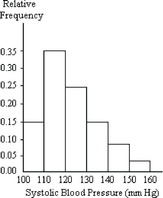 Approximately what percentage of the people aged 25-40 had a systolic blood pressure reading greater than or equal to 130?
(Multiple Choice)
4.9/5  (37)
(37)
The frequency table shows the lengths in inches of 40 fireplace logs.
Length (in) Number of Logs 14.5-14.9 2 15.0-15.4 5 15.5-15.9 12 16.0-16.4 11 16.5-16.9 7 17.0-17.4 3 Construct a cumulative frequency table for the data.
(Essay)
4.8/5 (39)
The time series line chart below shows the prices of a volatile stock from January 1999 to December 1999. Between which two consecutive months did the price of the stock drop by The greatest percentage?
(Multiple Choice)
4.8/5 (37)
The stacked bar chart below shows the percentages of death due to cancer in four geographic regions of the U.S. that occurred in three ethnic groups in 2003. 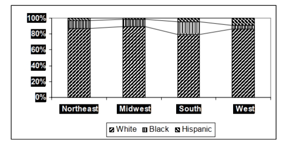 In which geographic area did Hispanics account for their highest percentage of cancer deaths
in 2003?
In which geographic area did Hispanics account for their highest percentage of cancer deaths
in 2003?
(Short Answer)
4.9/5 (43)
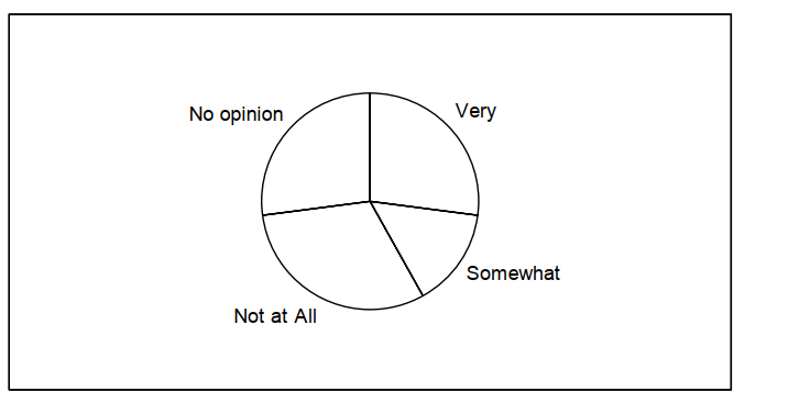
The data below represent the results of a poll in which the following question was asked:, "To what degree are you satisfied with the outcome of the 2012 gubernatorial election?" Which pie chart below represents the given data set?
Very 36 Somewhat 48 Not at All 62 No opinion 54
A)
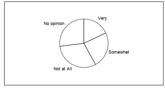 B)
B)
(Short Answer)
4.8/5 (38)
The table shows the end-of-the-month checking account balance of a statistics teacher for the months January 1999 through December 1999 as determined by the closing balance on the last banking day of the month. The balance is rounded to the nearest dollar.
Jan Feb Mar Apr May Jun Jul Aug Sep Oct Nov Dec 1112 1356 1627 1936 1743 1481 1490 1340 1139 910 700 500 Which time series line chart represents the data?
(Multiple Choice)
4.8/5 (30)
Find the original data from the stem-and-leaf plot. Stem Leaves 1 18 2 1137 3 13389 4 34
(Multiple Choice)
4.7/5 (30)
Using the graphical display below.
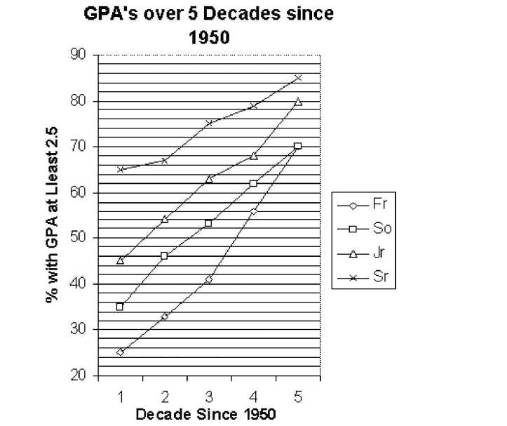 -Identify the class that has had the greatest percentage increase with respect to its initial percentage over the five decades.
(Multiple Choice)
4.8/5 (36)
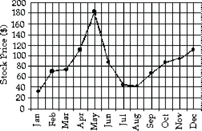
The table shows the price of a volatile stock from the months January 1999 through December 1999 as determined by the closing price on the last trading day of the month. The price is rounded to the nearest dollar.
Jan Feb Mar Apr May Jun Jul Aug Sep Oct Nov Dec 32 70 73 111 184 87 45 42 67 87 94 111
Which time series line chart represents the data?
(Multiple Choice)
4.8/5 (33)
The following multiple line graph shows the numbers of death due to cancer in four geographic regions of the U.S. that occurred in three ethnic groups in 2003. 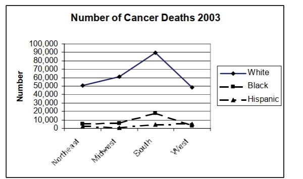 In which geographic area was the number of cancer deaths among whites the highest in 2003?
(Short Answer)
4.8/5 (35)
The histogram below shows the ages of the actors who won the academy award for best actor from 1970 to 2006.
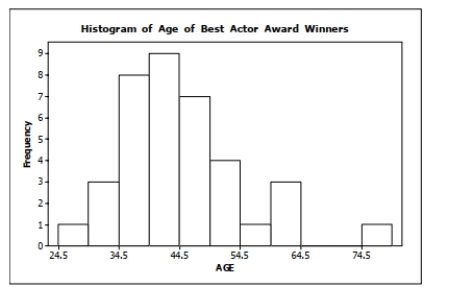 How many of the award winners were 50 years old or older at the time they won their Oscar?
(Short Answer)
4.8/5 (26)
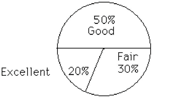
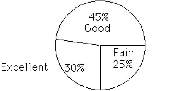
After reviewing a movie, 400 people rated the movie as excellent, good, or fair. The following data give the rating distribution. Which pie chart below represents the given data set?
Excellent Good Fair 120 180 100
A)
 B)
B)
(Short Answer)
4.8/5 (40)
The table lists the winners of the Wimbledon women's singles title for the years 1976-1995.
Construct a bar chart for the given relative frequencies. Winner Frequency Relative frequency C. Evert 2 0.10 V. Wade 1 0.05 M. Navratilova 9 0.45 C. Martinez 1 0.05 S. Graf 6 0.30 E. Goolagong 1 0.05
(Essay)
4.7/5 (36)
Which line chart below represents the data? Weight of Cats Weight (lb) Number of Cats 5-7 2 8-10 9 11-13 18 14-16 13 17-19 4 20-22 1
(Multiple Choice)
4.7/5 (41)
Which line chart below represents the data in the table?
Student Quiz Scores Quiz Scores Frequency 10-14 2 15-19 5 20-24 13 25-29 17 30-34 6
(Multiple Choice)
4.8/5 (27)
A medical research team studied the ages of patients who had strokes caused by stress. The results of 34 patients are tabulated below. Age Frequency 25-29 3 30-34 3 35-39 6 40-44 4 45-49 5 50-54 4 55-59 5 60-64 5 Construct the frequency histogram.
(Essay)
4.8/5 (44)
Using the graphical display below.
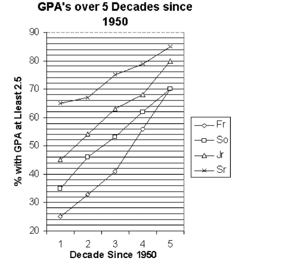 -Identify the class that had the lowest percentage increase in 2.5 or better GPA's between the fourth and fifth decades.
(Multiple Choice)
4.8/5 (38)
Construct a bar chart for the relative frequencies given. Blood type Frequency Relative frequency O 22 0.44 A 19 0.38 B 6 0.12 AB 3 0.06
(Essay)
5.0/5 (35)
The following dot plot represents the ages of the people in a sample selected from a group of campaign volunteers.
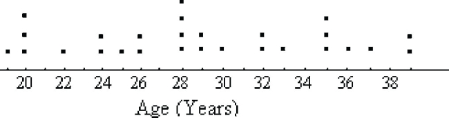 How many people were in the sample?
(Multiple Choice)
4.9/5 (36)
The data below are the numbers of hours of homework done as reported by 24 high school juniors for the last week in September, 2006.
6, 5, 6, 4, 6, 6, 9, 7, 6, 3, 8, 5, 5, 8, 6, 5, 8, 6, 5, 7, 5, 8, 7, 4
Using bins of 2 hours width, which relative frequency histogram represents the data?
(Multiple Choice)
5.0/5 (41)
Filters
- Essay(0)
- Multiple Choice(0)
- Short Answer(0)
- True False(0)
- Matching(0)