Exam 2: Graphical Summaries of Data
Exam 1: Basic Ideas39 Questions
Exam 2: Graphical Summaries of Data40 Questions
Exam 3: Numerical Summaries of Data76 Questions
Exam 4: Summarizing Bivariate Data33 Questions
Exam 5: Probability99 Questions
Exam 6: Discrete Probability Distributions76 Questions
Exam 7: The Normal Distribution131 Questions
Exam 8: Confidence Intervals62 Questions
Exam 9: Hypothesis Testing115 Questions
Exam 10: Two-Sample Confidence Intervals44 Questions
Exam 11: Two-Sample Hypothesis Tests43 Questions
Exam 12: Tests With Qualitative Data26 Questions
Exam 13: Inference in Linear Models51 Questions
Exam 14: Analysis of Variance48 Questions
Exam 15: Nonparametric Statistics27 Questions
Select questions type
The following table presents the rate of population growth of a suburb of Atlanta, Georgia for each of the years 1990 through 2009. Construct a time-series plot of the growth rate. Year Percent Growth Year Percent Growth 1990 3.1 2000 5.5 1991 3.3 2001 5.2 1992 4.3 2002 4.4 1993 3.5 2003 4.2 1994 4.4 2004 4.1 1995 5.7 2005 4.7 1996 5.2 2006 5.9 1997 6.4 2007 6.2 1998 5.6 2008 5.2 1999 5.8 2009 4.6
Free
(Multiple Choice)
4.8/5  (38)
(38)
Correct Answer: Verified
B
The following frequency distribution presents the weights in pounds (lb) of a sample of visitors to a health clinic.
Weights of Clinic Visitors Weight (lb) Frequency 100-109 1 110-119 1 120-129 5 130-139 4 140-149 7 150-159 4 160-169 10 170-179 8 180-189 5 190-199 5
Construct a frequency histogram.
Free
(Multiple Choice)
4.8/5 (40)
Correct Answer:Verified
C
A sample of 200 high school students were asked how many hours per week they spend watching television. The following frequency distribution presents the results. Time Spent Watching Television Number of hours Frequency 0.0-3.9 76 4.0-7.9 57 8.0-11.9 32 12.0-15.9 18 16.0-19.9 13 20.0-23.9 4 Construct a relative frequency ogive for the frequency distribution.
Free
(Multiple Choice)
4.8/5 (38)
Correct Answer:Verified
D
A sample of 200 high school students were asked how many hours per week they spend watching television. The following frequency distribution presents the results. Time Spent Watching Television Number of hours Frequency 0.0-3.9 74 4.0-7.9 57 8.0-11.9 35 12.0-15.9 18 16.0-19.9 12 20.0-23.9 4 Construct a relative frequency polygon for the frequency distribution.
(Multiple Choice)
4.9/5 (46)
Classify the histogram as skewed to the left, skewed to the right, or approximately symmetric. 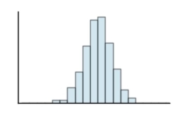
(Multiple Choice)
4.9/5 (39)
The following bar graph presents the average amount a certain family spent, in dollars, on various food categories in a recent year.
On which food category was the most money spent? 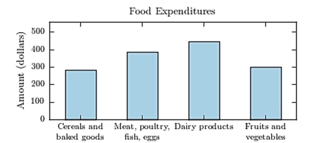
(Multiple Choice)
4.8/5 (34)
The following frequency distribution presents the frequency of passenger vehicles that pass through a certain intersection from 8:00 AM to 9:00 AM on a particular day. 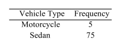 SUV 70 Truck 35
Construct a frequency bar graph for the data.
SUV 70 Truck 35
Construct a frequency bar graph for the data.
(Multiple Choice)
4.7/5 (30)
Construct a dotplot for the following data. 16 13 14 12 15 13 14 14 12 12 14 13 13 14 12 13 15 14 12 16
(Multiple Choice)
4.9/5 (43)
The amounts 5 and 2 are compared. Which of the following graphical displays are the least misleading?
(Multiple Choice)
4.9/5 (38)
Gravity on Mars: The gravity on Earth is around 2/3 's stronger than the gravity on Mars. Which of the following graphics compare the gravity differences more accurately, and why?
(Multiple Choice)
4.8/5 (27)
The following time-series plot presents the population growth (in percent) of a suburb of Atlanta, Georgia for each of the years 1990 through 2009. Estimate the rate of growth in 1,999. 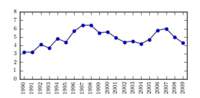
(Multiple Choice)
4.8/5 (38)
The amounts 3 and 2 are compared. Which of the following graphical displays are the least misleading?
(Multiple Choice)
4.9/5 (37)
Thirty households were surveyed for the number of televisions in each home. Following are the results.
0 0 0 0 1 1 0 4 2 5 0 2 1 0 2 4 0 0 0 1 0 1 1 5 3 0 4 1 3 0
Construct a relative frequency histogram.
(Multiple Choice)
4.9/5 (40)
The following frequency distribution presents the frequency of passenger vehicles that pass through a certain intersection from 8:00 AM to 9:00 AM on a particular day. Vehicle Type Frequency Motorcycle 7 Sedan 22 SUV 58 Truck 67 Construct a relative frequency Pareto chart for the data.
(Multiple Choice)
4.8/5 (42)
A sample of 200 high school students were asked how many hours per week they spend watching television. The following frequency distribution presents the results. Time Spent Watehing Television Number of hours Frequency 0.0-3.9 38 4.0-7.9 38 8.0-11.9 34 12.0-15.9 23 16.0-19.9 24 20.0-23.9 23 24.0-27.9 20 Construct a frequency ogive for the frequency distribution.
(Multiple Choice)
4.8/5 (38)
Construct a stem-and-leaf plot for the following data, in which the leaf represents the tenths place. 6.7 8.3 10.3 9.0 10.3 8.8 9.1 6.9 10.8 6.6 10.3 10.7 10.3 3.8 10.6 5.0 5.3 8.1 9.1 9.6 10.9 7.8 8.8 9.8
(Multiple Choice)
4.8/5 (37)
Toy sales: The following graph presents the percent market share for the US Toy Retail Sales between brick and mortar toy sales and online sales for the years 2011-2015. Does the graph present an accurate picture of the differences in revenue from these two sources? Or is it misleading?
Explain. 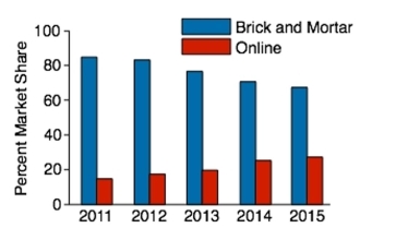
(Short Answer)
4.8/5 (26)
A sample of 200 high school students were asked how many hours per week they spend watching television. The following frequency distribution presents the results. Time Spent Watching Television Number of hours Frequency 0.0-3.9 49 4.0-7.9 36 8.0-11.9 31 12.0-15.9 29 16.0-19.9 19 20.0-23.9 15 24.0-27.9 21 Construct a frequency polygon for the frequency distribution.
(Multiple Choice)
4.9/5 (50)
The following frequency distribution presents the weights in pounds (lb) of a sample of visitors to a health clinic. Weight (lb) Frequency 100-103 2 104-107 1 108-111 4 112-115 4 116-119 10 120-123 9 124-127 4 128-131 1 What is the class width?
(Multiple Choice)
4.8/5 (35)
The following pie chart presents the percentages of fish caught in each of four ratings categories. Match this pie chart with its corresponding bar graph. 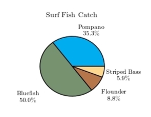
(Multiple Choice)
4.7/5 (31)
Filters
- Essay(0)
- Multiple Choice(0)
- Short Answer(0)
- True False(0)
- Matching(0)