Exam 2: Frequency Distributions and Graphs
Exam 1: The Nature of Probability and Statistics53 Questions
Exam 2: Frequency Distributions and Graphs79 Questions
Exam 3: Data Description98 Questions
Exam 5: Discrete Probability Distributions75 Questions
Exam 6: The Normal Distribution81 Questions
Exam 7: Confidence Intervals and Sample Size74 Questions
Exam 8: Hypothesis Testing86 Questions
Exam 9: Testing the Difference Between Two Means, Two Variances, and Two Proportions73 Questions
Exam 10: Correlation and Regression78 Questions
Exam 11: Other Chi-Square Tests69 Questions
Exam 12: Analysis of Variance71 Questions
Exam 13: Nonparametric Statistics87 Questions
Exam 14: Sampling and Simulation67 Questions
Select questions type
Which type of graph represents the data by using vertical bars of various heights to indicate frequencies?
(Multiple Choice)
4.8/5  (38)
(38)
When data are collected in original form, they are called __________.
________________________________________
(Short Answer)
4.9/5 (42)
One disadvantage of pie charts is that it is difficult to visually compare 2 frequency distributions.Plotting
relative frequency distributions (polygons or ogives) on the same axes is usually more informative.
(True/False)
4.8/5 (35)
The total frequency of the data whose ogive shown below 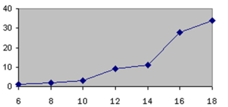 is approximately
(Multiple Choice)
4.8/5 (41)
A stem and leaf plot is a data plot that uses part of a data value as the stem and part of the data value as
the leaf to form groups or classes.
(True/False)
4.9/5 (40)
The larger the sample size, the larger the relative frequencies.
(True/False)
4.9/5 (39)
Pareto charts have units that are used for the frequency that are
(Multiple Choice)
4.8/5 (32)
A pie graph was created showing the number of children per family.If 234 families were in the survey
and the section depicting families with three children represented 120°, the number of families with three
children was 78.
(True/False)
4.7/5 (39)
An automobile dealer wants to construct a pie graph to represent types of cars sold in July.He sold 72 cars; 16 of which were convertibles.The convertibles will represent how many degrees in the circle?
(Multiple Choice)
4.9/5 (35)
In order to graphically compare two frequency distributions, one should use relative frequency
distributions in order to take differing sample sizes into account.
(True/False)
4.7/5 (27)
A Pareto chart does not have which of the following properties?
(Multiple Choice)
4.9/5 (28)
A time series graph is useful for detecting long term trends over a period of time.
(True/False)
4.8/5 (29)
A __________ would most appropriately represent the yearly-number of students that were enrolled in
Statistics over the past ten years.
________________________________________
(Short Answer)
4.8/5 (39)
Choose the correct statement describing the following stem and leaf plot for grades on a linear algebra exam. 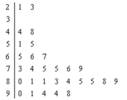
(Multiple Choice)
4.9/5 (41)
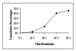 In the figure below, what class boundary has 30% of the data?
(Multiple Choice)
4.8/5 (29)
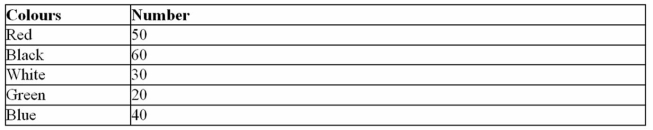
The following information shows the colours of cars preferred by customers.Draw
a pie graph and indicate how many degrees the black represents in a pie graph?
(Essay)
4.9/5 (37)
Filters
- Essay(0)
- Multiple Choice(0)
- Short Answer(0)
- True False(0)
- Matching(0)