Exam 3: Numerical Methods for Describing Data Distributions
Exam 1: Collecting Data in Reasonable Ways56 Questions
Exam 2: Graphical Methods for Describing Data Distributions62 Questions
Exam 3: Numerical Methods for Describing Data Distributions37 Questions
Exam 4: Describing Bivariate Numerical Data70 Questions
Exam 5: Probability55 Questions
Exam 6: Random Variables and Probability Distributions72 Questions
Exam 7: An Overview of Statistical Inference - Learning From Data19 Questions
Exam 8: Sampling Variability and Sampling Distributions35 Questions
Exam 9: Estimating a Population Proportion36 Questions
Exam 10: Asking and Answering Questions About a Population Proportion31 Questions
Exam 11: Asking and Answering Questions About the Difference Between Two Proportions42 Questions
Exam 12: Asking and Answering Questions About a Population Mean51 Questions
Exam 13: Asking and Answering Questions About the Difference Between Two Means46 Questions
Exam 14: Learning From Categorical Data36 Questions
Exam 15: Understanding Relationships - Numerical Data Part 243 Questions
Exam 16: Asking and Answering Questions About More Than Two Means25 Questions
Select questions type
Which statistical parameters of the numerical data distribution are commonly used to describe a center of the distribution?
Free
(Multiple Choice)
4.8/5  (40)
(40)
Correct Answer: Verified
D
By definition, an outlier is "extreme" if it is more than 3.0 iqr away from the closest quartile.
Free
(True/False)
4.8/5 (37)
Correct Answer:Verified
True
Spotrac publishes professional football players' salaries. The table below contains information about base salaries for fifteen players with the highest salaries in Buffalo Bills team in the year 2016. ( HYPERLINK "http://www.spotrac.com/nfl/rankings/2016/base/buffalo-bills/" 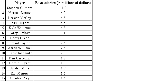 Choose the most appropriate description for the center of this data.
Free
(Multiple Choice)
4.8/5 (31)
Correct Answer:Verified
B
Grey Kangaroos are large, social marsupials, indigenous to Australia. As part of a study of the development of these creatures, biologists have measured various aspects of their skeletal structure. A sample of 148 palate widths was taken from skeletal remains and the data is presented in the stem-and-leaf plot below. The distributions of skeletal measures are generally thought to be approximately normal, which is consistent with the stem-and-leaf plot for this sample. The display uses five lines for each stem. Thus, "2t|" is the stem for palate widths of 22 and 23, "2f|" for 24 and 25, "2s|" for 26 and 27, and so on. (The "t" then stands for leaves that are twos and threes, the "f" for leaves of fours and fives, etc.) The mean palate width of this sample is 2.6 cm, and the standard deviation is 0.3 cm. 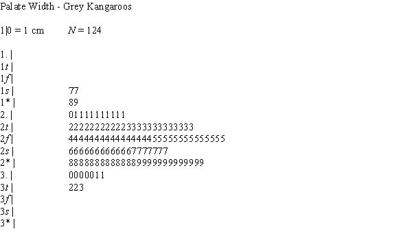
(a)If this sample is a good representation of the population of Grey Kangaroos, approximately what percent of palate widths in this sample would exceed 2.9 cm?
(b)What is the approximate percentile of a palate width that is 2.0 cm?
(c)One measure of variability is the length of an interval that contains the middle 90% of the values of a distribution. For these data, how long is that interval?
(Essay)
4.8/5 (28)
Astronomers are interested in the recessional velocity of galaxies--that is, the speed at which they are moving away from the Milky Way. The accompanying table contains the recessional velocities for a sample of galaxies, measured in km/sec. Negative velocity indicates the galaxy is moving towards us. 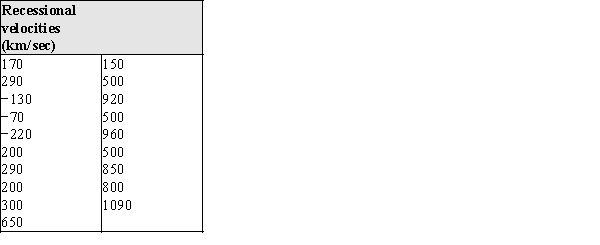
(a)Calculate these numerical summaries:
The mean _______________
The standard deviation _______________
The median _______________
The interquartile range _______________
(b)Construct a skeletal box plot for these data.
(c)Judging from the data and your responses in parts (a) and (b), would you say this distribution is skewed or approximately symmetric? Justify your response using appropriate statistical terminology.
(Essay)
4.8/5 (36)
The Territory of Iowa was initially surveyed in the 1830's. The surveyors were very careful to note the trees and vegetation; it was believed at that time that the richness of the soil could be measured by the density of trees encountered. The sample of Ash tree diameters from the original survey of what is now Linn County, Iowa, is presented in the stem and leaf plot below. The display uses five lines for each stem. Thus, "1t|" is the stem for diameters of 12 and 13, "1f|" for 14 and 15, "1s|" for 16 and 17, and so on. (The "t" then stands for leaves that are twos and threes, the "f" for leaves of fours and fives, etc.)The mean diameter of ash trees in this sample is 11.500 inches, and the standard deviation is 3.842 inches. 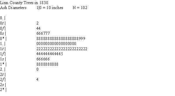
(a)What is the approximate diameter of an ash tree at the 20th percentile in this distribution?
(b)The Empirical Rule would suggest that 68% of ash tree diameters are between what two values?
(a)What is the approximate diameter of an ash tree at the 20th percentile in this distribution?
(b)The Empirical Rule would suggest that 68% of ash tree diameters are between what two values?
(Essay)
4.8/5 (37)
A wide variety of oak trees grow in the United States. In one study a sample of acorns was collected from different locations, and their volumes, in cm3, were recorded. In the table below are summary statistics for these data. 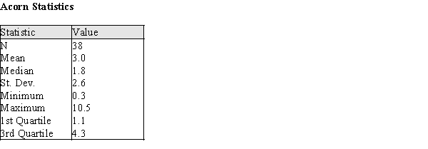
(a)Describe a procedure that uses these some or all of these summary statistics to determine whether outliers are present in the data.
(b)Using your procedure from part (a), determine if there are outliers in these data.
(a)Describe a procedure that uses these some or all of these summary statistics to determine whether outliers are present in the data.
(b)Using your procedure from part (a), determine if there are outliers in these data.
(Essay)
4.8/5 (34)
The table below summarizes the number of minutes spent exercising each day for a sample of 30 female college students. 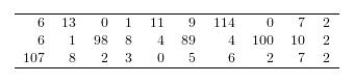 Construct a graphical display of the data distribution and then indicate what summary measures you would use to describe center and spread.
(Multiple Choice)
4.9/5 (37)
The data in the table below are the changes in the amount of space available to standing passengers at the 19 stops between 1987 and 1988. 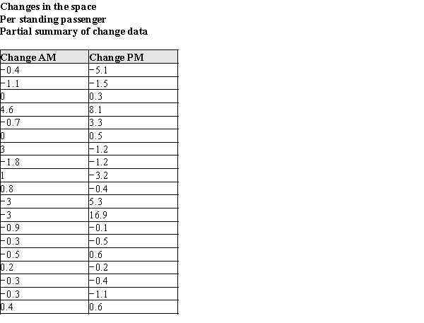 In the table below, summary information is presented for these data.
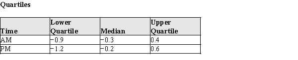
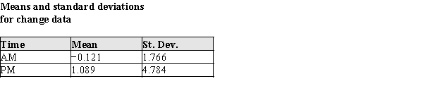
(a)Using the raw data and summary information presented in the tables above, construct box plots to compare the changes in available space the morning and afternoon. (Reminder: Don't forget to check for outliers!)(b)The Transit System wishes to know if their efforts to improve the standing space were successful. (Remember, more space is better!) Their engineers had suggested that the changes in the system would, on average, be more successful at increasing the available space in the morning than in the afternoon. Does the data support this initial belief? What specific aspects of the plot in part (a) support your answer?
(c)Using your box plots in part (a), write a short paragraph for the New York Times describing the success the Transit System had in increasing the available space per passenger. Note any differences in success between the morning rush and the afternoon rush.
(Essay)
4.9/5 (29)
Exhibit 3-2
In 1990 the New York Times reported the average number of square feet per standing passenger in 1987 and 1988 for 19 subway stops. Although the sampling method was not reported, we will presume that these data represent a random sample of days during the morning and evening rush hours. The NYC Transit Authority managers attempted to improve the space problem on subway cars (more space is better--trust us!) by adding cars to trains during the rush hours. They gathered the 1988 data to check on their efforts after one year. The data are in the table below. 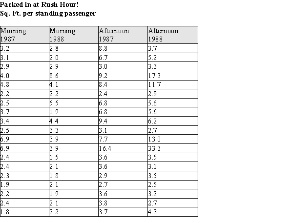 -Refer to Exhibit 3-2.
The MTA guidelines in 1987 specified a minimum of 3 square feet per standing passenger. The engineers would like to report standardized measures (z-scores) of this target value. That is, for each year and time of day, they will report how far away the target value of 3 feet is relative to the different distributions.
(a)Consider the original passenger space data for the morning rush in 1987, used in Exhibit 3-2. What are the mean and standard deviation for the sample?
-Refer to Exhibit 3-2.
The MTA guidelines in 1987 specified a minimum of 3 square feet per standing passenger. The engineers would like to report standardized measures (z-scores) of this target value. That is, for each year and time of day, they will report how far away the target value of 3 feet is relative to the different distributions.
(a)Consider the original passenger space data for the morning rush in 1987, used in Exhibit 3-2. What are the mean and standard deviation for the sample?  =
s =
(b)How many standard deviations above/below the mean is the target value of 3 feet for the distribution in part (a)?
=
s =
(b)How many standard deviations above/below the mean is the target value of 3 feet for the distribution in part (a)?
(Essay)
4.9/5 (32)
In order to attribute changes in nest activity to the active influence of the queen, 9 nests were randomly selected for experimental treatment. The normal activity of the nests were measured, and treatments were administered as described below:
Queens and Workers: Experimental Treatments
Normal treatment:
The observations were made of the undisturbed state of the nest as originally located.
Queen removed:
The queen was removed from the nest for about an hour.
Queen cooled/inactive:
The queen was removed to a cool environment, making her inactive, and returned to the nest; thus, she is present in the nest, but not able to interact with the worker wasps.
The data for the control treatment and each of the experimental treatments is given in the table below. The Activity Levels are the average proportion of active nest time for workers who were present in the normal and two experimental treatment periods. For example, 0.50 would mean for that nest the average amount of time the workers were actively working was 0.50 of the available time during that treatment. (The colony numbers are for identification in the table only.) 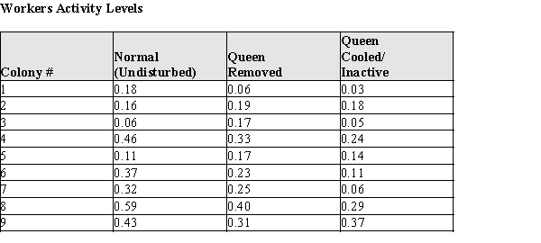
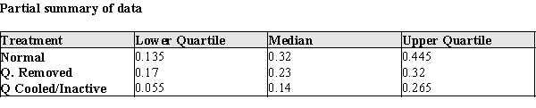
(a)Construct comparative box plots of the active nest times for (a) normal, (b) Queen removed, and (c) Queen Cooled/Inactive. (Note: since the data are proportions, there are no actual units for the data.)(b)Two current theories about the queen's interaction with workers are that (A) the queen increases worker activity by her mere presence, or (B) she increases worker activity by interacting with worker bees. Based on your plot in part (a), which theory--if either--is supported by the data? Justify your conclusion with an appropriate statistical argument.
(c)What are the mean and standard deviation of the proportion of worker activity for undisturbed wasp nests.
(a)Construct comparative box plots of the active nest times for (a) normal, (b) Queen removed, and (c) Queen Cooled/Inactive. (Note: since the data are proportions, there are no actual units for the data.)(b)Two current theories about the queen's interaction with workers are that (A) the queen increases worker activity by her mere presence, or (B) she increases worker activity by interacting with worker bees. Based on your plot in part (a), which theory--if either--is supported by the data? Justify your conclusion with an appropriate statistical argument.
(c)What are the mean and standard deviation of the proportion of worker activity for undisturbed wasp nests.  =
s =
(d)One of the nests (Colony #4) has a proportion of worker activity of 0.46. How many standard deviations above/below the mean is the worker activity level in this nest?
=
s =
(d)One of the nests (Colony #4) has a proportion of worker activity of 0.46. How many standard deviations above/below the mean is the worker activity level in this nest?
(Essay)
4.9/5 (31)
Exhibit 3-2
In 1990 the New York Times reported the average number of square feet per standing passenger in 1987 and 1988 for 19 subway stops. Although the sampling method was not reported, we will presume that these data represent a random sample of days during the morning and evening rush hours. The NYC Transit Authority managers attempted to improve the space problem on subway cars (more space is better--trust us!) by adding cars to trains during the rush hours. They gathered the 1988 data to check on their efforts after one year. The data are in the table below.
-Refer to Exhibit 3-2.
(a)Construct a comparative stem & leaf plot of the space per standing passenger for the morning rushes of 1987 vs. the morning rushes of 1988.
(b)Using your plot in part (a), describe the differences and similarities in the distributions of the morning standing room for the two years.
(Essay)
5.0/5 (30)
Consider a study in which the heights of a sample of 1000 high school seniors were recorded. The mean height is 70" and the standard deviation of the heights is 3". It is observed that the height distribution is approximately normal.
(a)Approximately what percent of heights in this sample would exceed 79"?
(b)What is the approximate percentile of a senior who is 73" tall?
(c)When the data were summarized the value of the first quartile was written down but then smudged. There is general agreement that the writer meant to indicate either 66" or 68". Which of these values is most likely the correct one? Justify your answer with appropriate statistical reasoning.
(Essay)
4.8/5 (32)
Exhibit 3-1
In recent years there has been considerable discussion about the appropriateness of the body shapes and proportions of Ken and Barbie dolls. These dolls are very popular, and there is some concern that the dolls may be viewed as having the "ideal body shape," potentially leading young children to risk anorexia in pursuit of that ideal. Researchers investigating the dolls' body shapes scaled Ken and Barbie up to a common height of 170.18 cm (5' 7") and compared them to body measurements of active adults. Common measures of body shape are the chest (bust), waist, and hip circumferences. These measurements for Ken and Barbie and their reference groups are presented in the table below: 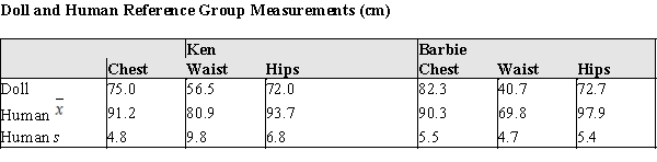 For the following questions, suppose that the researchers' scaled up dolls suddenly found themselves in the human world of actual men and women.
-Refer to Exhibit 3-1.
(a)Convert Barbie's chest, waist, and hips measurements to z-scores. Which of those measures appears to be the most different from Barbie's reference group? Justify your response with an appropriate statistical argument.
(b)The z-scores for Ken's Chest, Waist, and Hips when compared to active male adults are approximately −3.4, −2.5, and −3.2 respectively. Do these z-scores provide evidence to justify the claim that the Ken doll is a thin representation of adult men? Justify your response
(c)If women's waist measurements are approximately normally distributed, based on the sample above what is the approximate percentile of an 80 cm waist?
For the following questions, suppose that the researchers' scaled up dolls suddenly found themselves in the human world of actual men and women.
-Refer to Exhibit 3-1.
(a)Convert Barbie's chest, waist, and hips measurements to z-scores. Which of those measures appears to be the most different from Barbie's reference group? Justify your response with an appropriate statistical argument.
(b)The z-scores for Ken's Chest, Waist, and Hips when compared to active male adults are approximately −3.4, −2.5, and −3.2 respectively. Do these z-scores provide evidence to justify the claim that the Ken doll is a thin representation of adult men? Justify your response
(c)If women's waist measurements are approximately normally distributed, based on the sample above what is the approximate percentile of an 80 cm waist?
(Essay)
4.8/5 (35)
If there are no outliers, a skeletal and modified boxplot can differ in the length of the box, but not in the whisker lengths.
(True/False)
5.0/5 (34)
Which statistical parameters of the numerical data distribution are commonly used to describe a variability of the distribution?
(Multiple Choice)
4.9/5 (35)
Costs per serving (in cents) for 16 high-fiber cereals rated very good or good by Consumer Reports are shown below: 
Compute the mean and standard deviation for the above data set.
Compute the mean and standard deviation for the above data set.
(Multiple Choice)
4.7/5 (27)
The data in the table below are from observations taken on Roman coins dating from the first three centuries AD. Historians believe that different mints might reveal themselves in different trace element profiles in the coins; these coins are known to have been minted in Rome. The technique of Atomic Absorption Spectrometry was used to estimate the % by weight of various elements in these coins; the % by weight that is gold is presented here. 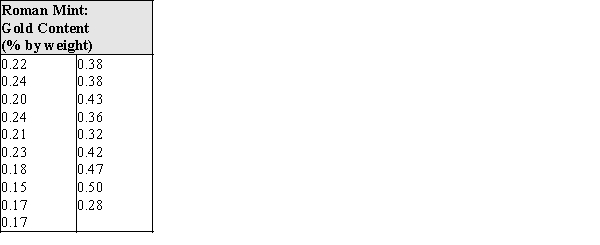
(a)Calculate these numerical summaries:
The mean _______________
The standard deviation _______________
The median _______________
The interquartile range _______________
(b)Construct a skeletal box plot for these data.
(c)Judging from the data and your responses in parts (a) and (b), would you say this distribution is skewed or approximately symmetric? Justify your response using appropriate statistical terminology.
(Essay)
4.8/5 (32)
The National U.S. Bureau of Labor Statistics (https://www.bls.gov/web/laus/laumstrk.htm) published the average unemployment rate in November 2017 for States (see table below). Find the center of this data set and interpret it. 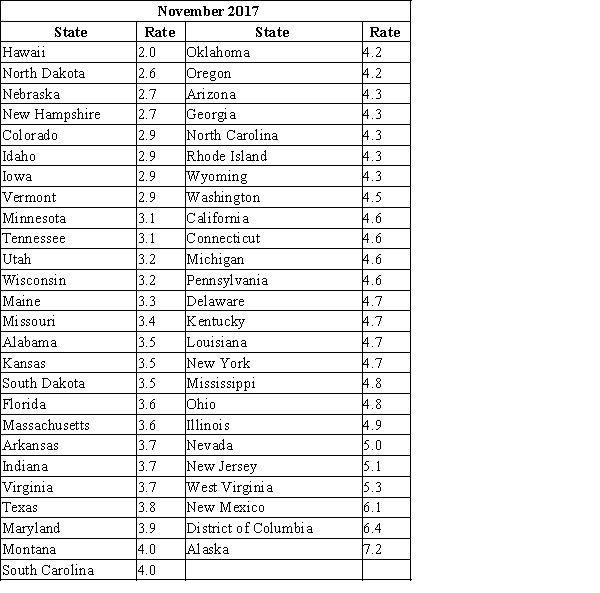
Choose the most appropriate description for the center of this data.
Choose the most appropriate description for the center of this data.
(Multiple Choice)
4.9/5 (28)
Exhibit 3-1
In recent years there has been considerable discussion about the appropriateness of the body shapes and proportions of Ken and Barbie dolls. These dolls are very popular, and there is some concern that the dolls may be viewed as having the "ideal body shape," potentially leading young children to risk anorexia in pursuit of that ideal. Researchers investigating the dolls' body shapes scaled Ken and Barbie up to a common height of 170.18 cm (5' 7") and compared them to body measurements of active adults. Common measures of body shape are the chest (bust), waist, and hip circumferences. These measurements for Ken and Barbie and their reference groups are presented in the table below: For the following questions, suppose that the researchers' scaled up dolls suddenly found themselves in the human world of actual men and women.
-Refer to Exhibit 3-1.
(a)Convert Ken's chest, waist, and hips measurements to z-scores. Which of those measures appears to be the most different from Ken's reference group? Justify your response with an appropriate statistical argument.
(b)The z-scores for Barbie's Chest, Waist, and Hips when compared to active female adults are approximately −1.4, −6.2, and −4.7 respectively. Do these z-scores provide evidence to justify the claim that the Barbie doll is a thin representation of adult women? Justify your response with an appropriate statistical argument.
(c)If men's waist measurements are approximately normally distributed, based on the sample above what is the approximate percentile of a 100 cm waist?
(Essay)
4.9/5 (28)
Filters
- Essay(0)
- Multiple Choice(0)
- Short Answer(0)
- True False(0)
- Matching(0)