Exam 2: Graphical Methods for Describing Data Distributions
In a story written in December 2002, the Des Moines Register reported on the percentages of students who qualify for Free/Reduced lunch programs in the elementary schools in Des Moines, Iowa. The data, by elementary school, appears in the table below. 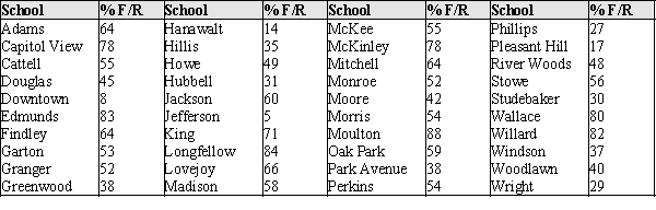 The data presented in the table about the Des Moines, Iowa, elementary schools was from an article that related the percent of children eligible for Free and Reduced lunch and teacher experience. The percent of children eligible for Free/Reduced lunch is generally regarded as an indicator of the socio-economic status of a neighborhood. The concern of the Des Moines Register in the article was that the least experienced teachers typically teach students from low-income families. The accompanying scatter plot shows the data from the article.
 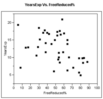 (a)If the Des Moines Register is correct, what sort of pattern should "ideally" appear in the scatter plot?
(b)Does this pattern emerge in these data? (Hint: Consider separately those schools with less than 75% eligibility, and those with greater than 75% eligibility for Free/Reduced lunch.)
(a)If the Des Moines Register is correct, what sort of pattern should "ideally" appear in the scatter plot?
(b)Does this pattern emerge in these data? (Hint: Consider separately those schools with less than 75% eligibility, and those with greater than 75% eligibility for Free/Reduced lunch.)
a)If the newspaper is correct, then schools with lower-income families would have both a higher rate of free lunches and a lower level of teacher experience. This would show in the graph as a decreasing trend: as the percentage of free lunches increases, the average years experience should decrease.
b)This is shown in the graph. Those schools with more than 75% eligibility for free lunches have less experience (no more than 10 years), while the schools that have less than 75% eligibility have average experience values up to more than 20 years. However, this trend is only moderate at best.
The most important right and responsibility of citizens in a democratic society is voting. The bar chart below shows, for different age groups in the 2000 presidential election in the United States, the percentage of individuals in that age group who are registered to vote. 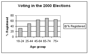 (a)Describe in a few sentences the registration pattern that you see in the data above.
(b)Some individuals argue that the reason for the current level of registration in the 18-24 year-old group is that many of them are college students and would have to vote absentee. In your opinion, would that explain the registration level for the 18 - 24 age-group? Why or why not?
(a)Describe in a few sentences the registration pattern that you see in the data above.
(b)Some individuals argue that the reason for the current level of registration in the 18-24 year-old group is that many of them are college students and would have to vote absentee. In your opinion, would that explain the registration level for the 18 - 24 age-group? Why or why not?
a)The proportion of people registering is smallest for the 18-24 year-old group, and gets larger with age, until finally declining in the 75+ year-old group.
b)Voting by absentee ballot may be more of a hassle b/c you have to get the ballot, but actual registration could be done at home before going to college. It would seem that unless the 18-24 year-olds decide for some reason they will not vote in their college years because of expected hassle of voting, the future voting would not be affecting the registration level.
Each person in a sample of 800 students who identified themselves as Democrats was asked about his or her mother's political party. The responses are summarized in the following table:  Construct and sketch a pie chart for these data.
pie chart: 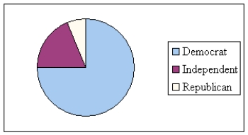
Investigators studying the relation between gender and the interests of early adolescents asked boys and girls in grades 5-9 to indicate on a 7-point scale their degree of interest in topics such as Life, Sports, and Cars.
The data in the scatter plot represent average levels of interest for boys and girls in grades 5 - 9. Each point represents one topic listed by the investigators. For example, boys average rating for "Opposite sex" as a 6.2, while girls on average rated their interest in this topic as 6.0 on the 7 point interest scale. This is recorded as the point (6.2, 6.0). 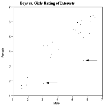 There are three interesting features of this scatter plot that you are to interpret below. What can you infer from each of these features of the scatterplot?
(a)The points generally seem to scatter around the line, y = x.
(b)There seem to be three clusters of points, one in the lower left, one in the middle, and one in the upper right of the graph.
(c)There are two points (as indicated by the arrows) that do not seem to fit the overall pattern. What can be said about the topics these points represent?
There are three interesting features of this scatter plot that you are to interpret below. What can you infer from each of these features of the scatterplot?
(a)The points generally seem to scatter around the line, y = x.
(b)There seem to be three clusters of points, one in the lower left, one in the middle, and one in the upper right of the graph.
(c)There are two points (as indicated by the arrows) that do not seem to fit the overall pattern. What can be said about the topics these points represent?
For stem and leaf plots with single-digit leaves, commas must be used to separate the leaves.
In recent years there has been a change in the grocery shopping habits of shoppers. "Non-traditional" stores such as gas stations and Wal-Marts are now selling groceries. The stacked bar chart below shows the percentages of market share for Traditional, Non-traditional, and Convenience stores for 1988 and 2005. 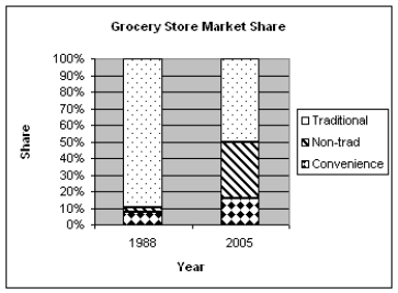 (a)In a few sentences describe how the proportions of market share have changed for traditional grocery stores from 1988 to 2005.
(b)The market share for which type of store has grown the most, compared to their market share in 1988. What aspect of the chart shows this?
(a)In a few sentences describe how the proportions of market share have changed for traditional grocery stores from 1988 to 2005.
(b)The market share for which type of store has grown the most, compared to their market share in 1988. What aspect of the chart shows this?
In 1986 marine biologists reported the discovery of a new species of fish in the Western North Atlantic. Data on the head length (n = 41) and pelvic fin length (n = 30) are shown below. 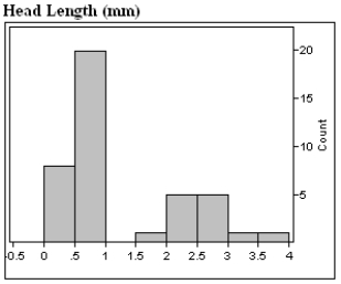
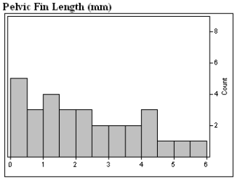 a)Describe in appropriate statistical terms, the distributions of these two variables.
b)The distribution of head lengths certainly appears to be rather strange. What do you think might account for the shape of this distribution?
a)Describe in appropriate statistical terms, the distributions of these two variables.
b)The distribution of head lengths certainly appears to be rather strange. What do you think might account for the shape of this distribution?
Ruminants are hoofed animals such as cattle and sheep. Two categories of ruminants are browsers (leaf eaters) and grazers (grass eaters). Some biologists believe that the incisor arcade, that part of the mouth between the incisors, is shaped differently for browsers and grazers, and that might explain their food selection. The "curvature" of an incisor arcade is a measure of its shape, with large values indicating a long, thin mouth, and small values a shorter, wider mouth. The back-to-back stem plot below compares the curvatures of incisor arcades of a sample of species of browsers and grazers in the ruminant family. 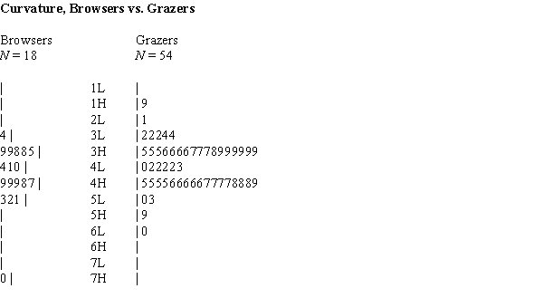
(a)Briefly describe each of the two curvature distributions, browsers and grazers, noting any unusual features of the data.
(b)The theory of some biologists is that browsers have thinner mouths because the browse plants frequently have thorns and spines; browsers have evolved to have thinner mouths to get beyond the thorns and spines to the food part of the plant. Is the data in the back-to-back stem plot consistent with this theory? What aspect of the data would you consider when answering this question?
The cumulative relative frequency plot shown was constructed using data on the percentage of college students enrolled in public institutions for the 50 U.S. states. Which of the following is closest to the approximate proportion of states that have more than 90 percent of college students enrolled in public institutions? 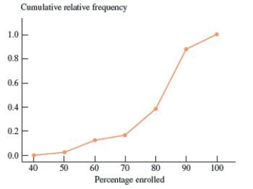
The annual household incomes, in thousands of dollars, for 150 households in a small community are summarized in the histogram below. 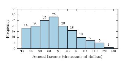 What proportion of households have annual incomes of $90,000 or more?
In the article, "Dimensional Relationships for Flying Animals," the wing areas in square centimeters of gliding birds of prey are reported. Night hunters are distinguished from the birds that hunt during the daylight hours, and the wing areas for samples of each type of bird are displayed in the following table: 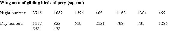
a)Construct a comparative (back to back) stem & leaf plot for the wing area for the two types of birds.
(b)Biologists speculate that since birds could be detected at a distance by their prey during the day, the species that hunt during the day should be smaller on average than those that hunt at night. Are the data as displayed in part (a) consistent with this theory? What specific aspects of the plot in part (a) support your answer?
Exhibit 2-2
In a story written in December 2002, the Des Moines Register reported on the percentages of students who qualify for Free/Reduced lunch programs in the elementary schools in Des Moines, Iowa. The data, by elementary school, appears in the table below.
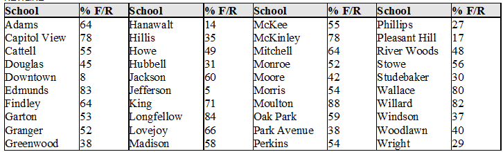 -Refer to Exhibit 2-2.
(a)Construct a histogram for these data, using the following class intervals:
0 to < 20
20 to < 40, etc.
(b)Describe the distribution of Free/Reduced eligibility percents, and note any unusual features.
-Refer to Exhibit 2-2.
(a)Construct a histogram for these data, using the following class intervals:
0 to < 20
20 to < 40, etc.
(b)Describe the distribution of Free/Reduced eligibility percents, and note any unusual features.
Exhibit 2-4
In the article, "Scaling of Mammalian Long Bones: Small and Large Mammals Compared," the average circumferences (distances around) in mm of the humerus, femur, and tibia of different species of mammals were reported. These are the long bones that primarily support the body mass in mammals. Each data value is the mean circumference for the available measures for a single species.
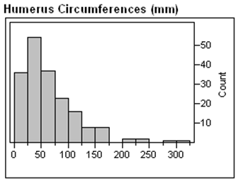
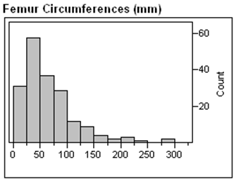
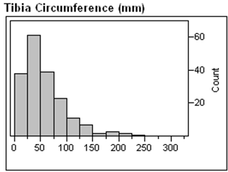 -Refer to Exhibit 2-4.
Describe the differences and similarities in the distributions of these different mammalian bones.
-Refer to Exhibit 2-4.
Describe the differences and similarities in the distributions of these different mammalian bones.
The following relative frequency distribution summarizes student responses to the question "If you could make your college choice over, would you still choose to enroll at your current college?"  Which of the following is the correct bar chart for the response data?
Investigators writing in the Journal of Early Adolescence were interested in the communication about sex and related topics between parents and 12-14 year olds. The investigators asked students and parents whether or not they had communicated with their child/parent about topics such as pregnancy, how to say "no," and methods of contraception. A scatter plot of their data is presented below. Each point represents one topic listed by the investigators. For example, 72.4% of parents and 57.6% of adolescents said the parents had discussed childbirth. This would be recorded as the point (57.6, 72.4). 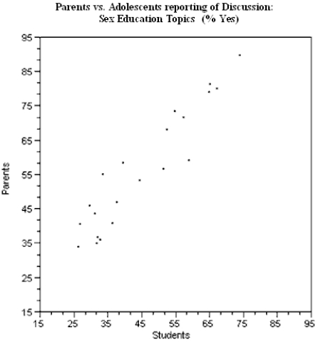 (a)On the graph above, sketch the line y = x, representing a line of "perfect agreement" between the parents and adolescents.
(b)What explanation do you have for the placement of the points in the scatter plot relative to the line you sketched in part (a)?
(a)On the graph above, sketch the line y = x, representing a line of "perfect agreement" between the parents and adolescents.
(b)What explanation do you have for the placement of the points in the scatter plot relative to the line you sketched in part (a)?
A curve with tails that decline more rapidly than the tails of a normal curve is called a heavy-tailed distribution.
The stem plot below displays the weights (in ounces) of a random sample of tomatoes grown on a local farm 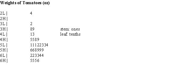
(a)Briefly describe the distribution of tomato weights.
(b)What is the weight of the heaviest tomato in the sample?
(a)Briefly describe the distribution of tomato weights.
(b)What is the weight of the heaviest tomato in the sample?
The frequency distribution shown summarizes data on the percentage of college students enrolled in public institutions for the 50 U.S. states.  What is the relative frequency for the 70 to < 80 interval?
The relative frequency for a particular category is the number of times the category appears in the data.
Filters
- Essay(0)
- Multiple Choice(0)
- Short Answer(0)
- True False(0)
- Matching(0)