Exam 4: Describing the Relation Between Two Variables
Exam 1: Data Collection118 Questions
Exam 2: Creating Tables and Drawing Pictures of Data77 Questions
Exam 3: Numerically Summarizing Data158 Questions
Exam 4: Describing the Relation Between Two Variables183 Questions
Exam 5: Probability266 Questions
Exam 6: Discrete Probability Distributions149 Questions
Exam 7: The Normal Probability Distribution123 Questions
Exam 8: Sampling Distributions46 Questions
Exam 9: Estimating the Value of a Parameter Using Confidence Intervals109 Questions
Exam 10: Hypothesis Tests Regarding a Parameter156 Questions
Exam 11: Inference on Two Samples125 Questions
Exam 12: Inference on Categorical Data39 Questions
Exam 13: Comparing Three or More Means51 Questions
Exam 14: Inference of the Least-Squares Regression Model and Multiple Regression82 Questions
Exam 15: Nonparametric Statistics74 Questions
Select questions type
The scatter diagram shows the relationship between average number of years of education and births per woman ofchild bearing age in selected countries. Use the scatter plot to determine whether the statement is true or false.
-There is no correlation between years of education and births per woman. 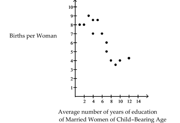
(Multiple Choice)
4.8/5  (31)
(31)
Write the word or phrase that best completes each statement or answers the question.
Provide an appropriate response.
-The data below represent the numbers of absences and the final grades of 15 randomly selected students from an astronomy class. Construct a scatter diagram for the data. Do you detect a trend?
Student Number Final Grade of Absences as a Percent 1 5 79 2 6 78 3 2 86 4 12 56 5 9 75 6 5 90 7 8 78 8 15 48 9 0 92 10 1 78 11 9 81 12 3 86 13 10 75 14 3 89 15 11 65
(Essay)
4.8/5 (31)
Interpret the Slope and the y-intercept of the Least-Squares Regression Line
-Each year a nationally recognized publication conducts its "Survey of America's Best Graduate and Professional Schools." An academic advisor wants to predict the typical starting salary of a graduate at a top business school using GMAT score of the school as a predictor variable. Total GMAT scores range from 200 to 800. A simple linear regression of SALARY versus GMAT using 25 data points shown below.
Give a practical interpretation of .
(Multiple Choice)
4.7/5 (35)
Compute the linear correlation coefficient between the two variables and determine whether a linear relation exists.
- 10 11 16 9 7 15 16 10 96 51 62 58 89 81 46 51
(Multiple Choice)
4.8/5 (33)
Compute and Interpret the Coefficient of Determination
-Calculate the coefficient of determination, given that the linear correlation coefficient, r, is -0.625. What does this tell you about the explained variation and the unexplained variation of the data about the regression line
(Short Answer)
4.9/5 (41)
Write the word or phrase that best completes each statement or answers the question.
Provide an appropriate response.
-Construct a scatter diagram for the given data. Determine whether there is a positive linear correlation, negative linear correlation, or no linear correlation.
-5 -3 4 1 -1 -2 0 2 3 -4 -10 -8 9 1 -2 -6 -1 3 6 -8
(Essay)
4.9/5 (32)
Compute the Sum of Squared Residuals
-The data below are the final exam scores of 10 randomly selected statistics students and the number of hours they slept the night before the exam. Compute the sum of the squared residuals of the least-squares line for the given data.
Hours, 3 5 2 8 2 4 4 5 6 3 Scores, 65 80 60 88 66 78 85 90 90 71
(Multiple Choice)
4.8/5 (30)
Write the word or phrase that best completes each statement or answers the question.
Provide an appropriate response.
-The numbers of home runs that Mark McGwire hit in the first 13 years of his major league baseball career are listed below. (Source: Major League Handbook) Construct a scatter diagram for the data. Is there a relationship between the home runs and the batting averages?
Home Runs 33 39 22 42 9 9 39 52 58 70 Batting Average .231 .235 .201 .268 .33 .252 .274 .312 .274 .299
(Essay)
4.8/5 (26)
Write the word or phrase that best completes each statement or answers the question.
Construct a scatter diagram for the data.
-The data below are the ages and systolic blood pressures (measured in millimeters of mercury) of 9 randomly selected adults.
Age, 38 41 45 48 51 53 57 61 65 Pressure, 116 120 123 131 142 145 148 150 152
(Short Answer)
4.9/5 (44)
Provide an appropriate response.
-The following data represent the living situation of newlyweds in a large metropolitan area and their annual household income. Find the marginal frequency for newlyweds who own their own home.
<\ 20,000 \ 20-35,000 \ 35-50,000 \ 50-75,000 >\ 75,000 Own home 31 52 202 355 524 Rent home 67 66 52 23 11 Live w/family 89 69 30 4 2
(Multiple Choice)
4.9/5 (35)
Write the expression as a sum of logs. Express powers as factors.
-
(Multiple Choice)
4.7/5 (27)
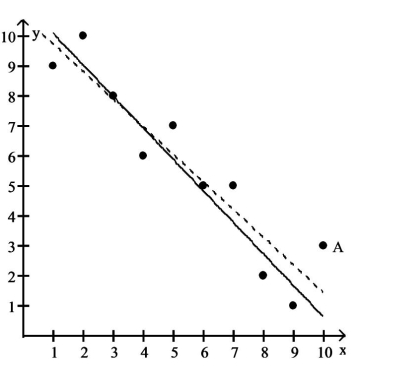
A scatter diagram is given with one of the points labeled ʺA.ʺ In addition, there are two least -squares regression lines
drawn. The solid line excludes the point A. The dashed line includes the point A. Based on the graph, is the point A
influential
-
(Multiple Choice)
4.8/5 (41)
Provide an appropriate response. 4 Use Logarithmic Transformations to Linearize Power Relations
-The following data represent the periods (in seconds) of simple pendulums of various lengths (in feet). Determine the logarithm of both the - and -values so that and .
Length, x Period, y 1 1.2 2 1.7 3 2.1 4 2.4 5 2.7 6 2.9
(Short Answer)
4.9/5 (36)
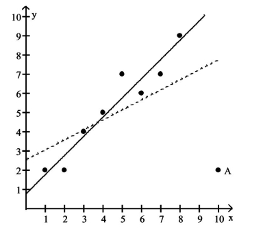
A scatter diagram is given with one of the points labeled ʺA.ʺ In addition, there are two least -squares regression lines
drawn. The solid line excludes the point A. The dashed line includes the point A. Based on the graph, is the point A
influential
-
(Multiple Choice)
4.7/5 (28)
Choose the one alternative that best completes the statement or answers the question.
-The following data represent the periods (in seconds) of simple pendulums of various lengths (in feet). Find the power equation of best fit.
Length, x Period, y 1 1.3 2 1.9 3 2.3 4 2.7 5 3.0 6 3.3
(Multiple Choice)
4.7/5 (36)
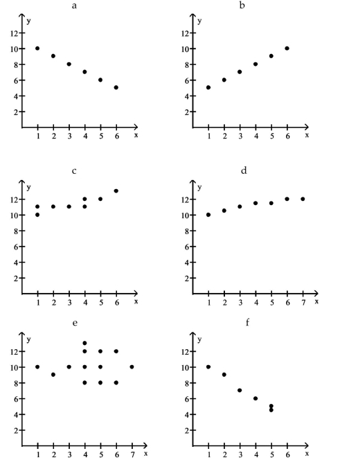
Use the scatter diagrams shown, labeled a through f to solve the problem.
-In which scatter diagram is r = 1 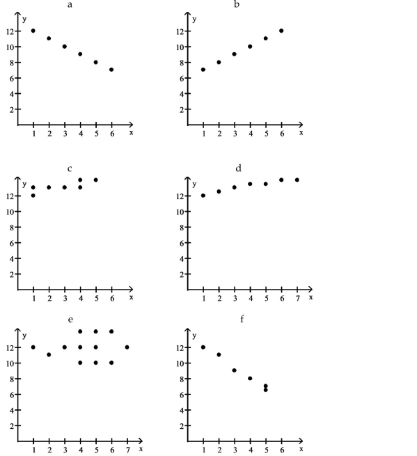
(Multiple Choice)
4.9/5 (30)
The scatter diagram shows the relationship between average number of years of education and births per woman ofchild bearing age in selected countries. Use the scatter plot to determine whether the statement is true or false.
-There is a strong negative correlation between years of education and births per woman. 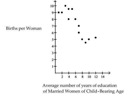
(Multiple Choice)
4.7/5 (37)
Use the scatter diagrams shown, labeled a through f to solve the problem.
-In which scatter diagram is
(Multiple Choice)
4.7/5 (35)
Write the word or phrase that best completes each statement or answers the question.
-In a comprehensive road test on all new car models, one variable measured is the time it takes a car to accelerate from 0 to 60 miles per hour. To model acceleration time, a regression analysis is conducted on a random sample of 129 new cars.
TIME60: y = Elapsed time (in seconds) from to
MAX: Maximum speed attained (miles per hour)
Initially, the simple linear model was fit to the data. Computer printouts for the analysis are given below:
UNWEIGHTED LEAST SQUARES LINEAR REGRESSION OF TIME60
 R-SQUARED 0.6960 RESID. MEAN SQUARE (MSE) 1.28695 ADJUSTED R-SQUARED 0.6937 STANDARD DEVIATION 1.13444
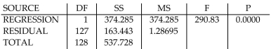 CASES INCLUDED 129 MISSING CASES 0
Find and interpret the estimate in the printout above.
CASES INCLUDED 129 MISSING CASES 0
Find and interpret the estimate in the printout above.
(Essay)
4.8/5 (29)
Filters
- Essay(0)
- Multiple Choice(0)
- Short Answer(0)
- True False(0)
- Matching(0)