Exam 2: Creating Tables and Drawing Pictures of Data
Exam 1: Data Collection118 Questions
Exam 2: Creating Tables and Drawing Pictures of Data77 Questions
Exam 3: Numerically Summarizing Data158 Questions
Exam 4: Describing the Relation Between Two Variables183 Questions
Exam 5: Probability266 Questions
Exam 6: Discrete Probability Distributions149 Questions
Exam 7: The Normal Probability Distribution123 Questions
Exam 8: Sampling Distributions46 Questions
Exam 9: Estimating the Value of a Parameter Using Confidence Intervals109 Questions
Exam 10: Hypothesis Tests Regarding a Parameter156 Questions
Exam 11: Inference on Two Samples125 Questions
Exam 12: Inference on Categorical Data39 Questions
Exam 13: Comparing Three or More Means51 Questions
Exam 14: Inference of the Least-Squares Regression Model and Multiple Regression82 Questions
Exam 15: Nonparametric Statistics74 Questions
Select questions type
The pie chart shows the percentage of votes received by each candidate in the student council presidential election. Use
the pie chart to answer the question.
-Scott Tarnowski owns a pet grooming shop. His prices for grooming dogs are based on the size of the dog. His records from last year are summarized below. Round percents to whole numbers. Class Frequency Large 345 Medium 830 Small 645
(Short Answer)
4.7/5  (38)
(38)
Create Cumulative Frequency and Relative Frequency Tables
-The April precipitation amounts (in inches) for 40 cities are listed below. Construct a frequency distribution, a relative frequency distribution, a cumulative frequency distribution, and a relative cumulative frequency distribution using eight classes. 2.0 3.2 1.8 2.9 0.9 4.0 3.3 2.9 3.6 0.8 3.1 2.4 2.4 2.3 1.6 1.6 4.0 3.1 3.2 1.8 2.2 2.2 1.7 0.5 3.6 3.4 1.9 2.0 3.0 1.1 3.0 4.0 4.0 2.1 1.9 1.1 0.5 3.2 3.0 2.2
(Short Answer)
4.8/5 (31)
Create Cumulative Frequency and Relative Frequency Tables
-The grade point averages for 40 evening students are listed below. Construct a relative frequency ogive using eight classes. 2.0 3.2 1.8 2.9 0.9 4.0 3.3 2.9 3.6 0.8 3.1 2.4 2.4 2.3 1.6 1.6 4.0 3.1 3.2 1.8 2.2 2.2 1.7 0.5 3.6 3.4 1.9 2.0 3.0 1.1 3.0 4.0 4.0 2.1 1.9 1.1 0.5 3.2 3.0 2.2
(Short Answer)
4.7/5 (35)
Relative frequency is the proportion (or percent) of observations within a category and is found using the formula: relative frequency
(True/False)
4.7/5 (39)
Create Cumulative Frequency and Relative Frequency Tables
-An ogive is a graph that represents cumulative frequencies or cumulative relative frequencies. The points labeled on the horizontal axis are the
(Multiple Choice)
4.8/5 (35)
Use the graph to answer the question. 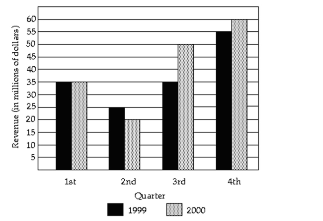 -In what quarter was the revenue the greatest for 2000
(Multiple Choice)
4.9/5 (35)
The pie chart shows the percentage of votes received by each candidate in the student council presidential election. Use
the pie chart to answer the question.
-Student Council President
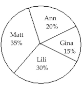 300 total votes Who got the fewest votes
(Multiple Choice)
4.7/5 (26)
Construct Histograms of Continuous Data
-What is the difference between a bar chart and a histogram
(Multiple Choice)
4.8/5 (42)
The pie chart shows the percentage of votes received by each candidate in the student council presidential election. Use
the pie chart to answer the question.
-A two-pound bag of assorted candy contained 100 caramels, 83 mint patties, 93 chocolate squares, 80 nut clusters, and 79 peanut butter taffy pieces. To create a pie chart of this data, the angle for the slice representing each candy type must be computed. What is the degree measure of the slice representing the mint patties rounded to the nearest degree?
(Multiple Choice)
4.8/5 (35)
The sum of all the relative frequencies of a distribution will always add up to 1.
(True/False)
4.9/5 (26)
Construct Frequency Polygons
- Weight (in pounds) Frequency 135-139 6 140-144 4 145-149 11 150-154 15 155-159 8
(Short Answer)
5.0/5 (33)
The pie chart shows the percentage of votes received by each candidate in the student council presidential election. Use
the pie chart to answer the question.
-The June precipitation amounts (in inches) for 40 cites are listed below. Construct a frequency distribution and a relative frequency distribution using eight classes.
2.0 3.2 1.8 2.9 0.9 4.0 3.3 2.9 3.6 0.8 3.1 2.4 2.4 2.3 1.6 1.6 4.0 3.1 3.2 1.8 2.2 2.2 1.7 0.5 3.6 3.4 1.9 2.0 3.0 1.1 3.0 4.0 4.0 2.1 1.9 1.1 0.5 3.2 3.0 2.2
(Short Answer)
4.8/5 (38)
The Excel frequency bar graph below describes the employment status of a random sample of U.S. adults. What is the percentage of those having no job 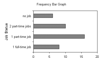
(Multiple Choice)
4.8/5 (41)
Draw Dot Plots
-The heights (in inches) of 30 mechanics are listed below. Construct a dot plot for the data. 70 72 71 70 69 73 69 68 70 71
67 71 70 74 69 68 71 71 71 72
69 71 68 67 73 74 70 71 69 68
(Short Answer)
4.7/5 (39)
Use the graph to answer the question.
-In what quarter was the revenue the least for 1999
(Multiple Choice)
4.7/5 (37)
Describe What Can Make a Graph Misleading or Deceptive
-The following graph shows the number of car accidents occurring in one city in each of the years 2001 through 2006. The number of accidents dropped in 2003 after a new speed limit was imposed. How is the bar graph misleading How would you redesign the graph to be less misleading 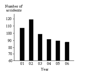
(Essay)
4.8/5 (31)
Identify the Shape of a Distribution
-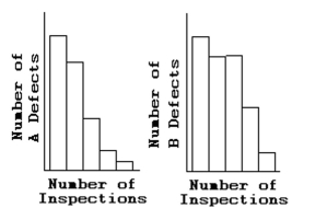 Is either histogram symmetric?
(Multiple Choice)
4.7/5 (36)
The pie chart shows the percentage of votes received by each candidate in the student council presidential election. Use
the pie chart to answer the question.
-
A sample of 15 Boy Scouts was selected and their weights (in pounds) were recorded as follows:
97 120 137 124 117 108 134 126 123 106 130 110 100 120 140
a. Using a class interval width of 10 , give the upper and lower boundaries for five class intervals, where the
lower boundary of the first class is 95 .
b. Construct a frequency distribution for the data
(Short Answer)
4.8/5 (30)
Create Cumulative Frequency and Relative Frequency Tables
-The local police, using radar, checked the speeds (in mph) of 30 motorists on a rural road. The results are listed below. Construct a frequency ogive using six classes. 44 38 41 50 36 36 43 42 49 48 35 40 37 41 43 50 45 45 39 38 50 41 47 36 35 40 42 43 48 33
(Short Answer)
4.8/5 (44)
Filters
- Essay(0)
- Multiple Choice(0)
- Short Answer(0)
- True False(0)
- Matching(0)