Exam 2: Describing Data: Frequency Tables, Frequency Distributions, and Graphic Presentation
Exam 1: What Is Statistics79 Questions
Exam 2: Describing Data: Frequency Tables, Frequency Distributions, and Graphic Presentation129 Questions
Exam 3: Describing Data: Numerical Measures132 Questions
Exam 4: Describing Data: Displaying and Exploring Data108 Questions
Exam 5: A Survey of Probability Concepts130 Questions
Exam 6: Discrete Probability Distributions128 Questions
Exam 7: Continuous Probability Distributions131 Questions
Exam 8: Sampling Methods and the Central Limit Theorem115 Questions
Exam 9: Estimation and Confidence Intervals129 Questions
Exam 10: One-Sample Tests of Hypothesis134 Questions
Exam 11: Two-Sample Tests of Hypothesis130 Questions
Exam 12: Analysis of Variance128 Questions
Exam 13: Correlation and Linear Regression130 Questions
Exam 14: Multiple Regression Analysis129 Questions
Exam 15: Index Numbers129 Questions
Exam 16: Time Series and Forecasting129 Questions
Exam 17: Nonparametric Methods: Goodness-Of-Fit Tests129 Questions
Exam 18: Nonparametric Methods: Analysis of Ranked Data129 Questions
Exam 19: Statistical Process Control and Quality Management129 Questions
Exam 20: An Introduction to Decision Theory115 Questions
Select questions type
To calculate a relative frequency, a class frequency is divided by ____________.
(Short Answer)
4.8/5  (39)
(39)
The relative frequency for a class is computed as the class
(Multiple Choice)
4.9/5 (26)
Refer to the following breakdown of responses to a survey of room cleanliness in a hotel. 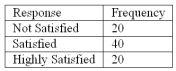 Draw a bar graph that illustrates the frequency table above.
(Essay)
4.8/5 (36)
Refer to the following breakdown of responses to a survey of "Are you concerned about being tracked while connected to the Internet"? 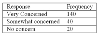 What type of chart should be used to show relative class frequencies?
(Multiple Choice)
4.8/5 (34)
To convert a frequency distribution to a relative frequency distribution, divide each class frequency by the sum of the class frequencies.
(True/False)
4.7/5 (45)
Refer to the following breakdown of responses to a survey of "Are you concerned about being tracked while connected to the Internet"? 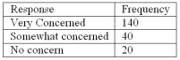 What is the class with the greatest frequency?
(Multiple Choice)
4.9/5 (30)
A student was studying the political party preferences of a university's student population. The survey instrument asked students to identify their political preference, for example, democrat, republican, libertarian, or other party. The best way to illustrate the relative frequency distribution is a:
(Multiple Choice)
5.0/5 (27)
A frequency distribution groups data into classes showing the number of observations in each class.
(True/False)
4.8/5 (39)
What is the difference in application between a bar chart and a pie chart?
(Essay)
4.8/5 (36)
What is the suggested class interval for a frequency distribution if the data ranges from 100 to 220 with 50 observations? ____________________
(Short Answer)
4.9/5 (38)
A sample distribution of hourly earnings in Paul's Cookie Factory is: 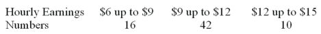 The limits of the class with the smallest frequency are:
(Multiple Choice)
4.8/5 (32)
Refer to the following breakdown of responses to a survey of room service in a hotel. 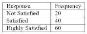 What is the class with the greatest frequency?
(Multiple Choice)
4.8/5 (45)
Refer to the following distribution: 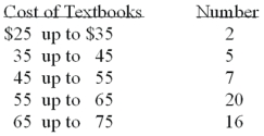 What is the relative class frequency for the $25 up to $35 class?
(Multiple Choice)
4.9/5 (35)
When classes in a frequency table are constructed so that each observation will fit into only one class, the categories are ________________________.
(Short Answer)
4.9/5 (33)
The midpoint of a class, which is also called a class mark, is halfway between the lower and upper limits.
(True/False)
4.9/5 (38)
Refer to the following wage breakdown for a garment factory. 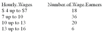 What is the class midpoint for the class with the greatest frequency?
(Multiple Choice)
4.9/5 (36)
Why are unequal class intervals sometimes used in a frequency distribution?
(Multiple Choice)
4.8/5 (32)
A student was studying the political party preferences of a university's student population. The survey instrument asked students to identify their political preference, for example, democrat, republican, libertarian, or other party. The best way to illustrate the frequencies for each political preference is a:
(Multiple Choice)
4.7/5 (36)
A group of 100 students were surveyed about their interest in a new Economics major. Interest was measured in terms of high, medium, or low. 30 students responded high interest; 50 students responded medium interest; 20 students responded low interest. What is the best way to illustrate the relative frequency of student interest?
A. Cumulative frequency polygon
B. Bar chart
C. Pie chart
D. Frequency table
(Short Answer)
4.8/5 (37)
Filters
- Essay(0)
- Multiple Choice(0)
- Short Answer(0)
- True False(0)
- Matching(0)