Exam 2: Tabular and Graphical Methods
Exam 1: Statistics and Data102 Questions
Exam 2: Tabular and Graphical Methods123 Questions
Exam 3: Numerical Descriptive Measures152 Questions
Exam 4: Introduction to Probability148 Questions
Exam 5: Discrete Probability Distributions158 Questions
Exam 6: Continuous Probability Distributions143 Questions
Exam 7: Sampling and Sampling Distributions136 Questions
Exam 8: Interval Estimation131 Questions
Exam 9: Hypothesis Testing116 Questions
Exam 10: Statistical Inference Concerning Two Populations131 Questions
Exam 11: Statistical Inference Concerning Variance120 Questions
Exam 12: Chi-Square Tests120 Questions
Exam 13: Analysis of Variance120 Questions
Exam 14: Regression Analysis140 Questions
Exam 15: Inference With Regression Models125 Questions
Exam 16: Regression Models for Nonlinear Relationships118 Questions
Exam 17: Regression Models With Dummy Variables130 Questions
Exam 18: Time Series and Forecasting125 Questions
Exam 19: Returns, Index Numbers, and Inflation120 Questions
Exam 20: Nonparametric Tests120 Questions
Select questions type
An auto parts chain asked customers to complete a survey rating the chain's customer service as average, above average, or below average. The following table shows the results from the survey.  (See the Excel Data File.) A rating of Average or Above Average accounted for what number of responses to the survey?
(Multiple Choice)
4.9/5  (44)
(44)
The following data represent the recent sales price (in $1,000s) of 24 homes in a Midwestern city  (See the Excel Data File.) Suppose the data are grouped into five classes, and one of them will be "115 up to 140"-that is, {x; 115 ≤ x < 140}. The relative frequency of this class is ________.
(Multiple Choice)
4.9/5 (41)
An analyst constructed the following frequency distribution on the monthly returns for 50 selected stocks. 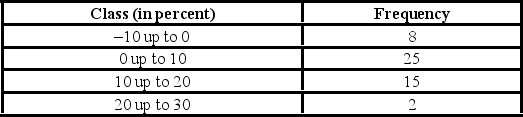 The number of stocks with returns of 0% up to 10% is ________.
(Multiple Choice)
5.0/5 (34)
Recent home sales in a suburb of Washington, D.C., are shown in the accompanying ogive. 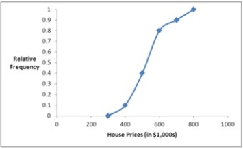 Approximate the percentage of houses that sold for less than $600,000.
(Multiple Choice)
4.9/5 (32)
When constructing a pie chart, only a few, the most frequent, categories must be included in the pie.
(True/False)
4.8/5 (30)
The following table shows average wind speeds (in miles per hour) during 15 major fires in California.  (See the Excel Data File.)
Construct a stem-and-leaf diagram. Were most of these storms fueled by 45+ mile-per-hour winds? Explain.
(See the Excel Data File.)
Construct a stem-and-leaf diagram. Were most of these storms fueled by 45+ mile-per-hour winds? Explain.
(Essay)
4.8/5 (42)
A hair stylist records the hair color of her 25 most recent appointments, classifying the color as blonde, brown, black, or red. Her data set is displayed next.  (See the Excel Data File.)
A) Construct a frequency and relative frequency distribution of the hair color of the stylist's customers.
B) Construct a pie chart. Which hair color is the most common among the stylist's customers?
C) Create a bar chart to display the frequency distribution. How many customers had black hair?
(See the Excel Data File.)
A) Construct a frequency and relative frequency distribution of the hair color of the stylist's customers.
B) Construct a pie chart. Which hair color is the most common among the stylist's customers?
C) Create a bar chart to display the frequency distribution. How many customers had black hair?
(Essay)
4.7/5 (33)
Use the following data to construct a scatterplot. What type of relationship is implied?  (See the Excel Data File.)
(Multiple Choice)
4.9/5 (43)
For quantitative data, a cumulative relative frequency distribution records the proportion (fraction) of values that fall below the upper limit of each class.
(True/False)
4.9/5 (32)
When displaying quantitative data, what is an ogive used to plot?
(Multiple Choice)
4.9/5 (34)
The following is a list of five of the world's busiest airports by passenger traffic for Year 1.  How many more millions of passengers flew out of Atlanta than flew out of Chicago?
(Multiple Choice)
4.8/5 (34)
Students in Professor Smith's business statistics course have evaluated the overall effectiveness of the professor's instruction on a five-point scale, where a score of 1 indicates very poor performance and a score of 5 indicates outstanding performance. The raw scores are displayed in the accompanying table.  (See the Excel Data File.) What percentage of students gave professor Smith an evaluation higher than 3?
(Multiple Choice)
4.8/5 (29)
A histogram is a series of rectangles where the width and height of each rectangle represent the frequency (or relative frequency) and the width of the respective class.
(True/False)
4.8/5 (34)
When using a polygon to graph quantitative data, what does each point represent?
(Multiple Choice)
4.9/5 (29)
The following data represent the recent sales price (in $1,000s) of 24 homes in a Midwestern city.  (See the Excel Data File.) Suppose the data on house prices will be grouped into five classes. The width of the classes for a frequency distribution or histogram is the closest to ________.
(Multiple Choice)
4.7/5 (38)
When constructing a frequency distribution for quantitative data classes are mutually ________ and ________.
(Short Answer)
4.8/5 (35)
The following frequency distribution shows the frequency of the asking price, in thousands of dollars, for current homes on the market in a particular city. 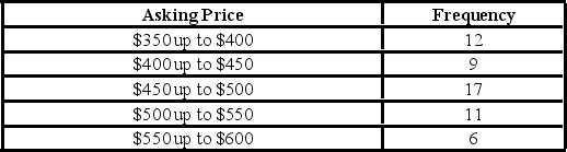 What percentage of houses has an asking price under $550,000?
(Multiple Choice)
4.8/5 (39)
Students in Professor Smith's business statistics course have evaluated the overall effectiveness of the professor's instruction on a five-point scale, where a score of 1 indicates very poor performance and a score of 5 indicates outstanding performance. The raw scores are displayed in the accompanying table:  (See the Excel Data File.) What is the most common score given in the evaluations?
(Multiple Choice)
4.9/5 (34)
A scatterplot depicts a positive ________ relationship, if as x increases, y tends to increase at an increasing rate.
(Short Answer)
4.8/5 (36)
Filters
- Essay(0)
- Multiple Choice(0)
- Short Answer(0)
- True False(0)
- Matching(0)