Exam 2: Tabular and Graphical Methods
Exam 1: Statistics and Data102 Questions
Exam 2: Tabular and Graphical Methods123 Questions
Exam 3: Numerical Descriptive Measures152 Questions
Exam 4: Introduction to Probability148 Questions
Exam 5: Discrete Probability Distributions158 Questions
Exam 6: Continuous Probability Distributions143 Questions
Exam 7: Sampling and Sampling Distributions136 Questions
Exam 8: Interval Estimation131 Questions
Exam 9: Hypothesis Testing116 Questions
Exam 10: Statistical Inference Concerning Two Populations131 Questions
Exam 11: Statistical Inference Concerning Variance120 Questions
Exam 12: Chi-Square Tests120 Questions
Exam 13: Analysis of Variance120 Questions
Exam 14: Regression Analysis140 Questions
Exam 15: Inference With Regression Models125 Questions
Exam 16: Regression Models for Nonlinear Relationships118 Questions
Exam 17: Regression Models With Dummy Variables130 Questions
Exam 18: Time Series and Forecasting125 Questions
Exam 19: Returns, Index Numbers, and Inflation120 Questions
Exam 20: Nonparametric Tests120 Questions
Select questions type
Thirty students at Eastside High School took the SAT on the same Saturday. Their raw scores are given next.  (See the Excel Data File.) Consider a frequency distribution of the data that groups the data in classes of 1400 up to 1600, 1600 up to 1800, 1800 up to 2000, and so on. What percent of students scored less than 2200?
(Multiple Choice)
4.8/5  (22)
(22)
For quantitative data, a relative frequency distribution identifies the proportion of observations that fall into each class.
(True/False)
4.8/5 (44)
The following histogram represents the number of pages in each book within a collection. What is the frequency of books containing at least 250 but fewer than 300 pages? 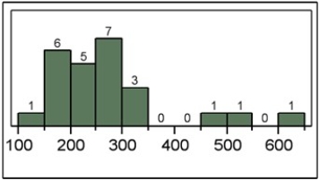
(Multiple Choice)
4.8/5 (31)
A frequency distribution for qualitative data groups these data into classes called intervals and records the total number of observations in each class.
(True/False)
4.8/5 (34)
Consider the following stem-and-leaf diagram.  Which of the following statements is correct?
(Multiple Choice)
4.8/5 (30)
To approximate the width of a class in the creation of a bar chart, we may use this formula: 
(True/False)
4.9/5 (32)
In the accompanying stem-and-leaf diagram, the values in the stem-and-leaf portions represent 10s and 1s digits, respectively.  What would be the frequency of the class 35 up to 45, that is {x; 35 ≤ x < 45}?
(Multiple Choice)
4.8/5 (42)
A statistics instructor computes the grade and percentage of classes that each of his students attends. Construct a scatterplot from the data displayed next. Does a relationship exist between attendance and grade?  (See the Excel Data File.)
(Essay)
4.9/5 (39)
A bar chart depicts the frequency or relative frequency of each category of qualitative data as a bar rising vertically from the horizontal axis. It is also acceptable for the bar to extend horizontally from the vertical axis.
(True/False)
4.9/5 (39)
Thirty students at Eastside High School took the SAT on the same Saturday. Their raw scores are given next.  (See the Excel Data File.) Consider a frequency distribution of the data that groups the data in classes of 1400 up to 1600, 1600 up to 1800, 1800 up to 2000, and so on. What graphical tool would you use to display the cumulative relative frequency of the grouped data?
(Multiple Choice)
4.7/5 (36)
An analyst constructed the following frequency distribution on the monthly returns for 50 selected stocks. 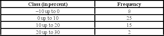 The number of stocks with returns of less than 10% is ________.
(Multiple Choice)
4.7/5 (36)
Johnson and Johnson (JNJ) is a consumer staples company. Consumer staples are products people need and buy even during times of financial hardship. Do you think JNJ will have a volatile stock price? Does the accompanying graph accurately depict the volatility of JNJ stock? Explain. 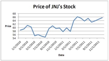
(Essay)
5.0/5 (41)
A survey of 400 unemployed people was completed at a job fair. Each person was asked to categorize his or her job interests. The accompanying relative frequency distribution was constructed. 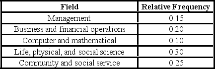 a. Construct the corresponding frequency distribution. How many of these people designated that the computer and mathematical industry was their job interest?
B) Construct a pie chart.
a. Construct the corresponding frequency distribution. How many of these people designated that the computer and mathematical industry was their job interest?
B) Construct a pie chart.
(Essay)
4.8/5 (39)
A stem-and-leaf diagram is useful in that it gives an overall picture of where quantitative data are centered and how the data are dispersed from the center.
(True/False)
4.9/5 (33)
For which of the following data sets will a pie chart be most useful?
(Multiple Choice)
4.9/5 (32)
The following data represent scores on a pop quiz in a statistics section.  (See the Excel Data File.) Suppose the data on quiz scores will be grouped into five classes. The width of the classes for a frequency distribution or histogram is the closest to ________.
(Multiple Choice)
4.8/5 (39)
An ogive is a graph that plots the cumulative frequency (or the cumulative relative frequency) of each class above the lower limit of the corresponding class.
(True/False)
4.8/5 (37)
Consider the following stem-and-leaf diagram.  Which data value occurs most often?
(Multiple Choice)
4.7/5 (30)
Filters
- Essay(0)
- Multiple Choice(0)
- Short Answer(0)
- True False(0)
- Matching(0)