Exam 2: Descriptive Statistics: Tabular and Graphical Displays
Exam 1: Data and Statistics85 Questions
Exam 2: Descriptive Statistics: Tabular and Graphical Displays112 Questions
Exam 3: Descriptive Statistics: Numerical Measures139 Questions
Exam 4: Introduction to Probability129 Questions
Exam 5: Discrete Probability Distributions150 Questions
Exam 6: Continuous Probability Distributions144 Questions
Exam 7: Sampling and Sampling Distributions119 Questions
Exam 8: Interval Estimation118 Questions
Exam 9: Hypothesis Tests118 Questions
Exam 10: Inference About Means and Proportions With Two Populations127 Questions
Exam 11: Inferences About Population Variances113 Questions
Exam 12: Tests of Goodness of Fit, Independence and Multiple Proportions76 Questions
Exam 13: Experimental Design and Analysis of Variance125 Questions
Exam 14: Simple Linear Regression103 Questions
Exam 15: Multiple Regression109 Questions
Exam 16: Regression Analysis: Model Building82 Questions
Exam 17: Time Series Analysis and Forecasting80 Questions
Exam 18: Nonparametric Methods83 Questions
Exam 19: Statistical Methods for Quality Control75 Questions
Exam 20: Decision Analysis71 Questions
Exam 21: Sample Survey68 Questions
Select questions type
The minimum number of variables represented in a histogram is
(Multiple Choice)
4.7/5  (41)
(41)
A graphical display of the relationship between two quantitative variables is
(Multiple Choice)
5.0/5 (35)
The sum of the relative frequencies for all classes will always equal
(Multiple Choice)
4.7/5 (33)
In a cumulative frequency distribution, the last class will always have a cumulative frequency equal to
(Multiple Choice)
4.8/5 (44)
The total number of data items with a value less than or equal to the upper limit for the class is given by the
(Multiple Choice)
4.8/5 (35)
A researcher is gathering data from four geographical areas designated: South = 1; North = 2; East = 3; West = 4. The designated geographical regions represent
(Multiple Choice)
4.8/5 (33)
A histogram is not appropriate for displaying which of the following types of information?
(Multiple Choice)
4.9/5 (30)
A graphical display of a frequency distribution, relative frequency distribution, or percent frequency distribution of quantitative data constructed by placing the class intervals on the horizontal axis and the frequencies on the vertical axis is a
(Multiple Choice)
4.9/5 (35)
Fifteen percent of the students in a School of Business Administration are majoring in Economics, 20% in Finance, 35% in Management, and 30% in Accounting. The graphical device(s) that can be used to present these data is (are)
(Multiple Choice)
4.8/5 (39)
What type of relationship is depicted in the following scatter diagram? 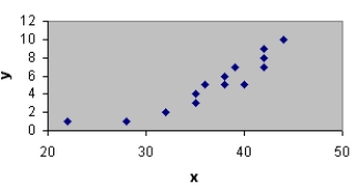
(Short Answer)
4.8/5 (35)
Exhibit 2-4
A survey of 400 college seniors resulted in the following crosstabulation regarding their undergraduate major and whether or not they plan to go to graduate school.  -Refer to Exhibit 2-4. What percentage of the students does not plan to go to graduate school?
(Multiple Choice)
4.8/5 (39)
When using Excel to create a __________ one must edit the chart to remove the gaps between rectangles.
(Multiple Choice)
4.8/5 (37)
What type of relationship is depicted in the following scatter diagram? 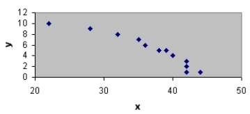
(Short Answer)
4.9/5 (40)
If several frequency distributions are constructed from the same data set, the distribution with the widest class width will have the
(Multiple Choice)
4.9/5 (38)
You are given the following data on times (in minutes) to complete a race. Construct a stem-and-leaf display. Specify the leaf unit for the display. 
(Essay)
4.8/5 (42)
Exhibit 2-1
The numbers of hours worked (per week) by 400 statistics students are shown below.  -Refer to Exhibit 2-1. The number of students working 19 hours or less
(Multiple Choice)
4.7/5 (37)
Exhibit 2-4
A survey of 400 college seniors resulted in the following crosstabulation regarding their undergraduate major and whether or not they plan to go to graduate school.
-Refer to Exhibit 2-4. Of those students who are majoring in business, what percentage plans to go to graduate school?
(Multiple Choice)
4.7/5 (42)
To construct a pie chart using Excel's Chart Tools, choose __________ as the chart type.
(Multiple Choice)
4.9/5 (38)
Exhibit 2-3
The number of sick days taken (per month) by 200 factory workers is summarized below.  -Refer to Exhibit 2-3. The number of workers who took more than 10 sick days per month
(Multiple Choice)
4.8/5 (33)
Filters
- Essay(0)
- Multiple Choice(0)
- Short Answer(0)
- True False(0)
- Matching(0)