Exam 2: Graphical and Tabular Descriptive Techniques
Exam 1: What Is Statistics39 Questions
Exam 2: Graphical and Tabular Descriptive Techniques192 Questions
Exam 3: Numerical Descriptive Techniques215 Questions
Exam 4: Data Collection and Sampling82 Questions
Exam 5: Probability200 Questions
Exam 6: Random Variables and Discrete Probability Distributions158 Questions
Exam 7: Continuous Probability Distributions149 Questions
Exam 8: Sampling Distributions127 Questions
Exam 9: Introduction to Estimation85 Questions
Exam 10: Introduction to Hypothesis Testing178 Questions
Exam 11: Inference About a Population75 Questions
Exam 12: Inference About Comparing Two Populations, Part 183 Questions
Exam 13: Inference About Comparing Two Populations, Part 284 Questions
Exam 14: Analysis of Variance125 Questions
Exam 15: Chi-Squared Tests118 Questions
Exam 16: Simple Linear Regression and Correlation231 Questions
Exam 17: Multiple Regression143 Questions
Exam 18: Review of Statistical Inference182 Questions
Select questions type
With nominal data, there is one and only one way the possible values can be ordered.
(True/False)
4.8/5  (33)
(33)
Internet Classes: A survey of 25 students was conducted to determine how they rate the quality of Internet classes. Students were asked to rate the overall quality from 0 (no quality at all) to 100 (extremely good quality). The stem-and-leaf display of the data is shown below.
 -What percentage of the students rated the overall quality of Internet classes as being 70 or above?
(Essay)
4.9/5 (32)
One of the advantages of a pie chart is that it clearly shows that the total percentages of all the categories add to 100%.
(True/False)
5.0/5 (36)
Which of the following is the method statisticians use to draw the best fitting straight line through the data on a scatter diagram?
(Multiple Choice)
4.8/5 (35)
A(n) ____________________ is a table that sorts data into class intervals (categories) and gives the number of observations in each interval (category).
(Short Answer)
4.9/5 (32)
The Dean of Students conducted a survey on campus. Class rank (Freshman, Sophomore, Junior, and Senior) is an example of a(n) ____________________ variable.
(Short Answer)
4.7/5 (34)
 -The line chart below shows tomato prices each month from January (month 1) to December last year ($ per pound). By looking at this chart you can see the lowest tomato prices occurred in July.
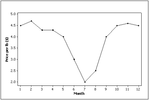
(True/False)
4.9/5 (36)
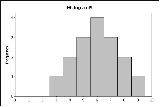
Compare the two histograms below. Which statement is true? 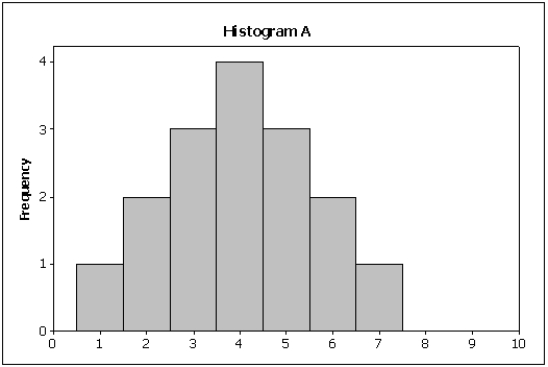
(Multiple Choice)
4.9/5 (27)
Which of the following statements about histograms is false?
(Multiple Choice)
4.8/5 (34)
A histogram is said to be symmetric if, when we draw a vertical line down the center of the histogram the two sides are nearly identical.
(True/False)
5.0/5 (32)
Two types of graphs that organize nominal data are ____________________ and ____________________.
(Short Answer)
4.8/5 (25)
Test Grades: The scores on a calculus test for a random sample of 40 students are as follows:
 -Describe the distribution of exam scores.
(Essay)
4.9/5 (42)
Briefly discuss the difference between cross-sectional data and time-series data.
(Essay)
4.8/5 (32)
Electronics Company: At a meeting of regional offices managers of a national electronics company, a survey was taken to determine the number of employees the regional managers supervise in the operation of their departments. The results of the survey are shown below.
 -What is the cumulative relative frequency corresponding to 5 employees?
(Essay)
4.9/5 (32)
According to the stem-and-leaf plot below, this data set has a negative median.

(True/False)
4.9/5 (31)
The Dean of Students conducted a survey on campus. The gender of each student is an example of a(n) ____________________ variable.
(Short Answer)
4.7/5 (41)
When a distribution has more values to the right and tails to the left, we say it is skewed negatively.
(True/False)
4.9/5 (34)
The advantage of a stem-and-leaf display over a histogram is that we can see the actual observations.
(True/False)
5.0/5 (46)
The relationship between two interval variables is graphically displayed by a
(Multiple Choice)
4.8/5 (32)
Filters
- Essay(0)
- Multiple Choice(0)
- Short Answer(0)
- True False(0)
- Matching(0)