Exam 2: Graphical and Tabular Descriptive Techniques
Exam 1: What Is Statistics39 Questions
Exam 2: Graphical and Tabular Descriptive Techniques192 Questions
Exam 3: Numerical Descriptive Techniques215 Questions
Exam 4: Data Collection and Sampling82 Questions
Exam 5: Probability200 Questions
Exam 6: Random Variables and Discrete Probability Distributions158 Questions
Exam 7: Continuous Probability Distributions149 Questions
Exam 8: Sampling Distributions127 Questions
Exam 9: Introduction to Estimation85 Questions
Exam 10: Introduction to Hypothesis Testing178 Questions
Exam 11: Inference About a Population75 Questions
Exam 12: Inference About Comparing Two Populations, Part 183 Questions
Exam 13: Inference About Comparing Two Populations, Part 284 Questions
Exam 14: Analysis of Variance125 Questions
Exam 15: Chi-Squared Tests118 Questions
Exam 16: Simple Linear Regression and Correlation231 Questions
Exam 17: Multiple Regression143 Questions
Exam 18: Review of Statistical Inference182 Questions
Select questions type
A researcher wishes to estimate the textbook costs of first-year students at Barry University. To do so, he recorded the textbook cost of 300 first-year students and found that their average textbook cost was $195 per semester. The variable of interest to the researcher is
(Multiple Choice)
4.9/5  (32)
(32)
In a histogram, each observation is assigned to one or more classes.
(True/False)
4.9/5 (43)
Which of the following statements about pie charts is false?
(Multiple Choice)
4.9/5 (33)
An individual's income depends somewhat on their number of years of education. Accordingly, we identify income as the ____________________ variable, and years of education as the ____________________ variable.
(Short Answer)
4.8/5 (40)
A(n) ____________________ histogram has two peaks, not necessarily equal in height.
(Short Answer)
4.8/5 (29)
Which of the following describes a positive linear relationship between X and Y?
(Multiple Choice)
4.8/5 (34)
 -The line chart below shows cucumber prices fluctuated from $2.00 per pound to over $4.50 per pound during the year.
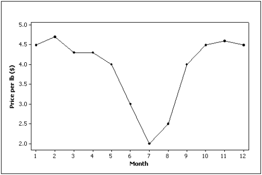
(True/False)
4.9/5 (21)
Provide one example of ordinal data; one example of nominal data; and one example of interval data.
(Essay)
4.8/5 (32)
Which situation identifies when to use pie charts and/or bar charts?
(Multiple Choice)
4.8/5 (32)
From a pie chart you are able to find the frequency for each category.
(True/False)
4.8/5 (31)
A(n) ____________________ chart is often used to display frequencies; a(n) ____________________ chart graphically shows relative frequencies.
(Short Answer)
4.9/5 (26)
The Chief of Police conducted a survey of the officers on his squad. An officer's shooting score at target practice is an example of a(n) ____________________ variable.
(Short Answer)
4.7/5 (25)
A(n) ____________________ is a graphical display consisting of a set of points, each point representing one variable measured along the horizontal axis, and another variable measured along the vertical axis.
(Short Answer)
4.9/5 (37)
Data for calories and salt content (milligrams of sodium) in 17 brands of meat hot dogs are shown in the scatter diagram below. According to this diagram, it appears that hot dogs that are high in sodium are generally low in calories, and hot dogs with low sodium are generally high in calories. 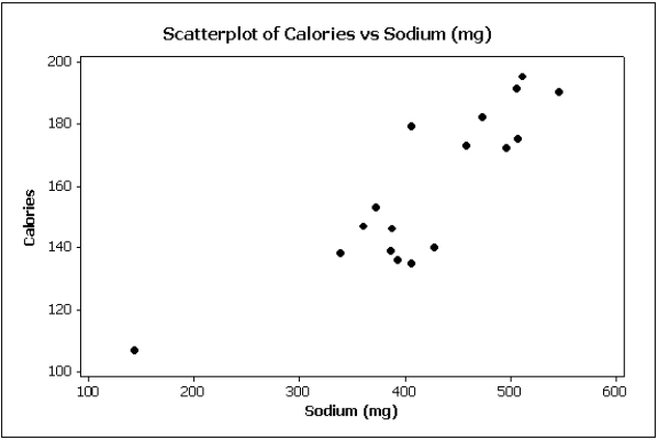
(True/False)
4.8/5 (40)
It is speculated that the number of police officers has a negative linear relationship with number of crimes. Explain why this might be so.
(Essay)
4.9/5 (39)
Filters
- Essay(0)
- Multiple Choice(0)
- Short Answer(0)
- True False(0)
- Matching(0)