Exam 2: Graphical and Tabular Descriptive Techniques
Exam 1: What Is Statistics39 Questions
Exam 2: Graphical and Tabular Descriptive Techniques192 Questions
Exam 3: Numerical Descriptive Techniques215 Questions
Exam 4: Data Collection and Sampling82 Questions
Exam 5: Probability200 Questions
Exam 6: Random Variables and Discrete Probability Distributions158 Questions
Exam 7: Continuous Probability Distributions149 Questions
Exam 8: Sampling Distributions127 Questions
Exam 9: Introduction to Estimation85 Questions
Exam 10: Introduction to Hypothesis Testing178 Questions
Exam 11: Inference About a Population75 Questions
Exam 12: Inference About Comparing Two Populations, Part 183 Questions
Exam 13: Inference About Comparing Two Populations, Part 284 Questions
Exam 14: Analysis of Variance125 Questions
Exam 15: Chi-Squared Tests118 Questions
Exam 16: Simple Linear Regression and Correlation231 Questions
Exam 17: Multiple Regression143 Questions
Exam 18: Review of Statistical Inference182 Questions
Select questions type
Teachers Ages: The ages (in years) of a sample of 25 teachers are as follows:
 -Draw a stem-and-leaf display of this data. What is the minimum and maximum age of the teachers in this data set?
(Essay)
4.8/5  (30)
(30)
Business School Graduates: A sample of business school graduates were asked what their major was. The results are shown in the following frequency distribution.
 -If you were only given the frequency bar chart below, would you able to reconstruct the original observations in the data set?
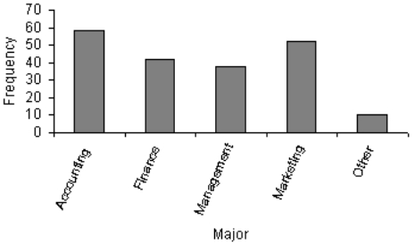
(Essay)
4.7/5 (35)
Whether or not you are over the age of 21 is a nominal variable.
(True/False)
4.7/5 (26)
Experience shows that few students hand in their statistics exams early; most prefer to hand them in near the end of the test period. This means the time taken by students to write exams is positively skewed.
(True/False)
4.8/5 (33)
Time series data are often graphically depicted on a line chart, which is a plot of the variable of interest over time.
(True/False)
4.9/5 (31)
We create a frequency distribution for interval data by counting the number of observations that fall into each of a series of intervals, called ____________________.
(Short Answer)
4.8/5 (30)
In a histogram a(n) ____________________ class is the one with the largest number of observations.
(Short Answer)
4.8/5 (35)
If when one variable increases the other one also increases, we say that there is a(n) ____________________ relationship between these two variables.
(Short Answer)
4.8/5 (37)
Insurance Company: A representative from a local insurance agency selected a random sample of insured homeowners and recorded the number of claims made in the last three years, with the following results:
 -How many total claims are represented in the sample?
(Essay)
4.9/5 (34)
Give an example of interval data that can also be treated as ordinal data and nominal data.
(Essay)
4.7/5 (30)
Consider the following cumulative frequency distribution.
 Fill in the frequencies for each class in the above table.
(Essay)
4.8/5 (32)
Beef prices throughout the year (month 1 = January) are shown in the line chart below (per pound). Describe beef prices for this given year using this line chart. 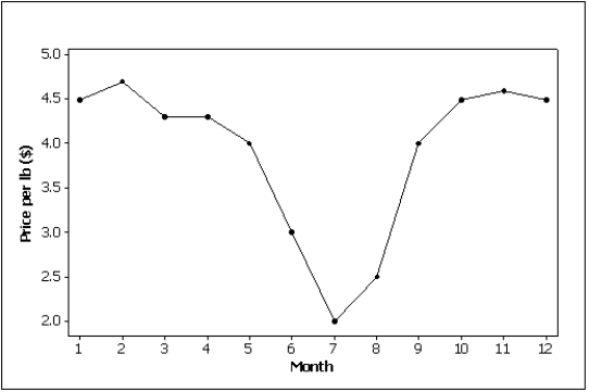
(Essay)
4.8/5 (41)
Bar and pie charts are graphical techniques for nominal data. The former focus the attention on the frequency of the occurrences of each category, and the later emphasizes the proportion of occurrences of each category.
(True/False)
4.9/5 (40)
Which of the following statements about shapes of histograms is true?
(Multiple Choice)
4.8/5 (35)
Suppose you measure the number of minutes it takes an employee to complete a task, where the maximum allowed time is 5 minutes, and each time is rounded to the nearest minute. Data from 130 employees is summarized below. How long did it take most employees to complete the task? 
(Multiple Choice)
4.7/5 (35)
Filters
- Essay(0)
- Multiple Choice(0)
- Short Answer(0)
- True False(0)
- Matching(0)