Exam 3: Graphical Descriptive Techniques II
Exam 1: What Is Statistics39 Questions
Exam 2: Graphical Descriptive Techniques I89 Questions
Exam 3: Graphical Descriptive Techniques II179 Questions
Exam 4: A: Numerical Descriptive Techniques202 Questions
Exam 4: B: Numerical Descriptive Techniques39 Questions
Exam 4: C: Numerical Descriptive Techniques18 Questions
Exam 5: Data Collection and Sampling76 Questions
Exam 6: Probability223 Questions
Exam 7: A: Random Variables and Discrete Probability Distributions225 Questions
Exam 7: B: Random Variables and Discrete Probability Distributions44 Questions
Exam 8: Continuous Probability Distributions200 Questions
Exam 9: Sampling Distributions150 Questions
Exam 10: Introduction to Estimation143 Questions
Exam 11: Introduction to Hypothesis Testing179 Questions
Exam 12: Inference About a Population149 Questions
Exam 13: Inference About Comparing Two Populations169 Questions
Exam 14: Analysis of Variance154 Questions
Exam 15: Chi-Squared Tests174 Questions
Exam 16: A: Simple Linear Regression and Correlation246 Questions
Exam 16: B: Simple Linear Regression and Correlation47 Questions
Exam 17: Multiple Regression156 Questions
Exam 18: Model Building137 Questions
Exam 19: Nonparametric Statistics171 Questions
Exam 20: Time-Series Analysis and Forecasting217 Questions
Exam 21: Statistical Process Control133 Questions
Exam 22: Decision Analysis121 Questions
Exam 23: Conclusion45 Questions
Select questions type
If two variables have a strong linear relationship,that means one variable is causing the other variable to go up or down.
(True/False)
4.9/5  (39)
(39)
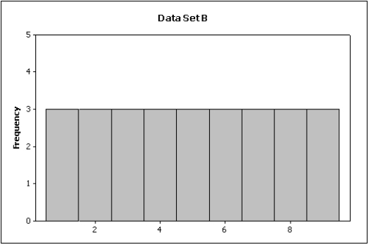
Compare the spread of the two histograms below.Which of the following is true? 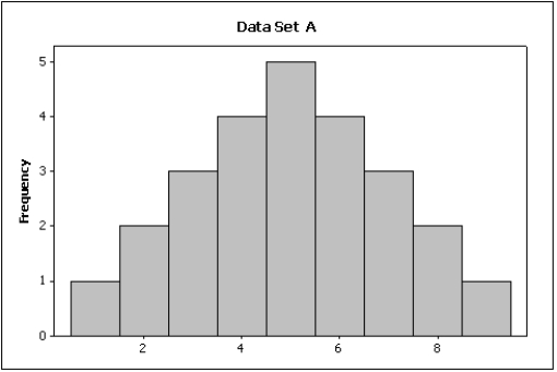
(Multiple Choice)
4.8/5 (38)
According to the stem-and-leaf plot below,this data set is symmetric.
Stem-and-leaf of P/E ratio;
Loef Unit
2 4 (2) 4 3 2 1 -1 -0 -0 0 0 1 1 53 97 65 3 6 3 8
(True/False)
4.7/5 (29)
A(n)____________________ is a table that sorts data into class intervals (categories)and gives the number of observations in each interval (category).
(Essay)
4.9/5 (28)
A(n)____________________ histogram has two peaks,not necessarily equal in height.
(Essay)
4.8/5 (31)
If we draw a straight line through the points in a scatter diagram and most of the points fall close to the line,there must be a positive relationship between the two variables.
(True/False)
4.8/5 (45)
A(n)____________________ display shows the actual observations as well as the number of observations in each class.
(Essay)
4.9/5 (33)
A professor examines the relationship between minutes studying and exam score (out of 200 points)for a random sample of his students.The scatter diagram is shown below.It appears that study time has somewhat of a positive linear relationship with exam score. 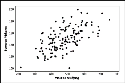
(True/False)
4.8/5 (42)
What are the two most important characteristics to look for in a scatter diagram?
(Essay)
4.7/5 (28)
Below are two line charts where the percentage return for a stock is shown over time.The two graphs are made from the same data set. 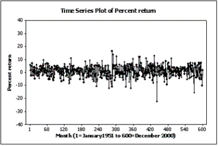
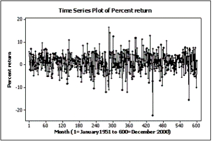 Explain why these two line charts look different.
(Essay)
4.8/5 (39)
Which of the following is a characteristic of graphical excellence?
(Multiple Choice)
4.8/5 (32)
When two variables are linearly related,and tend to move in opposite directions,we describe the nature of their association as a negative linear relationship.
(True/False)
4.8/5 (33)
Slopes and trends in a line chart appear to be steeper if you ____________________ the horizontal (time)axis.
(Essay)
4.8/5 (32)
Is it fair to depict Texas as most tornado prone area of the U.S.by showing it has the highest number of tornados of all states in the U.S.?
(Multiple Choice)
4.9/5 (33)
When a distribution has more values to the left and tails off to the right,it is skewed negatively.
(True/False)
4.9/5 (30)
The advantage of a stem-and-leaf display over a histogram is that we can see the actual observations.
(True/False)
4.8/5 (37)
Which of the following statements illustrates graphical deception?
(Multiple Choice)
4.8/5 (33)
Admission to ER
The following bar chart shows the type of aspirin (if any)given to 100 cardiac patients within 15 minutes of their admission to the emergency room. 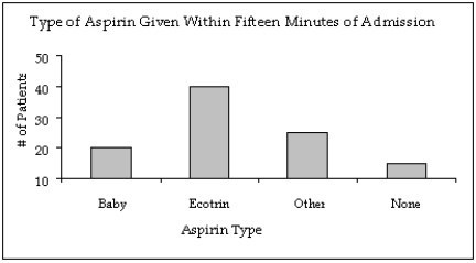 -{Admission to ER Narrative} In what way does the original bar chart distort the data as compared to a bar chart that starts at zero on the Y-axis (frequency axis)?
(Essay)
4.9/5 (35)
Filters
- Essay(0)
- Multiple Choice(0)
- Short Answer(0)
- True False(0)
- Matching(0)