Exam 3: Graphical Descriptive Techniques II
Exam 1: What Is Statistics39 Questions
Exam 2: Graphical Descriptive Techniques I89 Questions
Exam 3: Graphical Descriptive Techniques II179 Questions
Exam 4: A: Numerical Descriptive Techniques202 Questions
Exam 4: B: Numerical Descriptive Techniques39 Questions
Exam 4: C: Numerical Descriptive Techniques18 Questions
Exam 5: Data Collection and Sampling76 Questions
Exam 6: Probability223 Questions
Exam 7: A: Random Variables and Discrete Probability Distributions225 Questions
Exam 7: B: Random Variables and Discrete Probability Distributions44 Questions
Exam 8: Continuous Probability Distributions200 Questions
Exam 9: Sampling Distributions150 Questions
Exam 10: Introduction to Estimation143 Questions
Exam 11: Introduction to Hypothesis Testing179 Questions
Exam 12: Inference About a Population149 Questions
Exam 13: Inference About Comparing Two Populations169 Questions
Exam 14: Analysis of Variance154 Questions
Exam 15: Chi-Squared Tests174 Questions
Exam 16: A: Simple Linear Regression and Correlation246 Questions
Exam 16: B: Simple Linear Regression and Correlation47 Questions
Exam 17: Multiple Regression156 Questions
Exam 18: Model Building137 Questions
Exam 19: Nonparametric Statistics171 Questions
Exam 20: Time-Series Analysis and Forecasting217 Questions
Exam 21: Statistical Process Control133 Questions
Exam 22: Decision Analysis121 Questions
Exam 23: Conclusion45 Questions
Select questions type
Which of the following characteristics apply to achieve graphical excellence?
(Multiple Choice)
4.8/5  (30)
(30)
A line chart is created by plotting the value of the variable on the ____________________ axis and the time periods on the ____________________ axis.
(Essay)
4.9/5 (40)
The line chart below shows cucumber prices fluctuated from $2.00 per pound to over $4.50 per pound during the year. 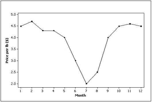
(True/False)
4.8/5 (43)
A(n)____________________ is a graphical representation of the cumulative relative frequencies.
(Essay)
5.0/5 (36)
Test scores
The scores on a calculus test for a random sample of 40 students are as follows:
63 74 42 65 51 54 36 56 68 57 62 64 76 67 79 61 81 77 59 38 84 68 71 94 71 86 69 75 91 55 48 82 83 54 79 62 68 58 41 47
-{Test Grades Narrative} Construct a cumulative frequency and a cumulative relative frequency distribution for this data.What proportion of the exam scores are less than 60? What proportion of the exam scores are 70 or more?
(Essay)
4.8/5 (29)
Internet Classes
A survey of 25 students was conducted to determine how they rate the quality of Internet classes.Students were asked to rate the overall quality from 0 (no quality at all)to 100 (extremely good quality).The stem-and-leaf display of the data is shown below.
Stem Leaves 3 15 4 01457889 5 0134677 6 24568 7 29 8 9 5
-{Internet Classes Narrative} What percentage of the students rated the overall quality of Internet classes as being 70 or above?
(Essay)
4.8/5 (29)
In order to draw a scatter diagram,we need interval data for
(Multiple Choice)
4.8/5 (24)
Home Care
Data are collected on the number of house calls (x)made in a given week by each of 60 nurses in a certain hospital.The same data set is displayed in each of the three histograms below. 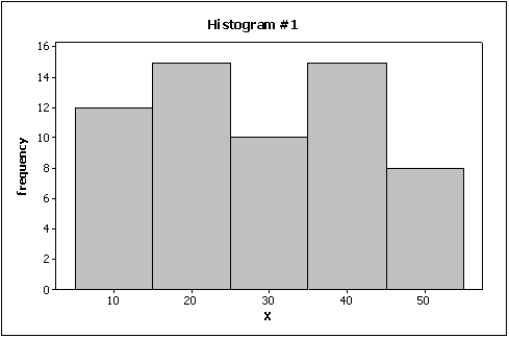
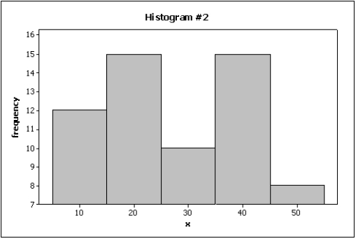
 -{Home Care Narrative} How many nurses are there in this hospital?
(Essay)
4.9/5 (32)
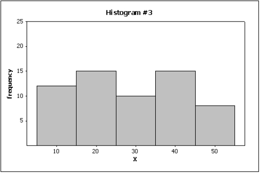
Which of the following describes the shape of the histogram below? 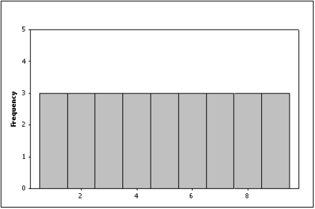
(Multiple Choice)
4.9/5 (25)
Time series data are often graphically depicted on a(n)____________________,which is a plot of the variable of interest over time.
(Essay)
4.8/5 (30)
A graph showing trends over time is called a(n)____________________ chart.
(Essay)
4.8/5 (23)
Possible methods of creating distorted impressions with bar charts include:
(Multiple Choice)
4.8/5 (35)
The number of class intervals in a histogram depends on the number of observations in the data set.
(True/False)
4.8/5 (28)
What values are displayed on a cumulative relative frequency distribution?
(Multiple Choice)
4.8/5 (23)
When two variables tend to move in opposite directions,yet still form a linear pattern,how do you describe their relationship?
(Multiple Choice)
4.8/5 (33)
A modal class is the class with the largest number of observations.
(True/False)
4.7/5 (38)
Differences in the frequencies of a histogram appear to be more dramatic if you ____________________ the vertical axis.
(Essay)
4.9/5 (35)
Filters
- Essay(0)
- Multiple Choice(0)
- Short Answer(0)
- True False(0)
- Matching(0)