Exam 3: Graphical Descriptive Techniques II
Exam 1: What Is Statistics39 Questions
Exam 2: Graphical Descriptive Techniques I89 Questions
Exam 3: Graphical Descriptive Techniques II179 Questions
Exam 4: A: Numerical Descriptive Techniques202 Questions
Exam 4: B: Numerical Descriptive Techniques39 Questions
Exam 4: C: Numerical Descriptive Techniques18 Questions
Exam 5: Data Collection and Sampling76 Questions
Exam 6: Probability223 Questions
Exam 7: A: Random Variables and Discrete Probability Distributions225 Questions
Exam 7: B: Random Variables and Discrete Probability Distributions44 Questions
Exam 8: Continuous Probability Distributions200 Questions
Exam 9: Sampling Distributions150 Questions
Exam 10: Introduction to Estimation143 Questions
Exam 11: Introduction to Hypothesis Testing179 Questions
Exam 12: Inference About a Population149 Questions
Exam 13: Inference About Comparing Two Populations169 Questions
Exam 14: Analysis of Variance154 Questions
Exam 15: Chi-Squared Tests174 Questions
Exam 16: A: Simple Linear Regression and Correlation246 Questions
Exam 16: B: Simple Linear Regression and Correlation47 Questions
Exam 17: Multiple Regression156 Questions
Exam 18: Model Building137 Questions
Exam 19: Nonparametric Statistics171 Questions
Exam 20: Time-Series Analysis and Forecasting217 Questions
Exam 21: Statistical Process Control133 Questions
Exam 22: Decision Analysis121 Questions
Exam 23: Conclusion45 Questions
Select questions type
Briefly explain the difference between correlation and causation in terms of a relationship between X and Y.
(Essay)
4.9/5  (35)
(35)
The following graph shows pepper prices throughout a 12-month period. 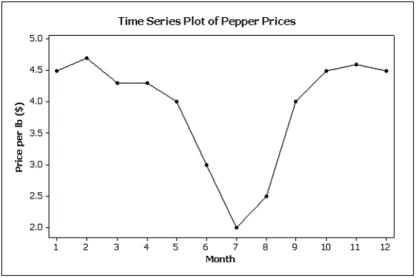 Suppose you made a new graph of the same data,where the maximum value on the Y-axis was changed from 5.0 to 10.0.(Assume everything else stays the same. ) Your new graph would appear to have ____ variability in pepper prices compared to the original graph shown above.
(Multiple Choice)
4.7/5 (33)
Briefly discuss the difference between cross-sectional data and time-series data.
(Essay)
4.8/5 (33)
Teachers Ages
The ages (in years)of a sample of 25 teachers are as follows:
47 21 37 53 28 40 30 32 34 26 34 24 24 35 45 38 35 28 43 45 30 45 31 41 56
-{Teachers Ages Narrative} Draw a frequency histogram of this data which contains four classes.What is the shape of the histogram?
(Essay)
4.8/5 (41)
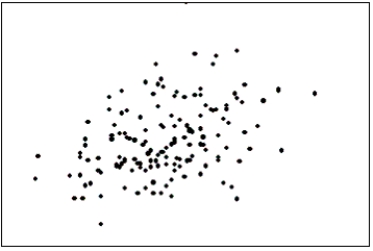
The first scatter diagram below shows a stronger linear relationship than the second scatter diagram.(Assume the scales on both scatter diagrams are the same. ) 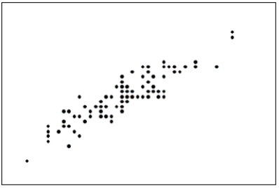
(True/False)
4.9/5 (44)
A pie chart showing 80% yes and 20% no would look the same whether it was based on 10,000 observations or 10 observations.This is one way that pie charts can be deceptive.
(True/False)
4.8/5 (37)
Graphical excellence gives the greatest number of ideas in the shortest time with the least ink in the smallest space.
(True/False)
4.9/5 (39)
Pie charts only show ____________________,not ____________________.This means you don't know what the sample size is unless it is stated on the pie chart.
(Essay)
5.0/5 (38)
A bar chart can be made to look deceptive if the Y-axis starts at a number other than zero.
(True/False)
4.9/5 (43)
Credit Hours
The College of Business at The State University of California produced 3,400 credit hours during Spring Semester,2011he number and percentage of credit hours produced by each of the four departments in the College of Business is shown below.
Department Percent Count Marketing 35.3 1.200 Management 23.5 800 Finance 23.5 800 Accounting 17.6 600 The following three-dimensional pie chart was constructed from the table above. 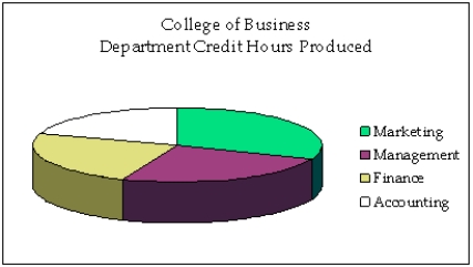 -{Credit Hours Narrative} In what way does the original three-dimensional pie chart distort the data,compared to a two-dimensional pie chart?
(Essay)
5.0/5 (30)
A line chart that is flat shows no fluctuation in the variable being presented.
(True/False)
4.7/5 (31)
Time series data are often graphically depicted on a line chart,which is a plot of the variable of interest over time.
(True/False)
4.8/5 (38)
Test scores
The scores on a calculus test for a random sample of 40 students are as follows:
63 74 42 65 51 54 36 56 68 57 62 64 76 67 79 61 81 77 59 38 84 68 71 94 71 86 69 75 91 55 48 82 83 54 79 62 68 58 41 47
-The weights of a sample of 25 workers are given (in pounds): 164,148,137,157,173,156,177,172,169,165,145,168,163,162,174,152,156,168,154,151,174,146,134,140,and 171.Construct an ogive for the data.What proportion of the worker's weights are between 160 and 180 pounds;below 150 pounds;and at or above 140 pounds,respectively?
(Essay)
4.8/5 (33)
A popular method of creating distorted impressions with bar charts is to construct the bars so that their widths are proportional to their heights.
(True/False)
4.8/5 (40)
Which of the following statements about shapes of histograms is true?
(Multiple Choice)
4.9/5 (32)
Which of the following statements about histograms is false?
(Multiple Choice)
4.8/5 (36)
Filters
- Essay(0)
- Multiple Choice(0)
- Short Answer(0)
- True False(0)
- Matching(0)