Exam 3: Graphical Descriptive Techniques II
Exam 1: What Is Statistics39 Questions
Exam 2: Graphical Descriptive Techniques I89 Questions
Exam 3: Graphical Descriptive Techniques II179 Questions
Exam 4: A: Numerical Descriptive Techniques202 Questions
Exam 4: B: Numerical Descriptive Techniques39 Questions
Exam 4: C: Numerical Descriptive Techniques18 Questions
Exam 5: Data Collection and Sampling76 Questions
Exam 6: Probability223 Questions
Exam 7: A: Random Variables and Discrete Probability Distributions225 Questions
Exam 7: B: Random Variables and Discrete Probability Distributions44 Questions
Exam 8: Continuous Probability Distributions200 Questions
Exam 9: Sampling Distributions150 Questions
Exam 10: Introduction to Estimation143 Questions
Exam 11: Introduction to Hypothesis Testing179 Questions
Exam 12: Inference About a Population149 Questions
Exam 13: Inference About Comparing Two Populations169 Questions
Exam 14: Analysis of Variance154 Questions
Exam 15: Chi-Squared Tests174 Questions
Exam 16: A: Simple Linear Regression and Correlation246 Questions
Exam 16: B: Simple Linear Regression and Correlation47 Questions
Exam 17: Multiple Regression156 Questions
Exam 18: Model Building137 Questions
Exam 19: Nonparametric Statistics171 Questions
Exam 20: Time-Series Analysis and Forecasting217 Questions
Exam 21: Statistical Process Control133 Questions
Exam 22: Decision Analysis121 Questions
Exam 23: Conclusion45 Questions
Select questions type
One of the variables used to help predict unemployment rates is the rate of inflation.Accordingly,we identify rate of inflation as the ____________________ variable,and unemployment rate as the ____________________ variable.
Free
(Essay)
4.7/5  (41)
(41)
Correct Answer: Verified
independent;dependent
X;Y
The sum of relative frequencies in a distribution always equals 1.
Free
(True/False)
4.8/5 (34)
Correct Answer:Verified
True
Observations that are measured at successive points in time is what type of data?
Free
(Multiple Choice)
4.8/5 (38)
Correct Answer:Verified
A
What does the length of each line of a stem-and-leaf display represent?
(Multiple Choice)
4.8/5 (28)
Graphical excellence is a term usually applied to techniques that are informative and concise and that impart information clearly to their viewers.
(True/False)
4.8/5 (34)
Observations that are measured at the same time represent what type of data?
(Multiple Choice)
4.8/5 (33)
Which of the following represents a graphical presentation of interval data?
(Multiple Choice)
4.8/5 (30)
A histogram is said to be symmetric if,when we draw a vertical line down the center of the histogram the two sides are nearly identical.
(True/False)
4.7/5 (38)
The scale used on a bar chart does not affect the way the bar chart looks.
(True/False)
4.8/5 (30)
The length of each line in a step-and-leaf display represents the ____________________ of that class interval defined by the stems.
(Essay)
4.9/5 (30)
Credit Hours
The College of Business at The State University of California produced 3,400 credit hours during Spring Semester,2011he number and percentage of credit hours produced by each of the four departments in the College of Business is shown below.
Department Percent Count Marketing 35.3 1.200 Management 23.5 800 Finance 23.5 800 Accounting 17.6 600 The following three-dimensional pie chart was constructed from the table above. 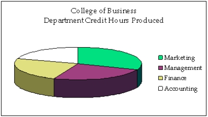 -Briefly explain why the histogram below is misleading.
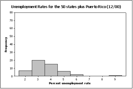
(Essay)
4.7/5 (33)
Credit Hours
The College of Business at The State University of California produced 3,400 credit hours during Spring Semester,2011he number and percentage of credit hours produced by each of the four departments in the College of Business is shown below.
Department Percent Count Marketing 35.3 1.200 Management 23.5 800 Finance 23.5 800 Accounting 17.6 600 The following three-dimensional pie chart was constructed from the table above.
-{Credit Hours Narrative} Construct a two-dimensional pie chart showing the percentages of credit hours produced by the four departments.
(Essay)
4.7/5 (39)
If when one variable increases the other one also increases,we say that there is a(n)____________________ relationship between these two variables.
(Essay)
4.8/5 (33)
Insurance Company
A representative from a local insurance agency selected a random sample of insured homeowners and recorded the number of claims made in the last three years,with the following results:
Number of claims 0 1 2 3 4 5 Frequency 9 20 14 13 5 3
-{Insurance Company Narrative} What number of claims was made by the highest proportion of homeowners?
(Essay)
4.8/5 (28)
Admission to ER
The following bar chart shows the type of aspirin (if any)given to 100 cardiac patients within 15 minutes of their admission to the emergency room. 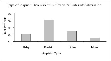 -{Admission to ER Narrative} Notice that the Y-axis of the bar chart does not start at a frequency of zero.Create a new bar chart of the displayed data that accurately displays the frequency for each aspirin type.
(Essay)
4.8/5 (32)
An online dating service has a quick poll on its website showing the following results.Critique the graph portion of the table.How can it be improved? 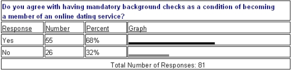
(Essay)
4.9/5 (27)
Filters
- Essay(0)
- Multiple Choice(0)
- Short Answer(0)
- True False(0)
- Matching(0)