Exam 3: Graphical Descriptive Techniques II
Exam 1: What Is Statistics39 Questions
Exam 2: Graphical Descriptive Techniques I89 Questions
Exam 3: Graphical Descriptive Techniques II179 Questions
Exam 4: A: Numerical Descriptive Techniques202 Questions
Exam 4: B: Numerical Descriptive Techniques39 Questions
Exam 4: C: Numerical Descriptive Techniques18 Questions
Exam 5: Data Collection and Sampling76 Questions
Exam 6: Probability223 Questions
Exam 7: A: Random Variables and Discrete Probability Distributions225 Questions
Exam 7: B: Random Variables and Discrete Probability Distributions44 Questions
Exam 8: Continuous Probability Distributions200 Questions
Exam 9: Sampling Distributions150 Questions
Exam 10: Introduction to Estimation143 Questions
Exam 11: Introduction to Hypothesis Testing179 Questions
Exam 12: Inference About a Population149 Questions
Exam 13: Inference About Comparing Two Populations169 Questions
Exam 14: Analysis of Variance154 Questions
Exam 15: Chi-Squared Tests174 Questions
Exam 16: A: Simple Linear Regression and Correlation246 Questions
Exam 16: B: Simple Linear Regression and Correlation47 Questions
Exam 17: Multiple Regression156 Questions
Exam 18: Model Building137 Questions
Exam 19: Nonparametric Statistics171 Questions
Exam 20: Time-Series Analysis and Forecasting217 Questions
Exam 21: Statistical Process Control133 Questions
Exam 22: Decision Analysis121 Questions
Exam 23: Conclusion45 Questions
Select questions type
Which of the following statements describe(s)the line chart below? 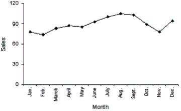
(Multiple Choice)
4.9/5  (38)
(38)
Test scores
The scores on a calculus test for a random sample of 40 students are as follows:
63 74 42 65 51 54 36 56 68 57 62 64 76 67 79 61 81 77 59 38 84 68 71 94 71 86 69 75 91 55 48 82 83 54 79 62 68 58 41 47
-Consider the following cumulative frequency distribution.
Classes Limits Cumulative Frequency Frequency <5 11 <10 18 <15 24 <20 33 <25 45 Fill in the frequencies for each class in the above table.
(Essay)
4.8/5 (31)
Which of the following is true about a stem-and-leaf display?
(Multiple Choice)
4.8/5 (32)
A cumulative relative frequency distribution lists the number of observations that lie below each of the class limits.
(True/False)
4.7/5 (22)
Electronics Company
At a meeting of regional offices managers of a national electronics company,a survey was taken to determine the number of employees the regional managers supervise in the operation of their departments.The results of the survey are shown below.
Number of emplayees supervised 1 2 3 4 5 Frequency 7 11 14 10
-{Electronics Company Narrative} What proportion of managers supervise 3 employees?
(Essay)
4.8/5 (30)
Home Care
Data are collected on the number of house calls (x)made in a given week by each of 60 nurses in a certain hospital.The same data set is displayed in each of the three histograms below. 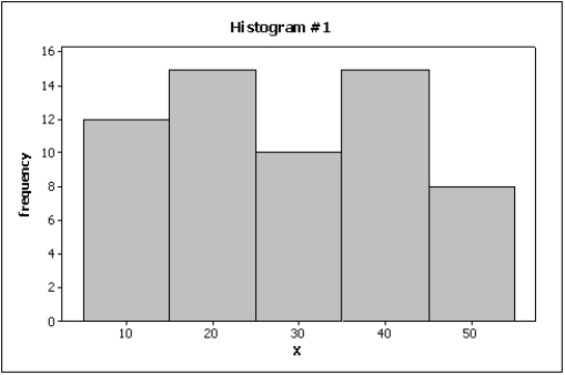
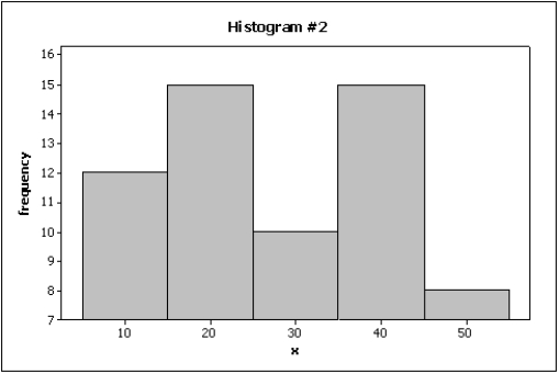
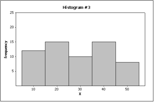 -{Home Care Narrative}Which graph do you think is the most appropriate display? Justify your answer.
(Essay)
4.9/5 (33)
We create a frequency distribution for interval data by counting the number of observations that fall into each of a series of intervals,called ____________________.
(Essay)
5.0/5 (29)
Test scores
The scores on a calculus test for a random sample of 40 students are as follows:
63 74 42 65 51 54 36 56 68 57 62 64 76 67 79 61 81 77 59 38 84 68 71 94 71 86 69 75 91 55 48 82 83 54 79 62 68 58 41 47
-Fifty two truck buyers were asked to indicate the car dealer they believed offered the best overall service.The four choices were A,B,C,and D as shown below:
Construct a table showing the frequencies and relative frequencies for this data set.What proportion of car buyers rated dealer D as the best?
(Essay)
4.8/5 (30)
Which of the following statements about histograms is true?
(Multiple Choice)
4.9/5 (44)
Teachers Ages
The ages (in years)of a sample of 25 teachers are as follows:
47 21 37 53 28 40 30 32 34 26 34 24 24 35 45 38 35 28 43 45 30 45 31 41 56
-{Teachers Ages Narrative} Draw a frequency histogram of this data which contains six classes.What is the shape of the histogram?
(Essay)
4.7/5 (43)
Slopes and trends in a line chart appear to be less steep if you ____________________ the horizontal (time)axis.
(Essay)
4.8/5 (29)
Credit Hours
The College of Business at The State University of California produced 3,400 credit hours during Spring Semester,2011he number and percentage of credit hours produced by each of the four departments in the College of Business is shown below.
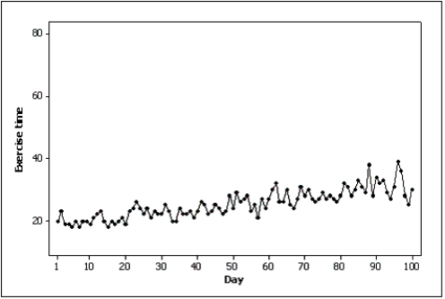
Department Percent Count Marketing 35.3 1.200 Management 23.5 800 Finance 23.5 800 Accounting 17.6 600 The following three-dimensional pie chart was constructed from the table above. 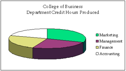 -Samantha recorded her amount of exercise time (in minutes)for 100 days.Both of the line charts below were created based on her same data set.Which line chart makes her exercise times look more variable and why?
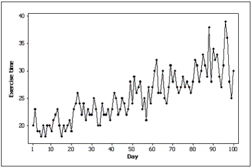
(Essay)
4.9/5 (40)
Insurance Company
A representative from a local insurance agency selected a random sample of insured homeowners and recorded the number of claims made in the last three years,with the following results:
Number of claims 0 1 2 3 4 5 Frequency 9 20 14 13 5 3
-{Insurance Company Narrative} How many total claims are represented in the sample?
(Essay)
4.7/5 (36)
Test scores
The scores on a calculus test for a random sample of 40 students are as follows:
63 74 42 65 51 54 36 56 68 57 62 64 76 67 79 61 81 77 59 38 84 68 71 94 71 86 69 75 91 55 48 82 83 54 79 62 68 58 41 47
-{Test Grades Narrative} Describe the distribution of exam scores.
(Essay)
4.7/5 (35)
A skewed histogram is one with a long tail extending either to the right or left.
(True/False)
4.8/5 (36)
Experience shows that few students hand in their statistics exams early;most prefer to hand them in near the end of the test period.This means the time taken by students to write exams is positively skewed.
(True/False)
4.7/5 (33)
A stem-and-leaf display reveals more information about the original data than does a histogram.
(True/False)
4.8/5 (36)
A graph of the frequency distribution for interval data is called a(n)____________________.
(Essay)
4.8/5 (41)
How do you determine whether two interval variables have a positive linear relationship?
(Multiple Choice)
4.9/5 (39)
A line chart is created by plotting the values of the variable on the vertical axis and the time periods on the horizontal axis.
(True/False)
4.8/5 (42)
Filters
- Essay(0)
- Multiple Choice(0)
- Short Answer(0)
- True False(0)
- Matching(0)