Exam 2: Displaying Data
Exam 1: Statistics and Samples36 Questions
Exam 2: Displaying Data55 Questions
Exam 3: Describing Data49 Questions
Exam 4: Estimating With Uncertainty47 Questions
Exam 5: Probability50 Questions
Exam 6: Hypothesis Testing40 Questions
Exam 7: Analyzing Proportions54 Questions
Exam 8: Fitting Probability Models to Frequency Data53 Questions
Exam 9: Contingency Analysis: Associations Between56 Questions
Exam 10: The Normal Distribution51 Questions
Exam 11: Inference for a Normal Population46 Questions
Exam 12: Comparing Two Means53 Questions
Exam 13: Handling Violations of Assumptions38 Questions
Exam 14: Designing Experiments56 Questions
Exam 15: Comparing Means of More Than Two Groups54 Questions
Exam 16: Correlation Between Numerical Variables49 Questions
Exam 17: Regression54 Questions
Exam 18: Multiple Explanatory Variables47 Questions
Exam 19: Computer-Intensive Methods25 Questions
Exam 20: Likelihood33 Questions
Exam 21: Meta-Analysis: Combining Information From38 Questions
Select questions type
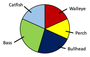
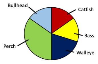
Consider a lake survey in which the relative amounts of five different types of fish are identified. Which of the following data sets matches the pie chart shown?
(Multiple Choice)
4.9/5  (35)
(35)
Which of the following is a good thing to do when designing a data table?
(Multiple Choice)
4.9/5 (34)
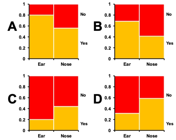
Consider a situation in which bacterial swabs were taken from the ears and noses of 50 study subjects, and the number of swabs that showed the presence of staphylococcus were measured. The table shows the results of the measurements. Which of the mosaic plots shown correctly depicts this data?
?
Contingency table showing presence of Staphylococcus in swabs from different body parts.
Present? Ear Nose Yes 40 28 No 10 22 ?
 ?
?
(Multiple Choice)
5.0/5 (42)
Bar graphs, histograms, and scatter plots should always show the y-axis all the way down to zero.
(True/False)
4.8/5 (34)
The primary purpose of scatter plots is to highlight differences between groups.
(True/False)
4.8/5 (39)
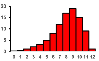
Consider the histogram shown. What two words describe the skew?
(Multiple Choice)
4.8/5 (27)
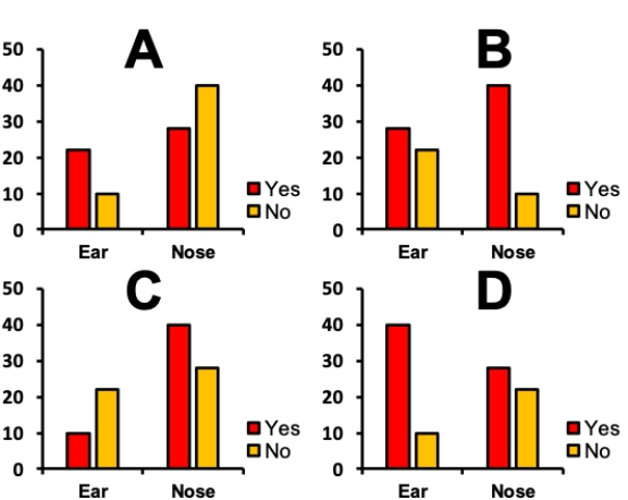
Consider a situation in which bacterial swabs were taken from the ears and noses of 50 study subjects, and the number of swabs that showed the presence of staphylococcus were measured. The table shows the results of the measurements. Which of the grouped bar graphs shown correctly depicts this data?
?
Contingency table showing presence of Staphylococcus in swabs from different body parts.
Present? Ear Nose Yes 40 28 No 10 22 ?
 ?
?
(Multiple Choice)
4.7/5 (41)
Multiple histograms and group bar graphs both use multiple sets of bars to display data and facilitate certain analyses. Contrast these two graphical methods-what is the main difference in the goal of these figures?
(Essay)
5.0/5 (37)
Bar graphs are typically superior to pie charts for representing category frequencies.
(True/False)
4.9/5 (41)
Strip plots and violin plots are typically used for the same purpose.
(True/False)
4.9/5 (37)
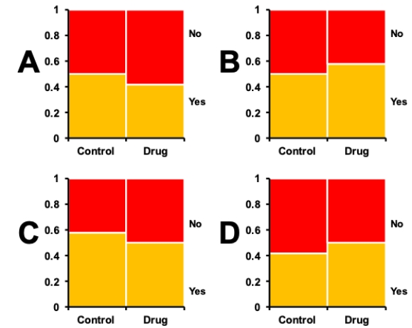
Consider a situation in which tumor-prone rats were given an experimental anti-cancer drug or a control. There were 50 rats in each treatment group, and after 6 weeks they were sacrificed and autopsies performed to determine the presence or absence of liver tumors. The table shows the results of the measurements. Which of the mosaic plots shown correctly depicts this data?
?
Contingency table showing presence of tumors in rats with different drug regimes.
Present? Control Drug Yes 29 25 No 21 25 ?
 ?
?
(Multiple Choice)
4.8/5 (44)
Consider a lake survey in which the relative amounts of five different types of fish are identified. Which of the following data sets matches the pie chart shown?
(Multiple Choice)
4.8/5 (32)
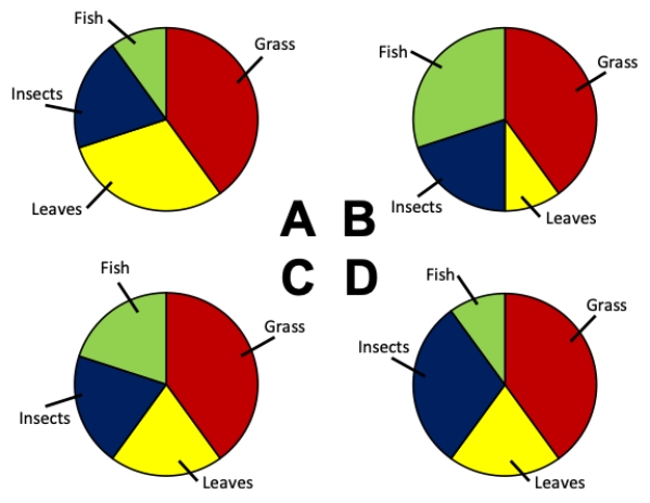
Consider an experiment in which an omnivorous species has its stomach contents analyzed. Which of the pie charts correctly depicts the following values for the diet of the omnivore:
Fish = 10%
Grass = 40%,
Insects = 20%
Leaves = 30%
(Multiple Choice)
4.8/5 (38)
There is no strict rule for choosing the number of bins in a histogram.
(True/False)
4.8/5 (42)
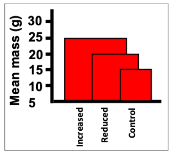
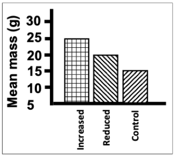
Consider an experiment in which rats are given three diets (reduced calorie, control, and increased calorie) and their masses at 6 weeks of age are measured. Which of the following is NOT an aspect of poor design in the figure shown?
(Multiple Choice)
4.8/5 (41)
Consider an experiment in which rats are given three diets (reduced calorie, control, and increased calorie) and their masses at 6 weeks of age are measured. Which of the following is an aspect of poor design in the figure shown?
(Multiple Choice)
4.9/5 (36)
Which of the following would greatly improve the utility of the data table shown?
?
Frequency table showing the number of fish caught by a fishing boat during a four hour fishing voyage.
Species of fish Frequency (number caught) Bass 10 Walleye 12 Perch 7 Bullhead 11 ?
(Multiple Choice)
4.9/5 (38)
Consider the data table that indicates how many subjects in a skin cancer study had various sizes of moles on their backs. Which of the histograms correctly depicts the data?
Frequency table showing the average size of moles on 70 subjects.
Diameter of Number moles () of subjects 0-5 15 5-10 24 10-15 13 15-20 9 20-25 8 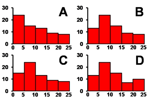 ?
?
?
?
(Multiple Choice)
4.9/5 (38)
Effective graphs are designed to accomplish three goals. Which of the following is NOT one of these goals?
(Multiple Choice)
4.8/5 (35)
Filters
- Essay(0)
- Multiple Choice(0)
- Short Answer(0)
- True False(0)
- Matching(0)