Exam 3: Graphical Descriptive Techniques II
Exam 1: What Is Statistics43 Questions
Exam 2: Graphical Descriptive Techniques I93 Questions
Exam 3: Graphical Descriptive Techniques II183 Questions
Exam 4: Numerical Descriptive Techniques274 Questions
Exam 5: Data Collection and Sampling82 Questions
Exam 6: Probability234 Questions
Exam 7: Random Variables and Discrete Probability Distributions274 Questions
Exam 8: Continuous Probability Distributions215 Questions
Exam 9: Sampling Distributions153 Questions
Exam 10: Introduction to Estimation152 Questions
Exam 11: Introduction to Hypothesis Testing182 Questions
Exam 12: Inference About a Population147 Questions
Exam 13: Inference About Comparing Two Populations170 Questions
Exam 14: Analysis of Variance153 Questions
Exam 15: Chi-Squared Tests175 Questions
Exam 16: Simple Linear Regression and Correlation298 Questions
Exam 17: Multiple Regression157 Questions
Select questions type
Teachers Ages
The ages (in years) of a sample of 25 teachers are as follows:
 -{Teachers Ages Narrative} Draw a stem-and-leaf display of this data.What is the minimum and maximum age of the teachers in this data set?
(Essay)
4.9/5  (32)
(32)
Which of the following statements about shapes of histograms is true?
(Multiple Choice)
4.9/5 (36)
Which of the following is the method statisticians use to draw the best fitting straight line through the data on a scatter diagram?
(Multiple Choice)
4.8/5 (36)
Is it fair to depict Texas as most tornado prone area of the U.S.by showing it has the highest number of tornados of all states in the U.S.?
(Multiple Choice)
4.8/5 (34)
A cumulative relative frequency distribution lists the number of observations that lie below each of the class limits.
(True/False)
4.8/5 (35)
The line chart below shows tomato prices each month from January (month 1) to December last year ($ per pound).By looking at this chart you can see the lowest tomato prices occurred in July. 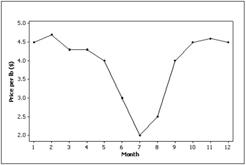
(True/False)
4.8/5 (36)
A professor examines the relationship between minutes studying and exam score (out of 200 points) for a random sample of his students.The scatter diagram is shown below.It appears that study time has somewhat of a positive linear relationship with exam score. 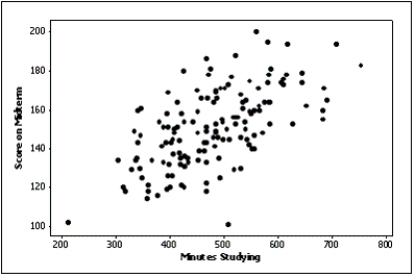
(True/False)
4.8/5 (32)
One of the variables used to help predict unemployment rates is the rate of inflation.Accordingly, we identify rate of inflation as the ____________________ variable, and unemployment rate as the ____________________ variable.
(Short Answer)
4.8/5 (36)
The two most important characteristics to look for in a scatter diagram are the ____________________ and ____________________ of the linear relationship.
(Short Answer)
4.9/5 (45)
According to the stem-and-leaf plot below, the median quiz score for this data set is 8.

(True/False)
4.8/5 (46)
What values are displayed on a cumulative relative frequency distribution?
(Multiple Choice)
4.8/5 (35)
The sum of relative frequencies in a distribution always equals 1.
(True/False)
4.9/5 (39)
The original observations cannot be determined once they are grouped into a frequency distribution.
(True/False)
4.8/5 (24)
Electronics Company
At a meeting of regional offices managers of a national electronics company, a survey was taken to determine the number of employees the regional managers supervise in the operation of their departments.The results of the survey are shown below.
 -{Electronics Company Narrative} How many regional offices are represented in the survey results?
(Short Answer)
4.8/5 (33)
Graphical techniques should not be used to present data if accurate tabular forms for the same data are available.
(True/False)
4.9/5 (27)
Home Care
Data are collected on the number of house calls (x) made in a given week by each of 60 nurses in a certain hospital.The same data set is displayed in each of the three histograms below. 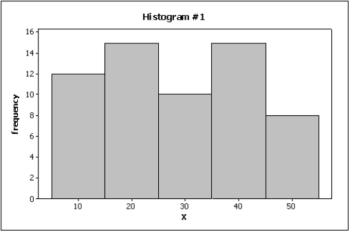
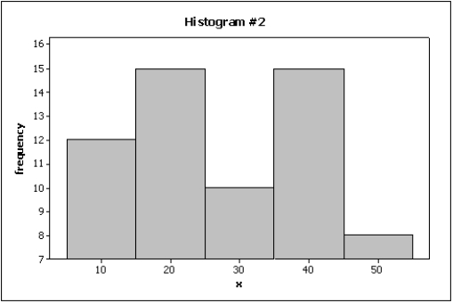
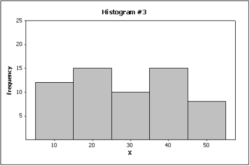 -{Home Care Narrative} Which histogram makes the differences in the house calls appear to be the most dramatic?
(Essay)
4.9/5 (40)
The relative frequency of a class in a histogram is computed by
(Multiple Choice)
4.7/5 (38)
Filters
- Essay(0)
- Multiple Choice(0)
- Short Answer(0)
- True False(0)
- Matching(0)