Exam 3: Graphical Descriptive Techniques II
Exam 1: What Is Statistics43 Questions
Exam 2: Graphical Descriptive Techniques I93 Questions
Exam 3: Graphical Descriptive Techniques II183 Questions
Exam 4: Numerical Descriptive Techniques274 Questions
Exam 5: Data Collection and Sampling82 Questions
Exam 6: Probability234 Questions
Exam 7: Random Variables and Discrete Probability Distributions274 Questions
Exam 8: Continuous Probability Distributions215 Questions
Exam 9: Sampling Distributions153 Questions
Exam 10: Introduction to Estimation152 Questions
Exam 11: Introduction to Hypothesis Testing182 Questions
Exam 12: Inference About a Population147 Questions
Exam 13: Inference About Comparing Two Populations170 Questions
Exam 14: Analysis of Variance153 Questions
Exam 15: Chi-Squared Tests175 Questions
Exam 16: Simple Linear Regression and Correlation298 Questions
Exam 17: Multiple Regression157 Questions
Select questions type
Observations that are measured at the same time are called ____________________ data.
(Short Answer)
4.9/5  (28)
(28)
The number of class intervals in a histogram depends on the number of observations in the data set.
(True/False)
4.7/5 (40)
Internet Classes
A survey of 25 students was conducted to determine how they rate the quality of Internet classes.Students were asked to rate the overall quality from 0 (no quality at all) to 100 (extremely good quality).The stem-and-leaf display of the data is shown below.
 -{Internet Classes Narrative} What percentage of the students rated the overall quality of Internet classes as being 60 or below?
(Short Answer)
4.9/5 (31)
A pie chart uses relative frequencies to summarize the data so including the sample size is not important.
(True/False)
4.7/5 (30)
The line chart below shows cucumber prices fluctuated from $2.00 per pound to over $4.50 per pound during the year. 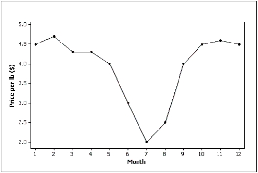
(True/False)
4.8/5 (51)
Slopes and trends in a line chart appear to be less steep if you ____________________ the horizontal (time) axis.
(Short Answer)
4.8/5 (37)
The two most important characteristics revealed by the scatter diagram are the strength and direction of the linear relationship.
(True/False)
4.9/5 (33)
The graphical technique used to describe the relationship between two interval variables is the scatter diagram.
(True/False)
5.0/5 (40)
If when one variable increases the other one also increases, we say that there is a(n) ____________________ relationship between these two variables.
(Short Answer)
4.9/5 (39)
Electronics Company
At a meeting of regional offices managers of a national electronics company, a survey was taken to determine the number of employees the regional managers supervise in the operation of their departments.The results of the survey are shown below.
 -{Electronics Company Narrative} What is the cumulative relative frequency corresponding to 4 employees?
(Essay)
4.8/5 (37)
The length of each line in a step-and-leaf display represents the ____________________ of that class interval defined by the stems.
(Short Answer)
4.8/5 (33)
The more observations we have, the ____________________ the number of class intervals we need to use to draw a useful histogram.
(Short Answer)
5.0/5 (25)
Admission to ER
The following bar chart shows the type of aspirin (if any) given to 100 cardiac patients within 15 minutes of their admission to the emergency room. 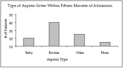 -{Admission to ER Narrative} In what way does the original bar chart distort the data as compared to a bar chart that starts at zero on the Y-axis (frequency axis)?
(Essay)
4.7/5 (31)
When one variable increases and the other decreases, we say that there is a(n) ____________________ relationship between these two variables.
(Short Answer)
5.0/5 (33)
Observations that are measured at the same time represent what type of data?
(Multiple Choice)
4.7/5 (36)
Can a scatter diagram be used to explore the relationship between two nominal variables? Explain why or why not.
(Essay)
4.9/5 (34)
Beef prices throughout the year (month 1 = January) are shown in the line chart below (per pound).Describe beef prices for this given year using this line chart. 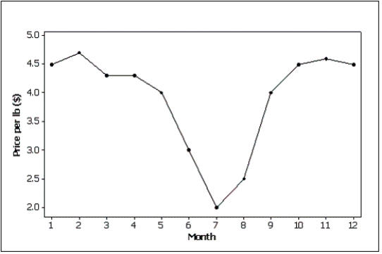
(Essay)
4.8/5 (29)
Filters
- Essay(0)
- Multiple Choice(0)
- Short Answer(0)
- True False(0)
- Matching(0)