Exam 3: Graphical Descriptive Techniques II
Exam 1: What Is Statistics43 Questions
Exam 2: Graphical Descriptive Techniques I93 Questions
Exam 3: Graphical Descriptive Techniques II183 Questions
Exam 4: Numerical Descriptive Techniques274 Questions
Exam 5: Data Collection and Sampling82 Questions
Exam 6: Probability234 Questions
Exam 7: Random Variables and Discrete Probability Distributions274 Questions
Exam 8: Continuous Probability Distributions215 Questions
Exam 9: Sampling Distributions153 Questions
Exam 10: Introduction to Estimation152 Questions
Exam 11: Introduction to Hypothesis Testing182 Questions
Exam 12: Inference About a Population147 Questions
Exam 13: Inference About Comparing Two Populations170 Questions
Exam 14: Analysis of Variance153 Questions
Exam 15: Chi-Squared Tests175 Questions
Exam 16: Simple Linear Regression and Correlation298 Questions
Exam 17: Multiple Regression157 Questions
Select questions type
Test scores
The scores on a calculus test for a random sample of 40 students are as follows:
 -{Test Grade Narrative} Construct a relative frequency histogram for this data set and discuss its shape.
(Essay)
4.9/5  (28)
(28)
Possible methods of creating distorted impressions with bar charts include:
(Multiple Choice)
4.8/5 (29)
Consider the following cumulative frequency distribution.
 Fill in the frequencies for each class in the above table.
(Short Answer)
4.9/5 (40)
Samantha recorded her amount of exercise time (in minutes) for 100 days.Both of the line charts below were created based on her same data set.Which line chart makes her exercise times look more variable and why? 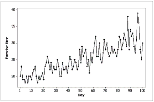
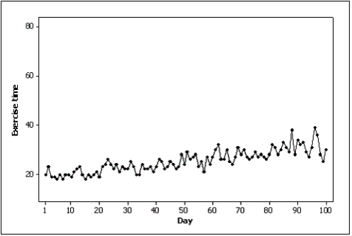
(Essay)
4.9/5 (28)
A(n) ____________________ is a graphical display consisting of a set of points, each point representing one variable measured along the horizontal axis, and another variable measured along the vertical axis.
(Short Answer)
4.9/5 (44)
Differences in the frequencies of a histogram appear to be more dramatic if you ____________________ the vertical axis.
(Short Answer)
4.8/5 (31)
Experience shows that few students hand in their statistics exams early; most prefer to hand them in near the end of the test period.This means the time taken by students to write exams is positively skewed.
(True/False)
4.8/5 (30)
When a distribution has more values to the left and tails off to the right, it is skewed negatively.
(True/False)
4.8/5 (27)
A(n) ____________________ display shows the actual observations as well as the number of observations in each class.
(Short Answer)
4.7/5 (38)
Electronics Company
At a meeting of regional offices managers of a national electronics company, a survey was taken to determine the number of employees the regional managers supervise in the operation of their departments.The results of the survey are shown below.
 -{Electronics Company Narrative} What proportion of managers supervise 3 employees?
(Short Answer)
4.7/5 (41)
We determine the approximate width of the classes by subtracting the smallest observation from the largest and dividing the answer by the number of ____________________.
(Short Answer)
4.8/5 (36)
The number of observations within each class may be found in a frequency distribution.
(True/False)
4.8/5 (33)
Credit Hours
The College of Business at The State University of California produced 3,400 credit hours during Spring Semester, 2011he number and percentage of credit hours produced by each of the four departments in the College of Business is shown below.
 The following three-dimensional pie chart was constructed from the table above.
 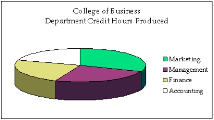 -{Credit Hours Narrative} In what way does the original three-dimensional pie chart distort the data, compared to a two-dimensional pie chart?
(Essay)
4.9/5 (36)
According to the stem-and-leaf plot below, this data set has a negative median.

(True/False)
4.8/5 (27)
Home Care
Data are collected on the number of house calls (x) made in a given week by each of 60 nurses in a certain hospital.The same data set is displayed in each of the three histograms below. 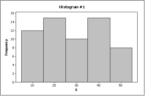
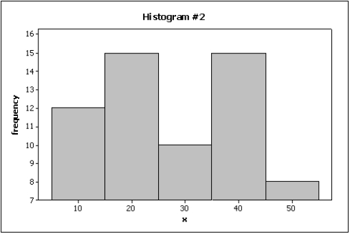
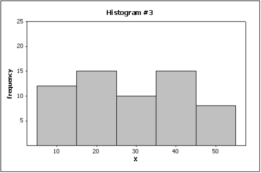 -{Home Care Narrative} Which histogram makes the differences in the house calls appear to be the least dramatic?
(Essay)
4.8/5 (38)
Filters
- Essay(0)
- Multiple Choice(0)
- Short Answer(0)
- True False(0)
- Matching(0)