Exam 3: Graphical Descriptive Techniques II
Exam 1: What Is Statistics43 Questions
Exam 2: Graphical Descriptive Techniques I93 Questions
Exam 3: Graphical Descriptive Techniques II183 Questions
Exam 4: Numerical Descriptive Techniques274 Questions
Exam 5: Data Collection and Sampling82 Questions
Exam 6: Probability234 Questions
Exam 7: Random Variables and Discrete Probability Distributions274 Questions
Exam 8: Continuous Probability Distributions215 Questions
Exam 9: Sampling Distributions153 Questions
Exam 10: Introduction to Estimation152 Questions
Exam 11: Introduction to Hypothesis Testing182 Questions
Exam 12: Inference About a Population147 Questions
Exam 13: Inference About Comparing Two Populations170 Questions
Exam 14: Analysis of Variance153 Questions
Exam 15: Chi-Squared Tests175 Questions
Exam 16: Simple Linear Regression and Correlation298 Questions
Exam 17: Multiple Regression157 Questions
Select questions type
Internet Classes
A survey of 25 students was conducted to determine how they rate the quality of Internet classes.Students were asked to rate the overall quality from 0 (no quality at all) to 100 (extremely good quality).The stem-and-leaf display of the data is shown below.
 -{Internet Classes Narrative} What percentage of the students rated the overall quality of on-line classes as being below 40?
(Short Answer)
4.9/5  (40)
(40)
If the data in a scatter diagram is scattered completely at random, what do you conclude?
(Multiple Choice)
4.9/5 (40)
The scale used on a bar chart does not affect the way the bar chart looks.
(True/False)
4.8/5 (29)
Data for calories and salt content (milligrams of sodium) in 17 brands of meat hot dogs are shown in the scatter diagram below.According to this diagram, it appears that hot dogs that are high in sodium are generally low in calories, and hot dogs with low sodium are generally high in calories. 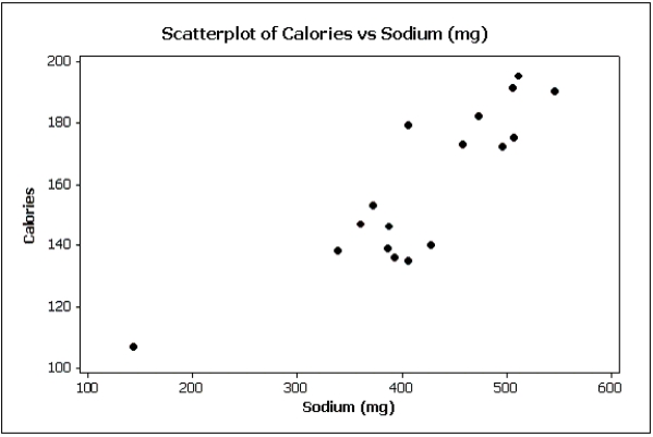
(True/False)
4.7/5 (34)
A department store's monthly sales (in thousands of dollars) for the last year were as follows.A histogram should be used to present these data.

(Essay)
4.8/5 (36)
If two variables have a strong linear relationship, that means one variable is causing the other variable to go up or down.
(True/False)
4.9/5 (29)
Graphical excellence is a term usually applied to techniques that are informative and concise and that impart information clearly to their viewers.
(True/False)
4.8/5 (31)
A bar chart can be made to look deceptive if the Y-axis starts at a number other than zero.
(True/False)
4.7/5 (28)
Briefly discuss the difference between cross-sectional data and time-series data.
(Essay)
4.8/5 (35)
The following graph shows pepper prices throughout a 12-month period. 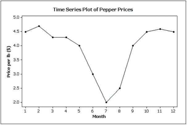 Suppose you made a new graph of the same data, where the maximum value on the Y-axis was changed from 5.0 to 10.0.(Assume everything else stays the same.) Your new graph would appear to have ____ variability in pepper prices compared to the original graph shown above.
(Multiple Choice)
4.9/5 (40)
A(n) ____________________ is a table that sorts data into class intervals (categories) and gives the number of observations in each interval (category).
(Short Answer)
4.7/5 (34)
According to the stem-and-leaf plot below, this data set is symmetric.

(True/False)
4.9/5 (39)
Pie charts only show ____________________, not ____________________.This means you don't know what the sample size is unless it is stated on the pie chart.
(Short Answer)
4.9/5 (34)
Which of the following describes a positive linear relationship between X and Y?
(Multiple Choice)
4.9/5 (36)
Test scores
The scores on a calculus test for a random sample of 40 students are as follows:
 -{Test Grades Narrative} Construct frequency and relative frequency distributions for this data set using seven class intervals.Describe the shape of the data set.
(Essay)
4.9/5 (31)
Time series data are often graphically depicted on a line chart, which is a plot of the variable of interest over time.
(True/False)
4.7/5 (35)
What does the length of each line of a stem-and-leaf display represent?
(Multiple Choice)
4.8/5 (32)
Which of the following is a characteristic of graphical excellence?
(Multiple Choice)
4.9/5 (28)
Filters
- Essay(0)
- Multiple Choice(0)
- Short Answer(0)
- True False(0)
- Matching(0)