Exam 2: Exploring Data With Tables and Graphs
Exam 1: Introduction to Statistics60 Questions
Exam 2: Exploring Data With Tables and Graphs60 Questions
Exam 3: Describing, Exploring, and Comparing Data60 Questions
Exam 4: Probability60 Questions
Exam 5: Discrete Probability Distributions60 Questions
Exam 6: Normal Probability Distributions60 Questions
Exam 7: Estimating Parameters and Determining Sample Sizes60 Questions
Exam 8: Hypothesis Testing60 Questions
Exam 9: Inferences From Two Samples60 Questions
Exam 10: Correlation and Regression60 Questions
Exam 11: Goodness-Of-Fit and Contingency Tables60 Questions
Exam 12: Analysis of Variance59 Questions
Exam 13: Nonparametric Tests60 Questions
Exam 14: Statistical Process Control60 Questions
Select questions type
Use the high closing values of Statstar Inc. stock from the years 2005-2016 to construct a time-series graph. (Let x = 0 represent 2005 and so on.)Identify a trend.
Year High Year High 2005 48 2011 62 2006 53 2012 60 2007 47 2013 68 2008 55 2014 42 2009 58 2015 51 2010 61 2016 78
Free
(Essay)
4.9/5  (27)
(27)
Correct Answer: Verified
Triserend th: rouAnswers gh 201will 3, aftverary. whiPocssih tbhele re anwswer: as a sExharcepp dtr ofopr ia n d2r01op4 in fohilloghw edclo bsiy ning crvaleases ue in thr20oug07, h the2016.re w as a steady 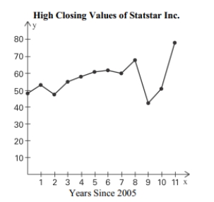
A nurse measured the blood pressure of each person who visited her clinic. Following is a relative-frequency histogram for the systolic blood pressure readings for those people aged between 25 and 40 years. The blood pressure readings were given to the nearest
Whole number. Approximately what percentage of the people aged 25 -40 had a systolic
Blood pressure reading between 110 and 119 mm Hg inclusive? Systolic Blood Pressure for People Aged Years
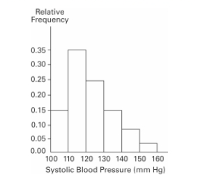 Systolic Blood Pressure (mm Hg)
Free
(Multiple Choice)
4.9/5 (38)
Correct Answer:Verified
A
The following frequency distribution displays the scores on a math test. Find the class boundaries of scores interval 40-59. Scores Number of Students 50-59 2 60-69 4 70-79 6 80-89 15 90-99 5
Free
(Multiple Choice)
4.8/5 (39)
Correct Answer:Verified
A
Describe the differences between a histogram and a stemplot and discuss the advantages and disadvantages of each.
(Essay)
4.9/5 (41)
The following data set represents Heather's average monthly charges (in $)for cable TV for the past 12 months. 105 125 110 98 102 115 110 123 118 101 95 128
Construct a frequency distribution with 4 classes.
(Essay)
4.7/5 (38)
Suppose that a data set has a minimum value of 24 and a maximum of 79 and that you want 5 classes. Explain how to find the class width for this frequency table. What happens if
you mistakenly use a class width of 11 instead of 12?
(Essay)
4.8/5 (34)
The following frequency distribution analyzes the scores on a math test. Find the class boundaries of scores interval 90-99. Scores Number of Students 50-59 2 60-69 4 70-79 6 80-89 15 90-99 5
(Multiple Choice)
5.0/5 (35)
According to USA Today, the largest categories of sports equipment sales are as follows: fishing ($2.0 billion); firearms and hunting ($3.1 billion); camping ($1.7 billion); golf ($2.5 billion). What type of graph would depict these different categories and their relative
Amounts the best?
(Multiple Choice)
4.8/5 (33)
Which choice displays the best graphic display of the amount of nitrous oxide (NO explained by the amount of carbon monoxide (CO)emissions in million metric tons over a Ten year period in the United States? The data set is below: CO 5638 5708 5893 5807 5881 5939 6024 6032 5946 6022 NO 351 349 345 339 335 335 362 371 376 384
(Multiple Choice)
4.9/5 (38)
The frequency distribution below summarizes the home sale prices in the city of Summerhill for the month of June. Determine the class width, class midpoint, and the class boundaries
for the class 235.0-265.9.
Sale Price (in thousand S) Frequency 80.0-110.9 2 111.0-141.9 5 142.0-172.9 7 173.0-203.9 10 204.0-234.9 3 235.0-265.9 1
(Essay)
4.8/5 (30)
Which of the following cumulative frequency distribution corresponds to the given frequency distribution? Weight (oz) Number of Stones 1.2-1.6 5 1.7-2.1 2 2.2-2.6 5 2.7-3.1 5 3.2-3.6 13
(Multiple Choice)
4.7/5 (33)
A nurse measured the blood pressure of each person who visited her clinic. Following is a relative-frequency histogram for the systolic blood pressure readings for those people aged between 25 and 40 years. The blood pressure readings were given to the nearest
Whole number. Approximately what percentage of the people aged 25 -40 had a systolic
Blood pressure reading between 110 and 139 mm Hg inclusive? Systolic Blood Pressure for People Aged 25 - 40 Years
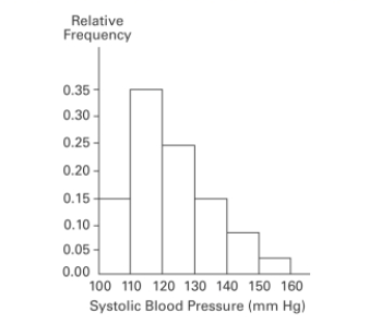 Systolic Blood Pressure (mm Hg)
(Multiple Choice)
4.7/5 (33)
Graphs should be constructed in a way that is fair and objective. A common deceptive graph
alters the axes of the graph in what way?
(Essay)
4.9/5 (29)
The following frequency distribution represents the scores on a math test. Find the class midpoint of scores for the interval 40-59. Scores Number of students 50-59 2 60-69 4 70-79 6 80-89 15 90-99 5
(Multiple Choice)
4.9/5 (44)
A nurse measured the blood pressure of each person who visited her clinic. Following is a relative-frequency histogram for the systolic blood pressure readings for those people aged between 25 and 40 years. The blood pressure readings were given to the nearest
Whole number. Approximately what percentage of the people aged 25 -40 had a systolic
Blood pressure reading between 110 and 139 mm Hg inclusive? Systolic Blood Pressure for People Aged 25 - 40 Years
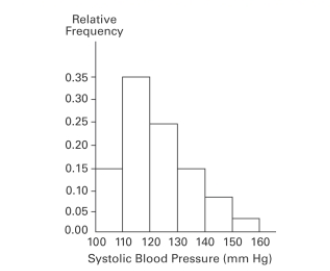
(Multiple Choice)
4.7/5 (35)
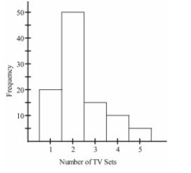
The histogram below represents the number of television sets per household for a sample of U.S. households. What is the sample size? Number of Television Sets Per U.S. Household
(Multiple Choice)
4.9/5 (36)
The following data show the number of laps run by each participant in a marathon. 46 65 55 43 51 48 57 30 43 49 32 56
Which of these choices display the correct stemplot?
(Multiple Choice)
4.9/5 (36)
The frequency table below shows the amount of weight loss during the first month of a diet program for a group of men. Constructing a frequency polygon. Applying a loose
interpretation of the requirements for a normal distribution, do the pounds of weight loss appear
to be normally distributed? Why or why not? Weight (lb) Frequency 5-7 2 8-10 9 11-13 18 14-16 13 17-19 4 20-22 1
(Essay)
4.7/5 (37)
The scatterplot below displays the amount of nitrous oxide (NO)explained by the amount of carbon monoxide (CO)emissions in million metric tons over a ten year period in the United States. Select the choice that best describes any relationship between the variables. 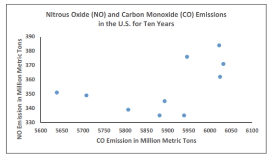
(Multiple Choice)
4.7/5 (24)
x 0.51 0.02 0.14 0.29 0.34 0.8 0.47 0.71 y 0.31 0.46 -0.12 0.34 -0.05 0.8 0.35 0.47 Which of these choices display the correct scatterplot?
(Multiple Choice)
5.0/5 (35)
Filters
- Essay(0)
- Multiple Choice(0)
- Short Answer(0)
- True False(0)
- Matching(0)