Exam 2: Exploring Data With Tables and Graphs
Exam 1: Introduction to Statistics155 Questions
Exam 2: Exploring Data With Tables and Graphs132 Questions
Exam 3: Describing, Exploring, and Comparing Data225 Questions
Exam 4: Probability219 Questions
Exam 5: Discrete Probability Distributions205 Questions
Exam 6: Normal Probability Distributions254 Questions
Exam 7: Estimating Parameters and Determining Sample Sizes170 Questions
Exam 8: Hypothesis Testing187 Questions
Exam 9: Inferences From Two Samples192 Questions
Exam 10: Correlation and Regression174 Questions
Exam 11: Goodness-Of-Fit and Contingency Tables100 Questions
Exam 12: Analysis of Variance113 Questions
Exam 13: Nonparametric Tests121 Questions
Exam 14: Statistical Process Control90 Questions
Select questions type
The frequency distribution below summarizes the home sale prices in the city of Summerhill for the month of June. Determine the width of each class.
(Multiple Choice)
4.8/5  (36)
(36)
A nurse measured the blood pressure of each person who visited her clinic. Following is a relative-frequency histogram for the systolic blood pressure readings for those people aged between 25 and 40. The blood pressure
Readings were given to the nearest whole number. Identify the center of the third class. 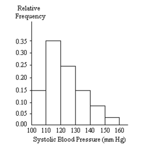
(Multiple Choice)
4.8/5 (40)
The frequency distribution below summarizes the home sale prices in the city of Summerhill for the month of June. Find the class boundaries for class 80.0-110.9.
(Multiple Choice)
4.8/5 (28)
Construct a pie chart representing the given data set.
-The graph below shows the number of car accidents occurring in one city in each of the years 2001 through
2006. The number of accidents dropped in 2003 after a new speed limit was imposed. Does the graph distort the
data? How would you redesign the graph to be less misleading? 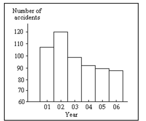
(Essay)
4.8/5 (36)
In a survey, 20 people were asked how many magazines they had purchased during the previous year. The
results are shown below. Construct a histogram to represent the data. Use 4 classes with a class width of 10, and
begin with a lower class limit of -0.5. What is the approximate amount at the center? 6 15 3 36 25 18 12 18 5 30 24 7 0 22 33 24 19 4 12 9
(Essay)
4.8/5 (32)
The frequency distribution below summarizes the home sale prices in the city of Summerhill for the month of June. Determine the class midpoint (in thousand $) for the class 235.0-265.9.
(Multiple Choice)
4.8/5 (35)
In a survey, 26 voters were asked their ages. The results are shown below. Construct a histogram to represent the data (with 5 classes beginning with a lower class limit of 19.5 and a class width of 10). What is the approximate age at the center? 43 56 28 63 67 66 52 48 37 51 40 60 62 66 45 21 35 49 32 53 61 53 69 31 48 59
(Essay)
4.9/5 (38)
A medical research team studied the ages of patients who had strokes caused by stress. The ages of 34 patients who suffered stress strokes were as follows.
29 30 36 41 45 50 57 61 28 50 36 58
60 38 36 47 40 32 58 46 61 40 55 32
61 56 45 46 62 36 38 40 50 27
Construct a frequency distribution for these ages. Use 8 classes beginning with a lower class limit of
(Essay)
4.9/5 (29)
Suppose that you construct a histogram and a relative frequency histogram corresponding to a particular
frequency table. In what ways will the two histograms be similar? In what ways will they differ?
(Essay)
4.9/5 (33)
The following data consists of the weights (in pounds) of 15 randomly selected women and the weights of 15 randomly selected men. Which of these choices display the correct back-to-back stemplot? Women: 128 150 118 166 142 122 137 110 175 152 145 126 139 111 170 Men: 140 153 199 186 169 136 176 162 196 155 173 190 141 166 153
(Multiple Choice)
4.8/5 (41)
A nurse measured the blood pressure of each person who visited her clinic. Following is a relative-frequency histogram for the systolic blood pressure readings for those people aged between 25 and 40. The blood pressure
Readings were given to the nearest whole number. Approximately what percentage of the people aged 25-40
Had a systolic blood pressure reading between 110 and 139 inclusive? 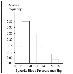
(Multiple Choice)
4.9/5 (29)
Suppose that a data set has a minimum value of 24 and a maximum of 79 and that you want 5 classes. Explain
how to find the class width for this frequency table. What happens if you mistakenly use a class width of 11
instead of 12?
(Essay)
4.9/5 (43)
In a survey, 20 people were asked how many magazines they had purchased during the previous year. The
results are shown below. Construct a histogram to represent the data. Use 4 classes with a class width of 10, and
begin with a lower class limit of -0.5. What is the approximate amount at the center? 6 15 3 36 25 18 12 18 5 30 24 7 0 22 33 24 19 4 12 9
(Essay)
4.9/5 (36)
Weight (oz) Number of Stones 1.2-1.6 5 1.7-2.1 2 2.2-2.6 5 2.7-3.1 5 3.2-3.6 13
(Multiple Choice)
4.9/5 (39)
Use the high closing values of Naristar Inc. stock from the years 1990 - 2001 to construct a time-series graph.
(Let x = 0 represent 1990 and so on.) Identify a trend. Year High Year High 1990 42 1996 47 1991 40 1997 60 1992 31 1998 61 1993 42 1999 57 1994 44 2000 54 1995 47 2001 30
(Essay)
4.8/5 (23)
The frequency chart shows the distribution of defects for the machines used to produce a product. Defects Frequency 0 1 1 3 2 0 3 2 4 4 5 0
(Multiple Choice)
4.9/5 (38)
Suppose that a histogram is constructed for the frequency distribution shown below: Age Frequency 30-39 11 40-49 23 50-59 17 60-69 12 70-89 6 The class 60-69 has twice the frequency of the class 70-89. In the histogram, will the area of the bar for the class
60-69 be twice the area of the bar for the class 70-89? In other words, will areas be proportional to frequencies
in this histogram? Explain your thinking. Are there any conditions under which areas are proportional to
frequencies in histograms?
(Essay)
4.8/5 (35)
The histogram below represents the number of television sets per household for a sample of U.S. households. What is the minimum number of households having the same number of television sets? 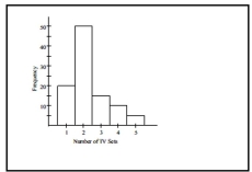
(Multiple Choice)
4.8/5 (33)
Kevin asked some of his friends how many hours they had worked during the previous week at their
after-school jobs. The results are shown below. 5 6 5 4 5 5 9 8 5 3 7 6 6 7 5 6 7 5 6 8 6 7 8 4 Construct a frequency distribution. Use 4 classes, a class width of 2 hours and a lower limit of 3 for class 1. 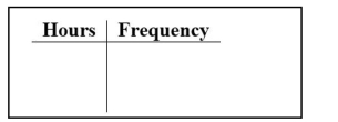
(Essay)
4.7/5 (30)
Attendance records at a school show the number of days each student was absent during the year. The days absent for each student were as follows. 0 2 3 4 2 3 4 6 7 2 3 4 6 9 8 Which of these choices display the correct dotplot?
(Multiple Choice)
4.8/5 (36)
Filters
- Essay(0)
- Multiple Choice(0)
- Short Answer(0)
- True False(0)
- Matching(0)