Exam 2: Exploring Data With Tables and Graphs
Exam 1: Introduction to Statistics155 Questions
Exam 2: Exploring Data With Tables and Graphs132 Questions
Exam 3: Describing, Exploring, and Comparing Data225 Questions
Exam 4: Probability219 Questions
Exam 5: Discrete Probability Distributions205 Questions
Exam 6: Normal Probability Distributions254 Questions
Exam 7: Estimating Parameters and Determining Sample Sizes170 Questions
Exam 8: Hypothesis Testing187 Questions
Exam 9: Inferences From Two Samples192 Questions
Exam 10: Correlation and Regression174 Questions
Exam 11: Goodness-Of-Fit and Contingency Tables100 Questions
Exam 12: Analysis of Variance113 Questions
Exam 13: Nonparametric Tests121 Questions
Exam 14: Statistical Process Control90 Questions
Select questions type
Construct a pie chart representing the given data set.
-The frequency table below shows the amount of weight loss during the first month of a diet program for a
group of men. Constructing a frequency polygon. Applying a loose interpretation of the requirements for
a normal distribution, do the pounds of weight loss appear to be normally distributed? Why or why not? Weight (lb) Frequency 5-7 2 8-10 9 11-13 18 14-16 13 17-19 4 20-22 1
(Essay)
4.9/5  (31)
(31)
Graphs should be constructed in a way that is fair and objective. A common deceptive graph alters the axes of
the graph in what way?
(Essay)
4.8/5 (37)
The linear ________ coefficient denoted by r measures the ________ of the linear association between two variables.
(Multiple Choice)
4.9/5 (37)
Sturges' guideline suggests that when constructing a frequency distribution, the ideal number of classes can be approximated by 1 + (log n)/(log 2), where n is the number of data values. Use this guideline to find the ideal
Number of classes when the number of data values is 148.
(Multiple Choice)
4.8/5 (41)
Use the data to create a stemplot.
-The attendance counts for this season's basketball games are listed below. 227 239 215 219
221 233 229 233
235 228 245 231
(Multiple Choice)
4.8/5 (33)
Describe at least two advantages to using stemplots rather than frequency distributions.
(Essay)
4.8/5 (39)
The following data show the number of laps run by each participant in a marathon. 46 65 55 43 51 48 57 30 43 49 32 56
Which of these choices display the correct stemplot?
(Multiple Choice)
5.0/5 (40)
The histogram below represents the number of television sets per household for a sample of U.S. households. What is the sample size? 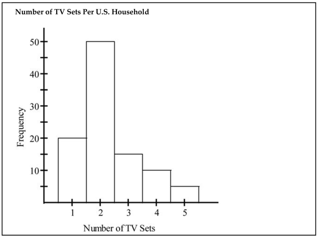
(Multiple Choice)
4.8/5 (46)
The histogram below shows the distribution of the assets (in millions of dollars) of 71 companies. Does the
distribution appear to be normal? 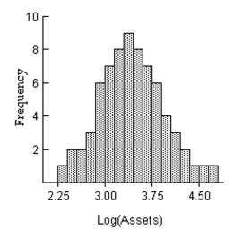
(Short Answer)
4.8/5 (38)
The frequency distribution below summarizes employee years of service for Alpha Corporation. Find the class boundaries for class 26-30. Years of service Frequency 1-5 5 6-10 20 11-15 25 16-20 10 21-25 5 26-30 3
(Multiple Choice)
4.9/5 (33)
The following frequency distribution analyzes the scores on a math test. Find the class midpoint of scores interval 40-59. Scores Number of students 40-59 2 60-75 4 76-82 6 83-94 15 95-99 5
(Multiple Choice)
4.8/5 (34)
A nurse measured the blood pressure of each person who visited her clinic. Following is a relative-frequency histogram for the systolic blood pressure readings for those people aged between 25 and 40 years. The blood
Pressure readings were given to the nearest whole number. Approximately what percentage of the people aged
25-40 had a systolic blood pressure reading between 110 and 139 mm Hg inclusive? 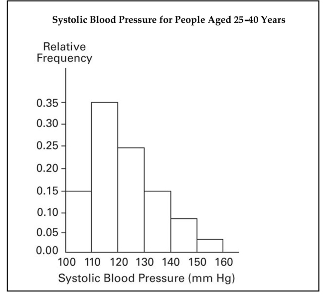
(Multiple Choice)
4.8/5 (35)
Which of the following cumulative frequency distribution corresponds to the given frequency distribution? Weight (oz) Number of Stones 1.2-1.6 5 1.7-2.1 2 2.2-2.6 5 2.7-3.1 5 3.2-3.6 13
(Multiple Choice)
4.7/5 (31)
On a math test, the scores of 24 students were 91 71 75 66 75 75 91 87 75 66 82 71 71 82 75 71 82 75 71 87 71 82 87 66
Construct a frequency distribution. Use 4 classes beginning with a lower class limit of 60 .
(Essay)
4.8/5 (32)
Construct a pie chart representing the given data set.
-A parcel delivery service lowered its prices and finds that it has delivered twice as many parcels this year as it
did last year. To illustrate this fact, the manager draws a graph as shown below. Each cube depicts a parcel. The
side length of the "parcel" on the right is twice the side length of the "parcel" on the left. Why is this graph
misleading? What visual impression is created by the graph? 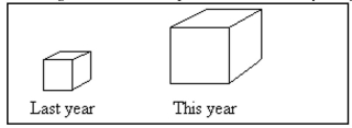
(Essay)
4.9/5 (50)
The following data show the number of laps run by each participant in a marathon. 46 65 55 43 51 48 57 30 43 49 32 56 Which of these choices display the correct stemplot?
(Multiple Choice)
4.9/5 (40)
The following frequency distribution represents the scores on a math test. Find the class midpoint of scores for the interval 40-59. Scores Number of students 50-59 2 60-69 4 70-79 6 80-89 15 90-99 5
(Multiple Choice)
4.9/5 (39)
Smoking and the episodes of lung cancer have a high correlation, but it does not prove ________.
(Multiple Choice)
4.8/5 (29)
The scatterplot below displays the amount of nitrous oxide (NO) explained by the amount of carbon monoxide (CO) emissions in million metric tons over a ten year period in the United States. Select the choice that best
Describes any relationship between the variables. 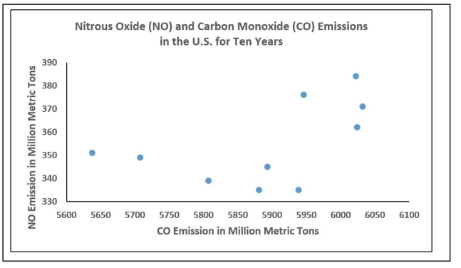
(Multiple Choice)
4.8/5 (35)
A nurse measured the blood pressure of each person who visited her clinic. Following is a relative-frequency histogram for the systolic blood pressure readings for those people aged between 25 and 40 years. The blood
Pressure readings were given to the nearest whole number. Approximately what percentage of the people aged
25-40 had a systolic blood pressure reading between 110 and 119 mm Hg inclusive? 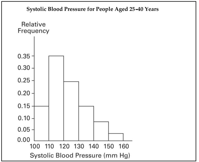
(Multiple Choice)
4.8/5 (32)
Filters
- Essay(0)
- Multiple Choice(0)
- Short Answer(0)
- True False(0)
- Matching(0)