Exam 10: Data Analysisstatistics: an Introduction
Exam 1: An Introduction to Problem Solving85 Questions
Exam 2: Introduction to Logic and Sets153 Questions
Exam 3: Numeration Systems and Whole Number Operations194 Questions
Exam 4: Number Theory116 Questions
Exam 5: Integers122 Questions
Exam 6: Rational Numbers and Proportional Reasoning85 Questions
Exam 7: Rational Numbers As Decimals and Percents102 Questions
Exam 8: Real Numbers and Algebraic Thinking151 Questions
Exam 9: Probability129 Questions
Exam 10: Data Analysisstatistics: an Introduction57 Questions
Exam 11: Introductory Geometry115 Questions
Exam 12: Congruence and Similarity With Constructions121 Questions
Exam 13: Congruence and Similarity With Transformations56 Questions
Exam 14: Area, Pythagorean Theorem, and Volume124 Questions
Select questions type
Use the figure to answer the question.
-The sales figures for the Big "D" Company are shown below in a line graph. 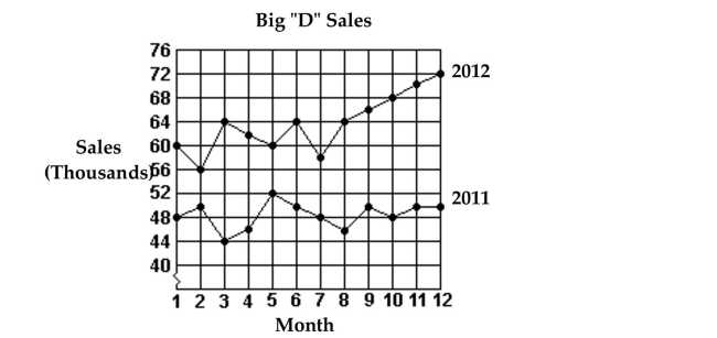 Which month in 2012 had the highest sales?
(Multiple Choice)
4.8/5  (32)
(32)
Use the figure to answer the question.
-Students in Mr. Mason's classes collected items from different countries. The data show how
many of each item one class collected. Construct a bar graph for the frequency data.
Stamps, 9
Postcards, 11
Coins, 7
Books, 13 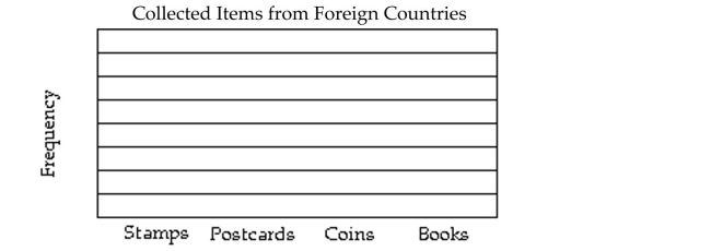
(Essay)
4.7/5 (26)
Use the statistical display to answer the question.
-The midterm test scores for the seventh-period typing class are shown below on a dot plot. 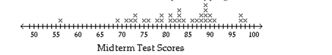 What are the outliers?
(Multiple Choice)
4.8/5 (31)
Use the figure to answer the question.
-The bar graph below shows the number of students by major in the College of Arts and Sciences. 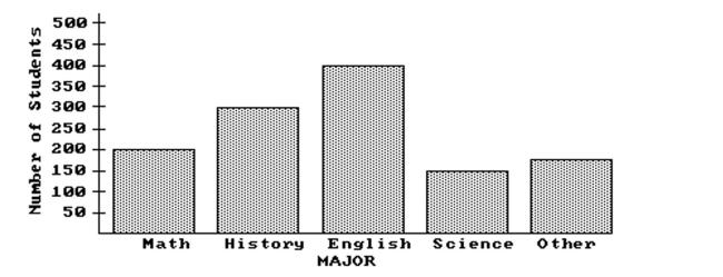 What percent of students in the college are history majors (to the nearest tenth of a percent)?
(Multiple Choice)
4.8/5 (40)
Use the circle graph to solve the problem.
-In a school survey, students showed these preferences for instructional materials. 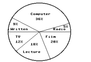 About how many students would you expect to prefer films in a school of 350 students?
(Multiple Choice)
4.8/5 (25)
Use the figure to answer the question.
-The data below give the figures for the United States production of canned fruit from 2002 to
2009. Make a line graph for the data. 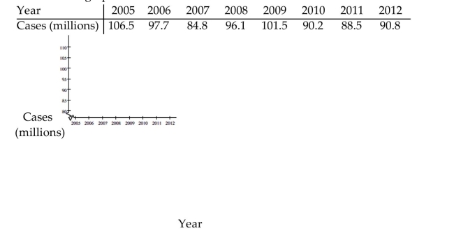
(Essay)
5.0/5 (30)
Use the statistical display to answer the question.
-The midterm test scores for the seventh-period typing class are shown below on a dot plot. 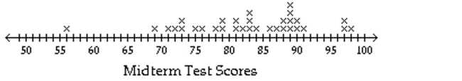 What is the largest gap in scores, not including gaps between outliers?
(Multiple Choice)
4.7/5 (30)
Use the circle graph to solve the problem.
-In a school survey, students showed these preferences for instructional materials. 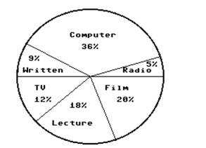 About how many students would you expect to prefer radio in a school of 250 students?
(Multiple Choice)
4.8/5 (28)
Use the figure to answer the question.
-The wages of the employees of a company are presented in this histogram. Assume that $6 is in the interval $6-$8, not $4-$6, similarly for $8, $10, and $12. 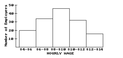 How many employees earn at least $12 and less than $14 an hour?
(Multiple Choice)
4.9/5 (41)
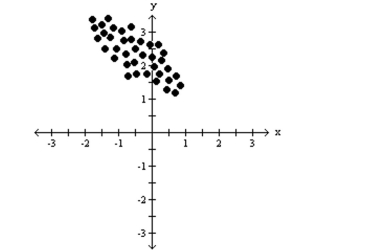
Identify whether the given scatterplot shows a positive association, negative association, or no association.
-The following scatterplot shows the temperature of a city and the city's latitude.
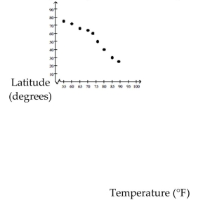
(Multiple Choice)
4.8/5 (29)
Use the figure to answer the question.
-This double-bar graph shows the number of male (M)and female (F)athletes at a university over a four-year period. 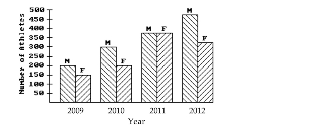 Which year had the smallest number of male athletes?
(Multiple Choice)
4.8/5 (30)
Use the figure to answer the question.
-This double-bar graph shows the number of male (M)and female (F)athletes at a university over a four-year period. 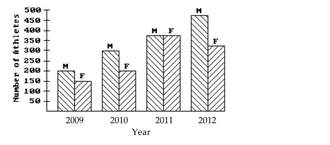 Which year had the same number of male and female athletes?
(Multiple Choice)
4.9/5 (29)
Use the figure to answer the question.
-The weights (in pounds)of a group of high school students are listed below in a stem-and-leaf plot.
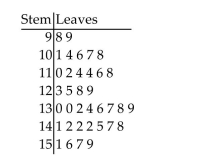 What is the difference between the lowest and highest weights?
(Multiple Choice)
4.7/5 (33)
Use the circle graph to solve the problem.
-In a school survey, students showed these preferences for instructional materials. 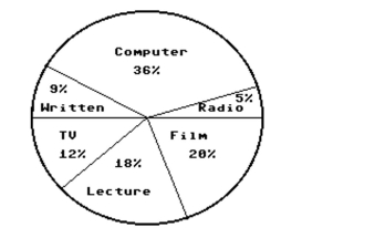 About how many students would you expect to prefer computers in a school of 500 students?
(Multiple Choice)
5.0/5 (34)
Use the figure to answer the question.
-The wages of the employees of a company are presented in this histogram. Assume that $6 is in the interval $6-$8, not $4-$6, similarly for $8, $10, and $12. 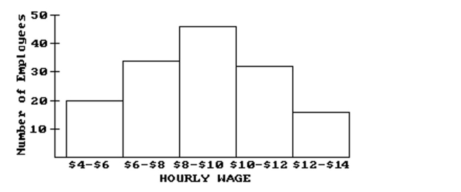 How many employees earn at least $4 and less than $6 an hour?
(Multiple Choice)
4.8/5 (34)
Use the statistical display to answer the question.
-The midterm test scores for the seventh-period typing class are shown below on a dot plot. 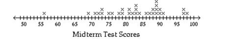 What are the low and high scores?
(Multiple Choice)
4.8/5 (37)
Use the figure to answer the question.
-The wages of the employees of a company are presented in this histogram. Assume that $6 is in the interval $6-$8, not $4-$6, similarly for $8, $10, and $12. 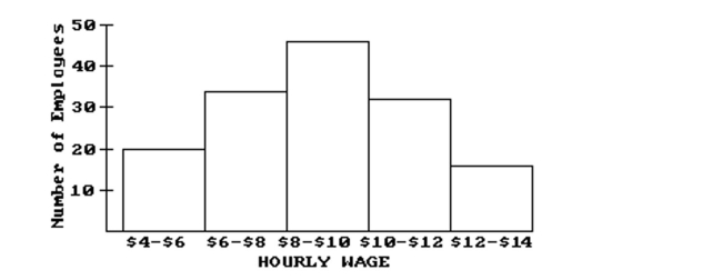 How many employees earn at least $6 and less than $8 an hour?
(Multiple Choice)
4.8/5 (28)
Identify whether the given scatterplot shows a positive association, negative association, or no association.
-
(Multiple Choice)
4.8/5 (43)
Use the figure to answer the question.
-The heights (in inches)of a group of high school students are listed below in a back-to-back stem-and-leaf plot. 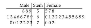 What is does represent on the plot?
(Multiple Choice)
4.7/5 (20)
Use the figure to answer the question.
-The sales figures for the Big "D" Company are shown below in a line graph. 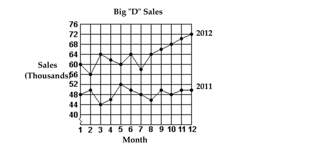 What were the total sales for the first 6 months of 2011?
(Multiple Choice)
4.8/5 (26)
Filters
- Essay(0)
- Multiple Choice(0)
- Short Answer(0)
- True False(0)
- Matching(0)