Exam 1: Describing Data With Graphs
Exam 1: Describing Data With Graphs94 Questions
Exam 2: Describing Data With Numerical Measures186 Questions
Exam 3: Describing Bivariate Data35 Questions
Exam 4: Probability and Probability Distributions136 Questions
Exam 5: Several Useful Discrete Distributions129 Questions
Exam 6: The Normal Probability Distribution196 Questions
Exam 7: Sampling Distributions162 Questions
Exam 8: Large-Sample Estimation173 Questions
Exam 9: Large-Sample Tests of Hypotheses210 Questions
Exam 10: Inference From Small Samples261 Questions
Exam 11: The Analysis of Variance156 Questions
Exam 12: Linear Regression and Correlation165 Questions
Exam 13: Multiple Regression Analysis178 Questions
Exam 14: Analysis of Categorical Data136 Questions
Exam 15: Nonparametric Statistics198 Questions
Select questions type
The total area of the six bars in a relative frequency histogram for which the width of each bar is five units is 5.
(True/False)
4.9/5  (39)
(39)
If the manager of a grocery store wishes to display the sales trend, the most effective type of graph will be:
(Multiple Choice)
4.8/5 (34)
The four classes: p to < 5, 5 to < 10, 10 to < 20, over 20, would be acceptable for developing a frequency distribution.
(True/False)
4.7/5 (28)
Which of the following is not the goal of descriptive statistics?
(Multiple Choice)
4.9/5 (31)
When constructing a relative frequency distribution, if the data are discrete, it will always be necessary to develop class boundaries.
(True/False)
4.9/5 (32)
Statistical inference is the process of making an estimate, prediction, or decision about a population based on sample data.
(True/False)
4.7/5 (30)
A histogram is usually used to display which of the following characteristics for a quantitative variable?
(Multiple Choice)
4.8/5 (32)
A neighborhood ice cream vendor would like to see if there is a relationship between day of the week and the number of children buying ice cream from her. The following data represent the number of children buying ice cream on each of the seven days of a particular week: 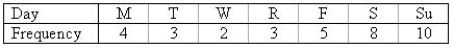 a. Construct a line chart to describe the data.
b. Is there any apparent trend in the data?
________________________________________________________
a. Construct a line chart to describe the data.
b. Is there any apparent trend in the data?
________________________________________________________
(Essay)
4.7/5 (31)
A continuous quantitative variable is one that can assume values at all points on an interval of values, with no gaps between possible values.
(True/False)
4.9/5 (41)
You asked ten of your classmates about their weight. On the basis of this information, you stated that the average weight of all students in your university or college is 158 pounds. This is an example of:
(Multiple Choice)
4.9/5 (30)
Groupings of data, created to enhance an understanding of them, usually by making the groups collectively exhaustive and mutually exclusive are called classes or categories.
(True/False)
4.9/5 (33)
A relative frequency distribution describes the proportion of data values that fall within each category.
(True/False)
4.7/5 (43)
A market share of 78.5 percent would be represented in a pie chart by a slice with a central angle of:
(Multiple Choice)
4.7/5 (36)
In the term "frequency distribution," frequency refers to the number of data values or measurements falling within each class.
(True/False)
4.8/5 (37)
A hospital administration would like to know the average length that a patient stays in the hospital. It would be almost impossible to look through all of the past records and average the lengths of stay. Instead, a sample of 1000 patients over the last year was randomly chosen and their lengths of stay were averaged. Describe the population and sample in this problem.
Population: ________________________________________________________
Sample: ________________________________________________________
(Essay)
5.0/5 (33)
The class interval in a frequency distribution is the number of data values falling within each class.
(True/False)
4.9/5 (43)
A common rule of thumb in constructing a relative frequency histogram is to use:
(Multiple Choice)
4.9/5 (42)
A high school volleyball coach has summarized the wins, losses, and ties of her team for the past 4 years in the following stacked bar chart. Interpret the chart. 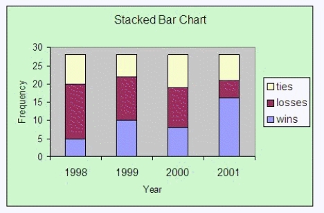
(Essay)
4.8/5 (36)
The two graphical techniques we usually use to present qualitative data are:
(Multiple Choice)
4.7/5 (27)
Filters
- Essay(0)
- Multiple Choice(0)
- Short Answer(0)
- True False(0)
- Matching(0)