Exam 3: Graphical Descriptive Techniques 2
Exam 1: What Is Statistics46 Questions
Exam 2: Graphical Descriptive Techniques 194 Questions
Exam 3: Graphical Descriptive Techniques 2156 Questions
Exam 4: Numerical Descriptive Techniques275 Questions
Exam 5: Data Collection and Sampling84 Questions
Exam 6: Probability240 Questions
Exam 7: Random Variables and Discrete Probability Distributions283 Questions
Exam 8: Continuous Probability Distributions224 Questions
Exam 9: Sampling Distributions156 Questions
Exam 10: Introduction to Estimation154 Questions
Exam 11: Introduction to Hypothesis Testing189 Questions
Exam 12: Inference About a Population153 Questions
Exam 13: Inference About Comparing Two Populations170 Questions
Exam 14: Analysis of Variance157 Questions
Exam 15: Chi-Squared Tests179 Questions
Exam 16: Simple Linear Regression and Correlation304 Questions
Exam 17: Multiple Regression160 Questions
Exam 18: Model Building148 Questions
Exam 19: Nonparametric Statistics175 Questions
Exam 20: Time-Series Analytics and Forecasting225 Questions
Exam 21: Statistical Process Control140 Questions
Exam 22: Decision Analysis123 Questions
Exam 23: Conclusion47 Questions
Select questions type
Observations that are measured at the same time are called ____________________ data.
(Short Answer)
5.0/5  (36)
(36)
When two variables tend to move in opposite directions,yet still form a linear pattern,how do you describe their relationship?
(Multiple Choice)
4.8/5 (32)
Home Care Data are collected on the number of house calls (x)made in a given week by each of 60 nurses in a certain hospital.The same data set is displayed in each of the three histograms below. 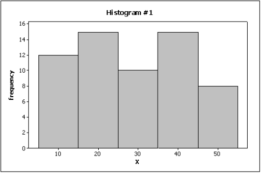
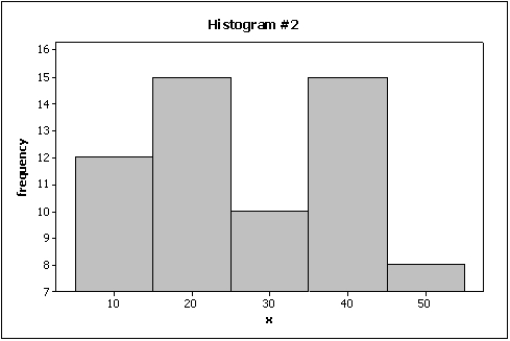
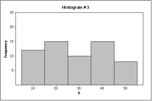
-{Home Care Narrative} Which histogram makes the differences in the house calls appear to be the least dramatic?
-{Home Care Narrative} Which histogram makes the differences in the house calls appear to be the least dramatic?
(Essay)
4.9/5 (39)
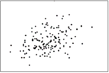
The first scatter diagram below shows a stronger linear relationship than the second scatter diagram.(Assume the scales on both scatter diagrams are the same.) 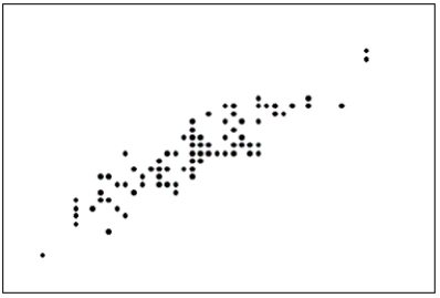
(True/False)
4.8/5 (33)
{Teachers Ages Narrative} Draw a frequency histogram of this data which contains six classes.What is the shape of the histogram?
(Essay)
4.8/5 (28)
An online dating service has a quick poll on its website showing the following results.Critique the graph portion of the table.How can it be improved? 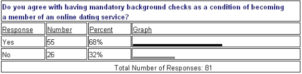
(Essay)
4.8/5 (32)
A modal class is the class with the largest number of observations.
(True/False)
4.8/5 (40)
A(n)____________________ is best defined as a set of symbols (such as people or animals)used to depict data.It often distorts the actual sizes of the items being portrayed.
(Short Answer)
4.8/5 (31)
If two variables have a strong linear relationship,that means one variable is causing the other variable to go up or down.
(True/False)
4.9/5 (41)
Graphical excellence is a term usually applied to techniques that are informative and concise and that impart information clearly to their viewers.
(True/False)
4.7/5 (36)
Home Care Data are collected on the number of house calls (x)made in a given week by each of 60 nurses in a certain hospital.The same data set is displayed in each of the three histograms below.
-{Home Care Narrative} How many nurses are there in this hospital?
(Essay)
4.8/5 (30)
A line chart is created by plotting the values of the variable on the vertical axis and the time periods on the horizontal axis.
(True/False)
4.9/5 (33)
A pie chart showing 80% yes and 20% no would look the same whether it was based on 10,000 observations or 10 observations.This is one way that pie charts can be deceptive.
(True/False)
4.9/5 (30)
Below are two line charts where the percentage return for a stock is shown over time.The two graphs are made from the same data set. 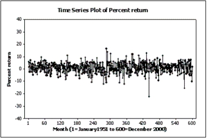
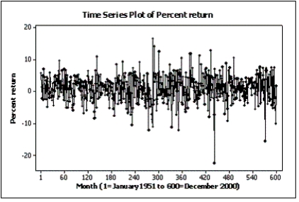 Explain why these two line charts look different.
(Essay)
4.8/5 (36)
The two most important characteristics to look for in a scatter diagram are the ____________________ and ____________________ of the linear relationship.
(Short Answer)
4.9/5 (47)
The line chart below shows potato prices per pound for each month from January (month 1)to December last year.By looking at this chart you can see the lowest potato prices occurred in ____________________. 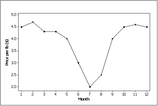
(Short Answer)
4.9/5 (32)
Differences in the frequencies of a histogram appear to be less dramatic if you ____________________ the vertical axis.
(Short Answer)
4.9/5 (34)
Filters
- Essay(0)
- Multiple Choice(0)
- Short Answer(0)
- True False(0)
- Matching(0)