Exam 3: Graphical Descriptive Techniques 2
Exam 1: What Is Statistics46 Questions
Exam 2: Graphical Descriptive Techniques 194 Questions
Exam 3: Graphical Descriptive Techniques 2156 Questions
Exam 4: Numerical Descriptive Techniques275 Questions
Exam 5: Data Collection and Sampling84 Questions
Exam 6: Probability240 Questions
Exam 7: Random Variables and Discrete Probability Distributions283 Questions
Exam 8: Continuous Probability Distributions224 Questions
Exam 9: Sampling Distributions156 Questions
Exam 10: Introduction to Estimation154 Questions
Exam 11: Introduction to Hypothesis Testing189 Questions
Exam 12: Inference About a Population153 Questions
Exam 13: Inference About Comparing Two Populations170 Questions
Exam 14: Analysis of Variance157 Questions
Exam 15: Chi-Squared Tests179 Questions
Exam 16: Simple Linear Regression and Correlation304 Questions
Exam 17: Multiple Regression160 Questions
Exam 18: Model Building148 Questions
Exam 19: Nonparametric Statistics175 Questions
Exam 20: Time-Series Analytics and Forecasting225 Questions
Exam 21: Statistical Process Control140 Questions
Exam 22: Decision Analysis123 Questions
Exam 23: Conclusion47 Questions
Select questions type
Electronics Company At a meeting of regional offices managers of a national electronics company,a survey was taken to determine the number of employees the regional managers supervise in the operation of their departments.The results of the survey are shown below. 
-{Electronics Company Narrative} What proportion of managers supervises 3 employees?
-{Electronics Company Narrative} What proportion of managers supervises 3 employees?
(Short Answer)
4.9/5  (40)
(40)
Which of the following statements about histograms is false?
(Multiple Choice)
4.8/5 (31)
Observations that are measured at successive points in time is what type of data?
(Multiple Choice)
4.9/5 (38)
In applications involving two variables,X and Y,where one variable depends to some degree on the other,we call Y the ____________________ variable.
(Short Answer)
4.8/5 (40)
Can a scatter diagram be used to explore the relationship between two nominal variables? Explain why or why not.
(Essay)
4.9/5 (38)
If when one variable increases the other one also increases,we say that there is a(n)____________________ relationship between these two variables.
(Short Answer)
4.8/5 (28)
Data for calories and salt content (milligrams of sodium)in 17 brands of meat hot dogs are shown in the scatter diagram below.According to this diagram,it appears that hot dogs that are high in sodium are generally low in calories,and hot dogs with low sodium are generally high in calories. 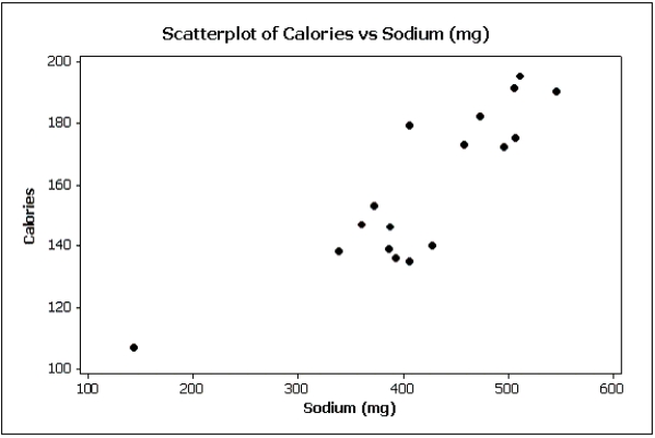
(True/False)
4.8/5 (31)
A bar chart can be made to look deceptive if the Y-axis starts at a number other than zero.
(True/False)
4.9/5 (33)
Insurance Company A representative from a local insurance agency selected a random sample of insured homeowners and recorded the number of claims made in the last three years,with the following results: 
-{Insurance Company Narrative} How many total claims are represented in the sample?
-{Insurance Company Narrative} How many total claims are represented in the sample?
(Essay)
4.8/5 (36)
In a histogram a(n)____________________ class is the one with the largest number of observations.
(Short Answer)
4.7/5 (37)
Which of the following describes the shape of the histogram below? 
(Multiple Choice)
4.8/5 (35)
 Admission to ER The following bar chart shows the type of aspirin (if any)given to 100 cardiac patients within 15 minutes of their admission to the emergency room.
 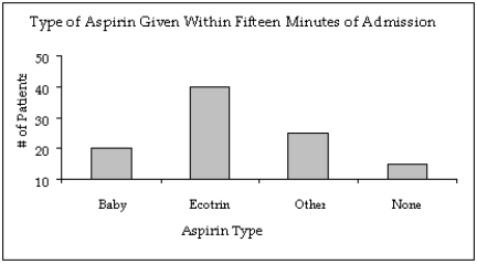 -{Admission to ER Narrative} In what way does the original bar chart distort the data as compared to a bar chart that starts at zero on the Y-axis (frequency axis)?
(Essay)
4.8/5 (27)
We create a frequency distribution for interval data by counting the number of observations that fall into each of a series of intervals,called ____________________.
(Short Answer)
4.7/5 (36)
The two most important characteristics revealed by the scatter diagram are the strength and direction of the linear relationship.
(True/False)
4.7/5 (37)
Filters
- Essay(0)
- Multiple Choice(0)
- Short Answer(0)
- True False(0)
- Matching(0)