Exam 3: Graphical Descriptive Techniques 2
Exam 1: What Is Statistics46 Questions
Exam 2: Graphical Descriptive Techniques 194 Questions
Exam 3: Graphical Descriptive Techniques 2156 Questions
Exam 4: Numerical Descriptive Techniques275 Questions
Exam 5: Data Collection and Sampling84 Questions
Exam 6: Probability240 Questions
Exam 7: Random Variables and Discrete Probability Distributions283 Questions
Exam 8: Continuous Probability Distributions224 Questions
Exam 9: Sampling Distributions156 Questions
Exam 10: Introduction to Estimation154 Questions
Exam 11: Introduction to Hypothesis Testing189 Questions
Exam 12: Inference About a Population153 Questions
Exam 13: Inference About Comparing Two Populations170 Questions
Exam 14: Analysis of Variance157 Questions
Exam 15: Chi-Squared Tests179 Questions
Exam 16: Simple Linear Regression and Correlation304 Questions
Exam 17: Multiple Regression160 Questions
Exam 18: Model Building148 Questions
Exam 19: Nonparametric Statistics175 Questions
Exam 20: Time-Series Analytics and Forecasting225 Questions
Exam 21: Statistical Process Control140 Questions
Exam 22: Decision Analysis123 Questions
Exam 23: Conclusion47 Questions
Select questions type
In order to draw a scatter diagram,we need interval data for
(Multiple Choice)
4.7/5  (43)
(43)
A skewed histogram is one with a long tail extending either to the right or left.
(True/False)
4.7/5 (29)
A supermarket's monthly sales (in thousands of dollars)for the last year were as follows:  Construct a relative frequency bar chart for this data set.How many observations are there in this data set?
(Essay)
4.8/5 (38)
The scatter diagram below depicts data with a negative linear relationship. 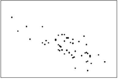
(True/False)
4.8/5 (39)
A pie chart uses relative frequencies to summarize the data so including the sample size is not important.
(True/False)
4.8/5 (38)
Is it fair to depict Texas as most tornado prone area of the U.S.by showing it has the highest number of tornados of all states in the U.S.?
(Multiple Choice)
4.9/5 (35)
If the form of the graph replaces the substance of the data,the graph is performing to function and graphical excellence is achieved.
(True/False)
4.9/5 (35)
A graph showing trends over time is called a(n)____________________ chart.
(Short Answer)
4.7/5 (42)
A relative frequency distribution describes the proportion of data values that fall within each category.
(True/False)
4.8/5 (21)
Slopes and trends in a line chart appear to be less steep if you ____________________ the horizontal (time)axis.
(Short Answer)
4.7/5 (38)
{Test Grades Narrative} Construct frequency and relative frequency distributions for this data set using seven class intervals.Describe the shape of the data set.
(Essay)
4.9/5 (32)
Time series data are often graphically depicted on a line chart,which is a plot of the variable of interest over time.
(True/False)
4.7/5 (35)
In applications involving two variables,X and Y,where one variable depends to some degree on the other,we call X the ____________________ variable.
(Short Answer)
4.9/5 (42)
Graphical techniques should not be used to present data if accurate tabular forms for the same data are available.
(True/False)
4.9/5 (27)
Graphical excellence gives the greatest number of ideas in the shortest time with the least ink in the smallest space.
(True/False)
4.9/5 (31)
A(n)____________________ histogram has two peaks,not necessarily equal in height.
(Short Answer)
4.9/5 (31)
Filters
- Essay(0)
- Multiple Choice(0)
- Short Answer(0)
- True False(0)
- Matching(0)